As demonstrated in these assets, I overhauled the “Ask HR” brand with an ultra-modern dark aesthetic punctuated by high-energy orange and crisp white. By pairing accessible typography with a chat-inspired logotype icon, I created a cohesive, premium corporate ecosystem bridging human resources with striking performance.
BRAND DESIGN
& visual systems
'Ask HR' Visual Identity
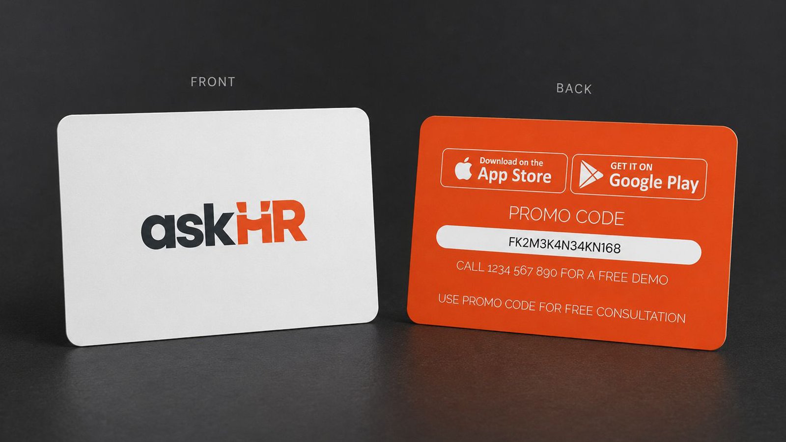
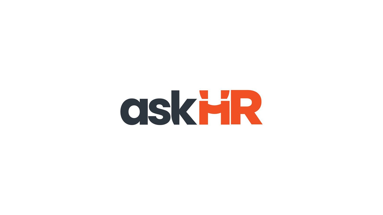

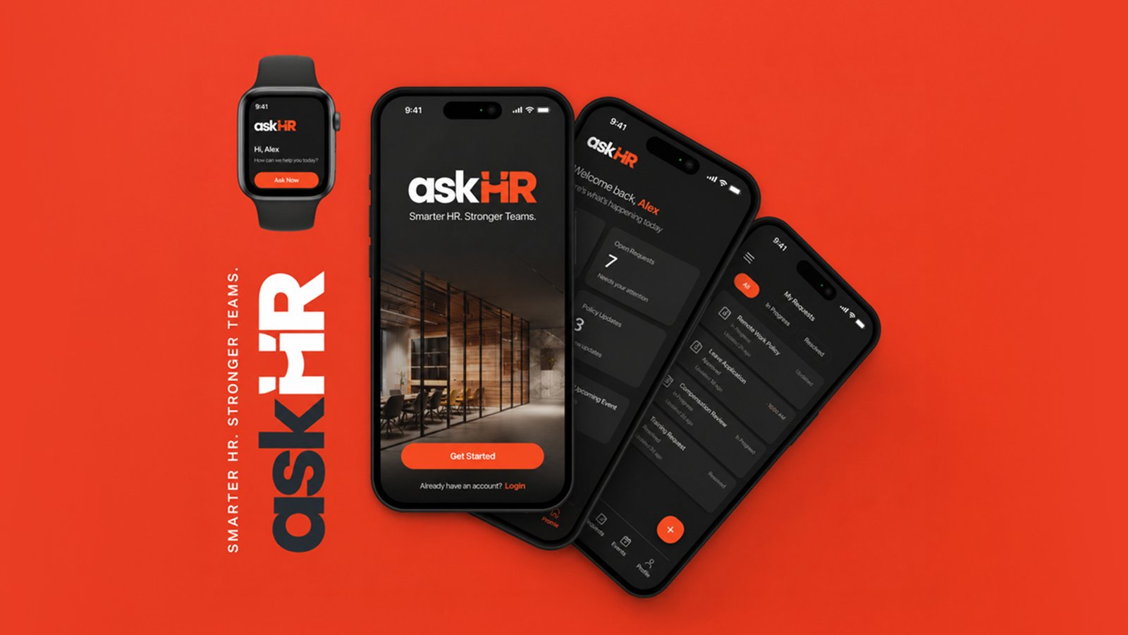
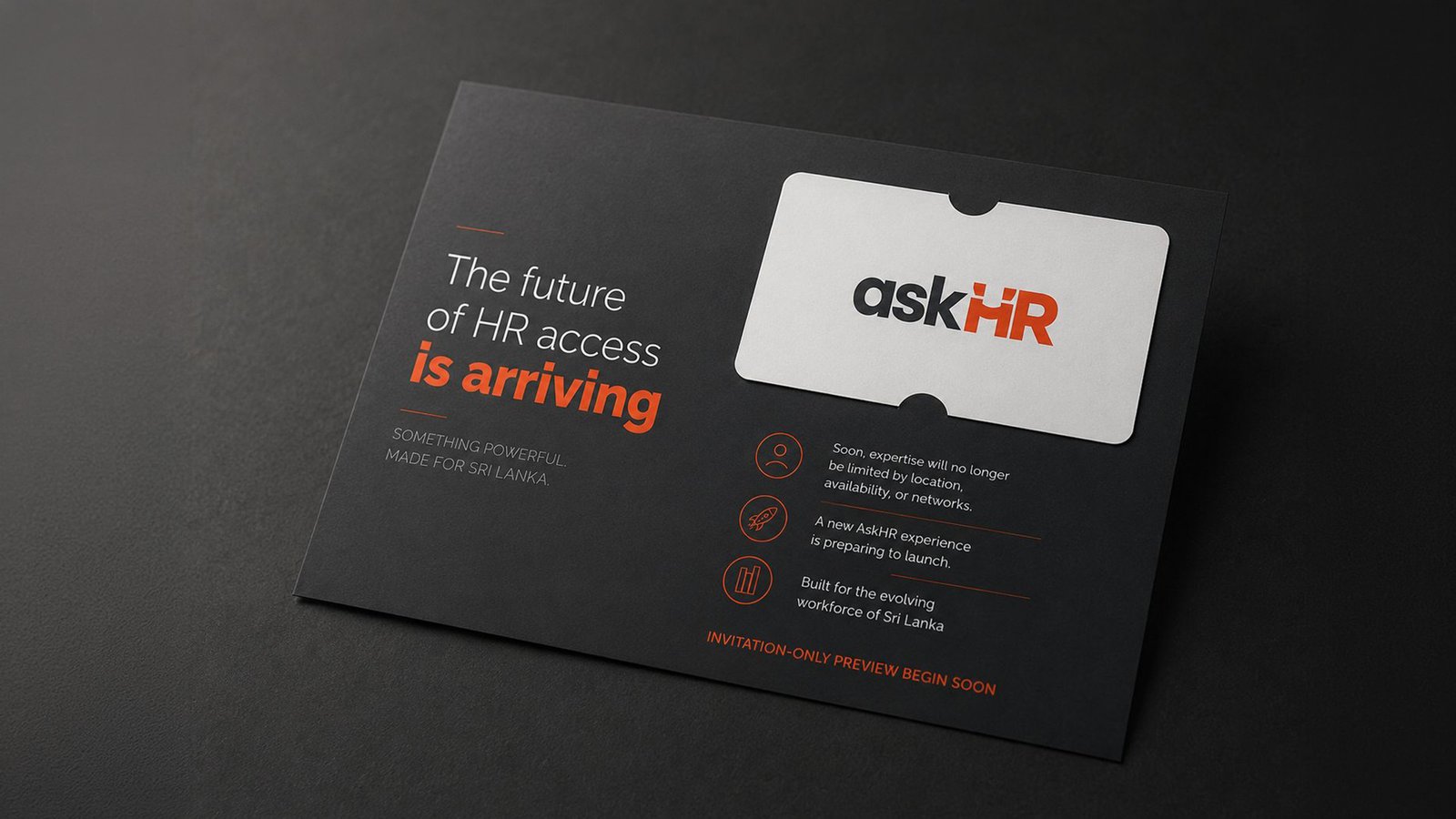
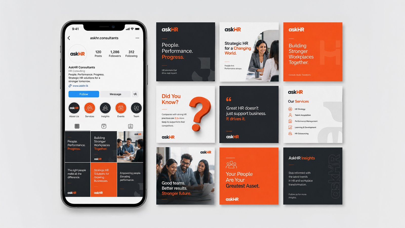
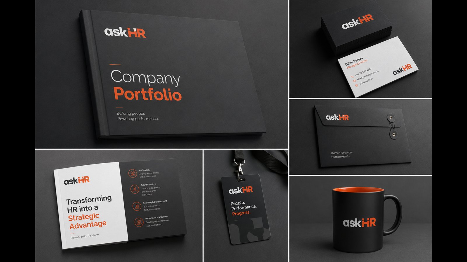


As demonstrated in these assets, I overhauled the “Ask HR” brand with an ultra-modern dark aesthetic punctuated by high-energy orange and crisp white. By pairing accessible typography with a chat-inspired logotype icon, I created a cohesive, premium corporate ecosystem bridging human resources with striking performance.
'Lather' Brand Build
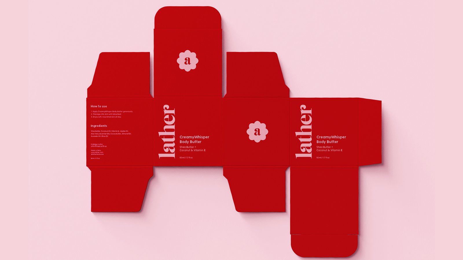
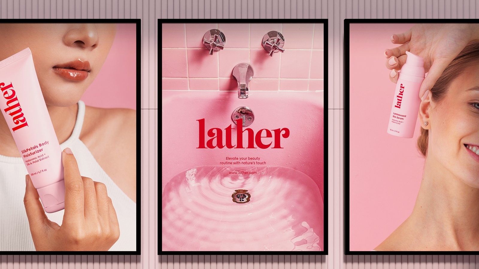
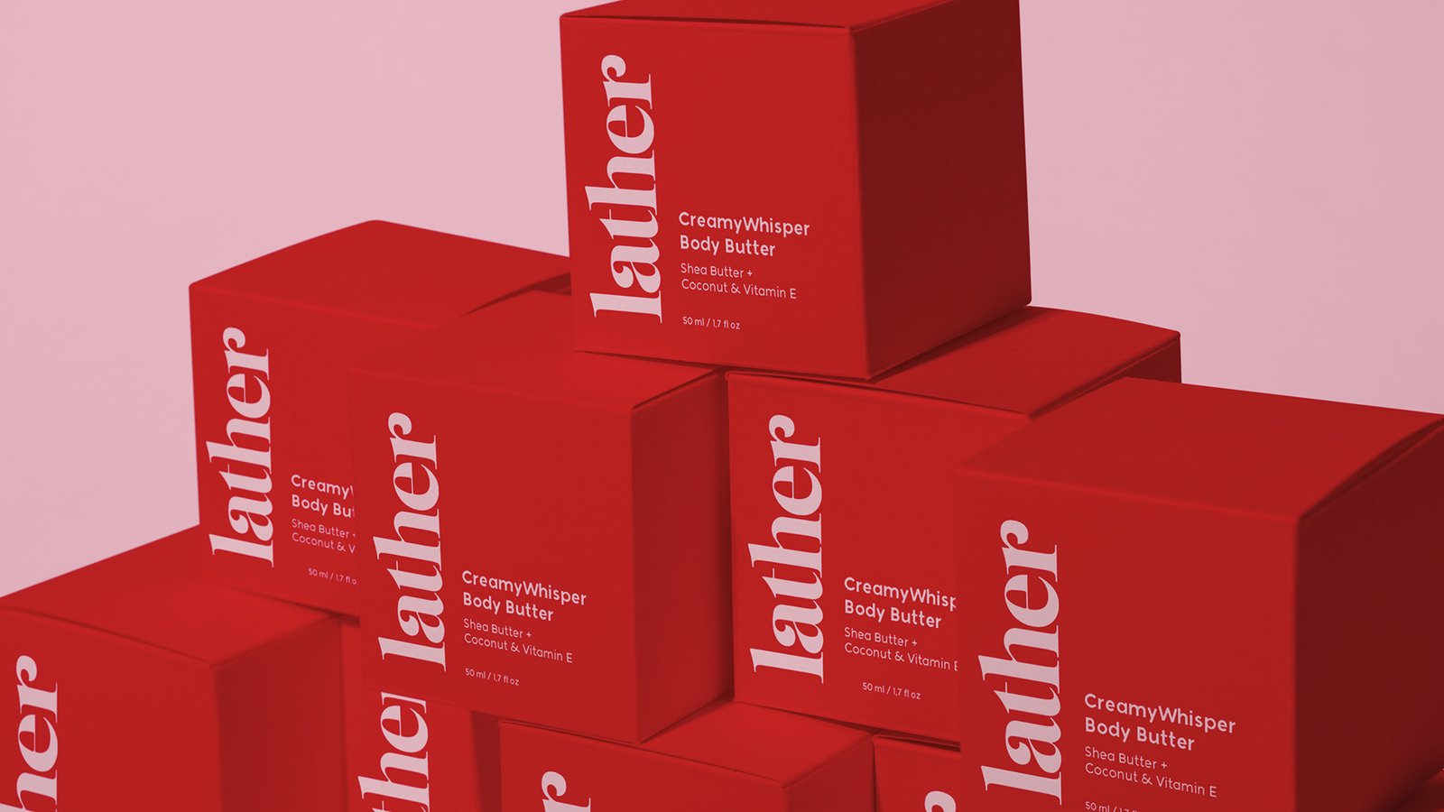
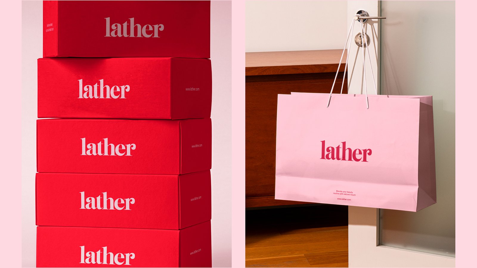
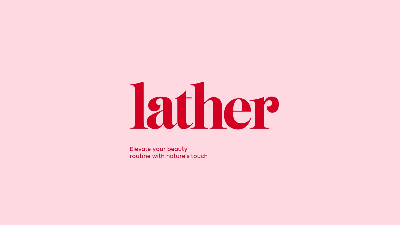
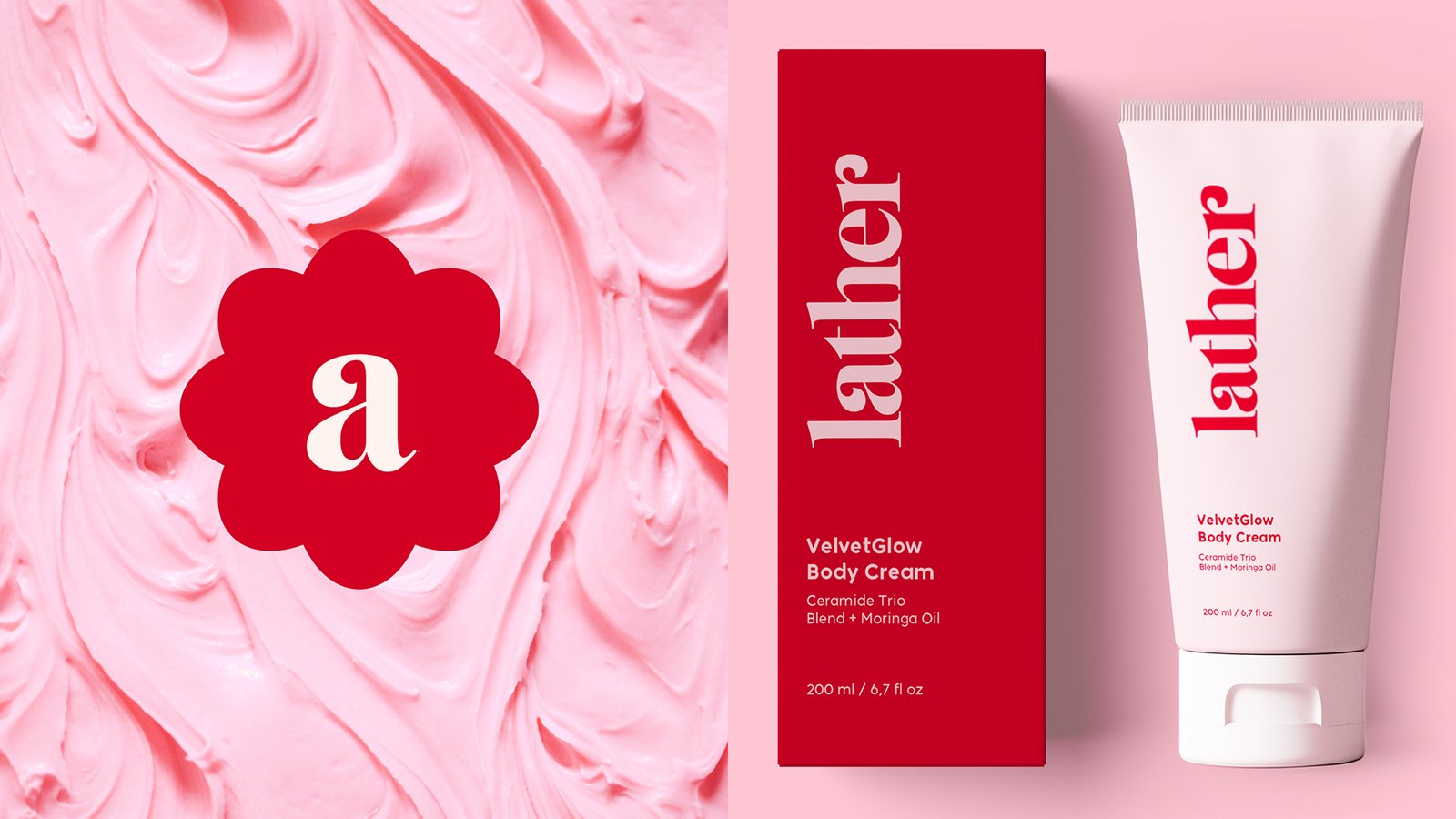

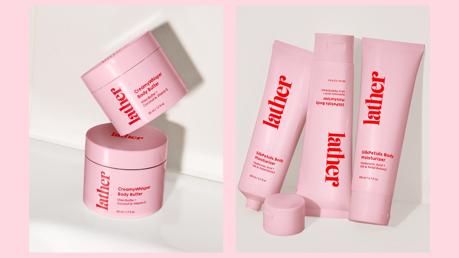
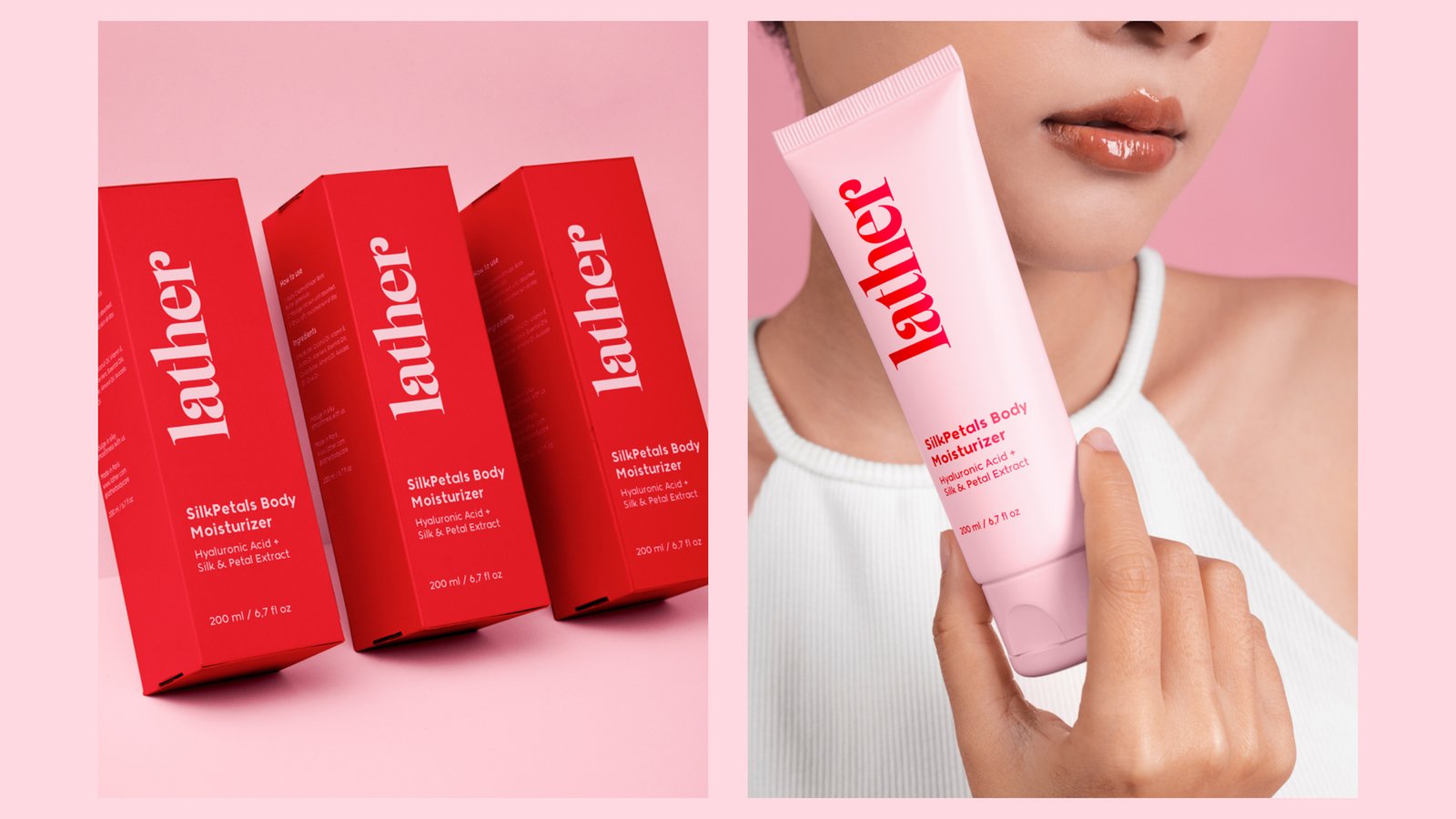


I overhauled the “Lather” skincare brand by introducing a bold, high-contrast palette of vibrant red and soft petal pink that completely redefines traditional clinical beauty packaging. By pairing a modern, fluid serif wordmark with minimalist layout typography, I transformed the identity into a striking, premium lifestyle piece that effortlessly balances raw energy with clean cosmetic elegance.
I overhauled the “Lather” skincare brand by introducing a bold, high-contrast palette of vibrant red and soft petal pink that completely redefines traditional clinical beauty packaging. By pairing a modern, fluid serif wordmark with minimalist layout typography, I transformed the identity into a striking, premium lifestyle piece that effortlessly balances raw energy with clean cosmetic elegance.
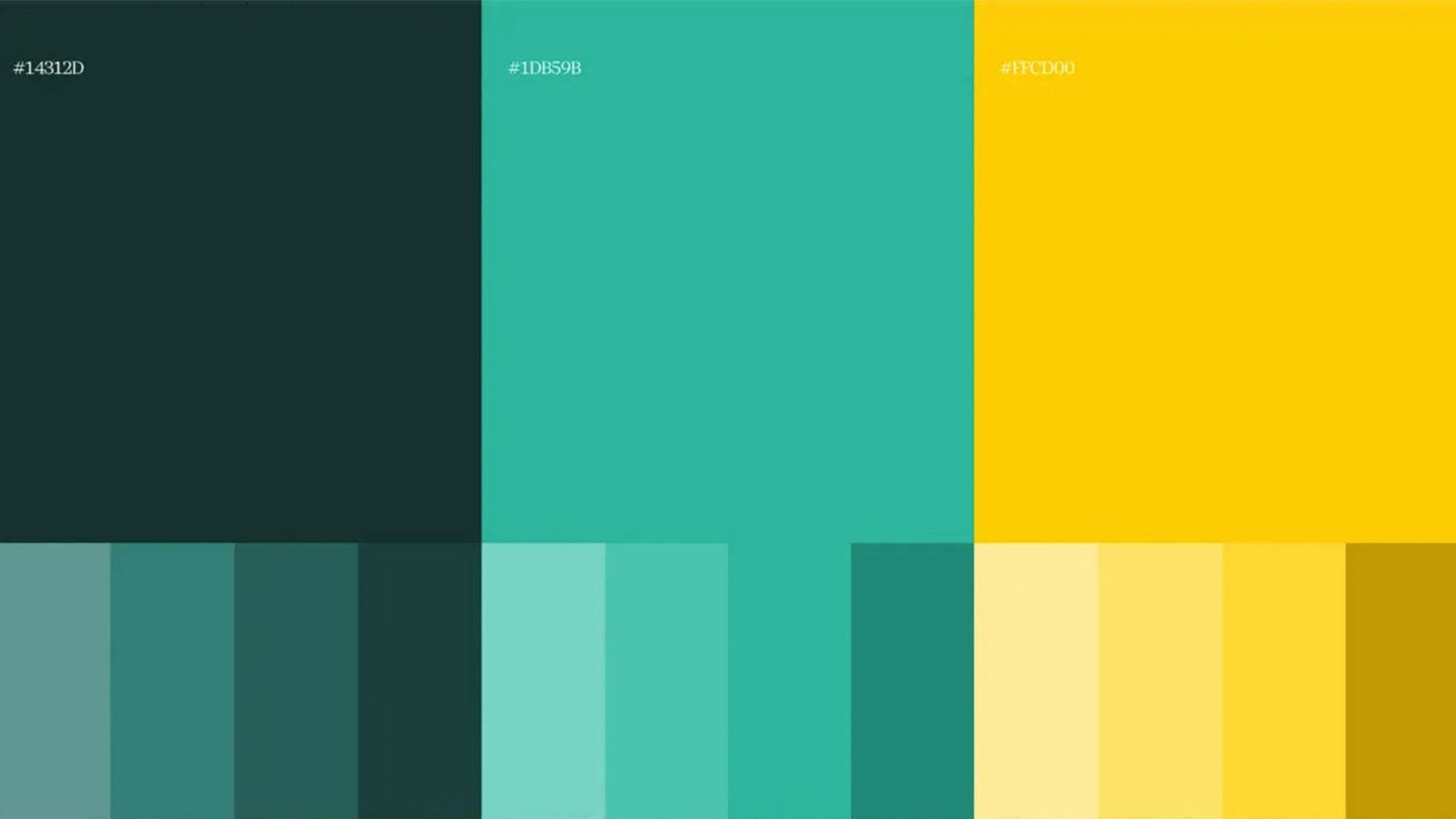
'Fixoria' Branding


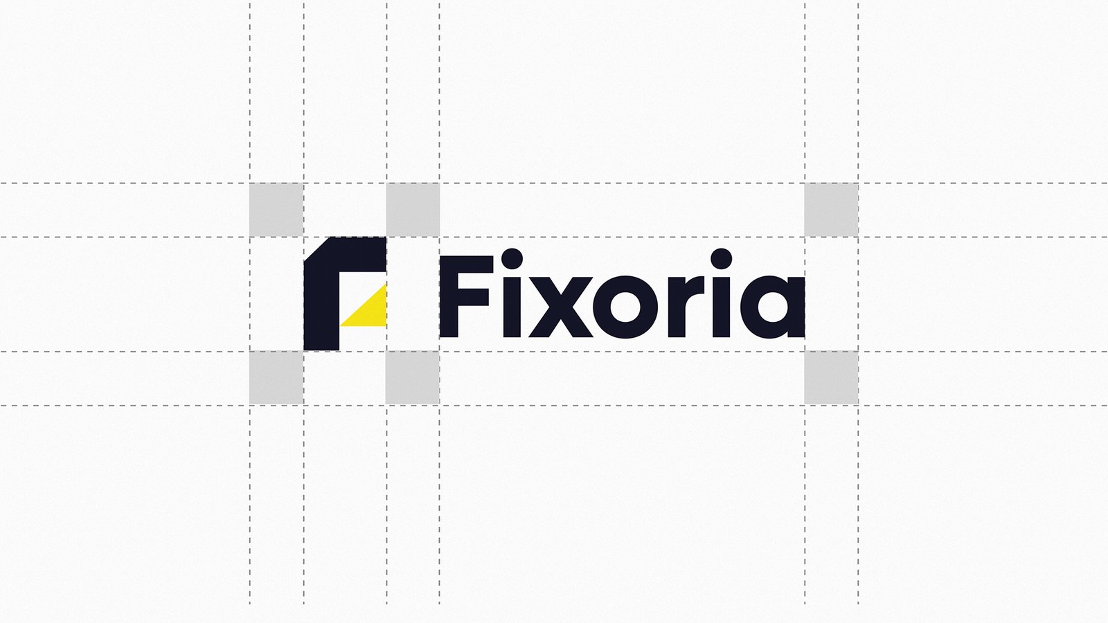
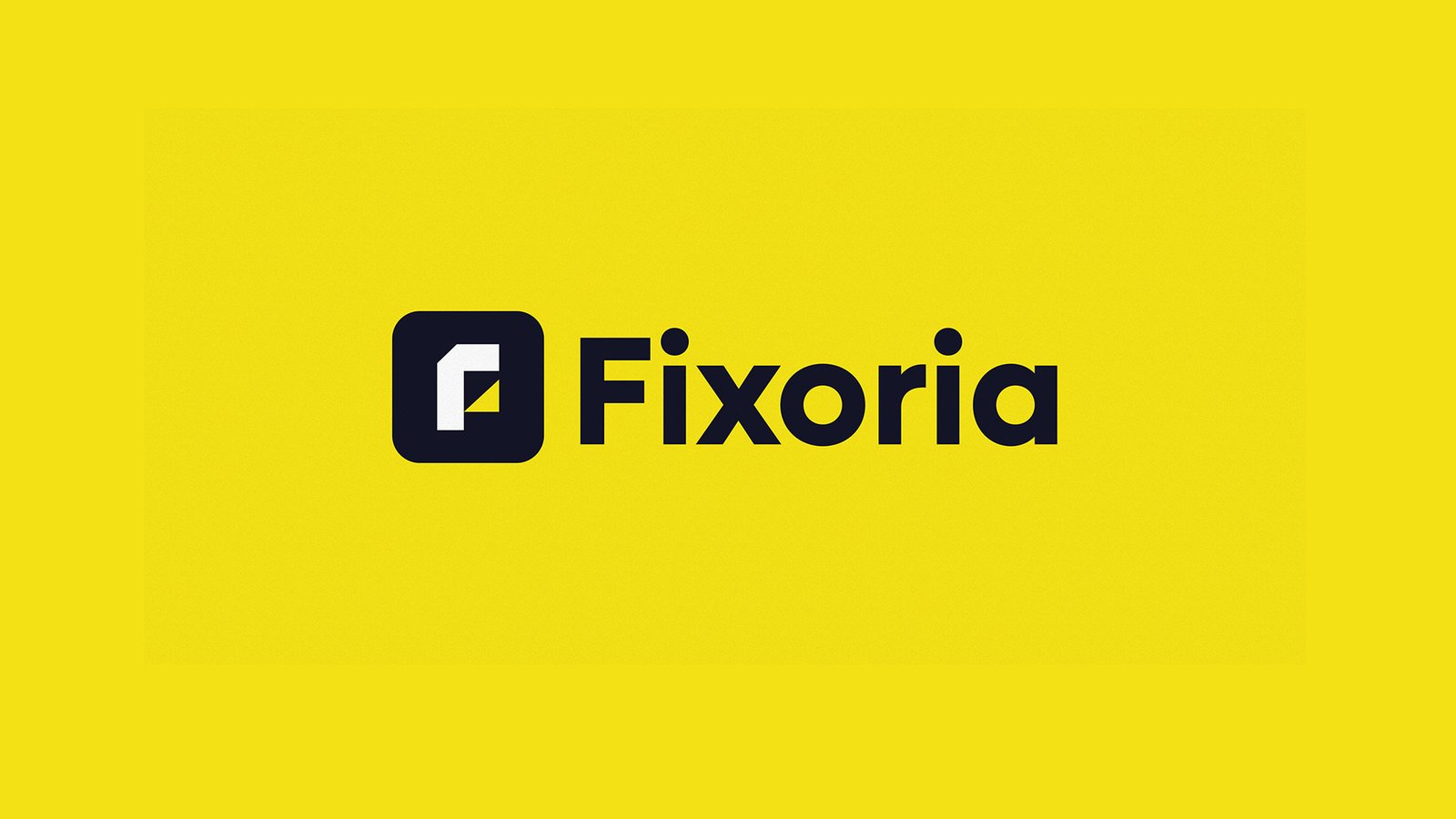
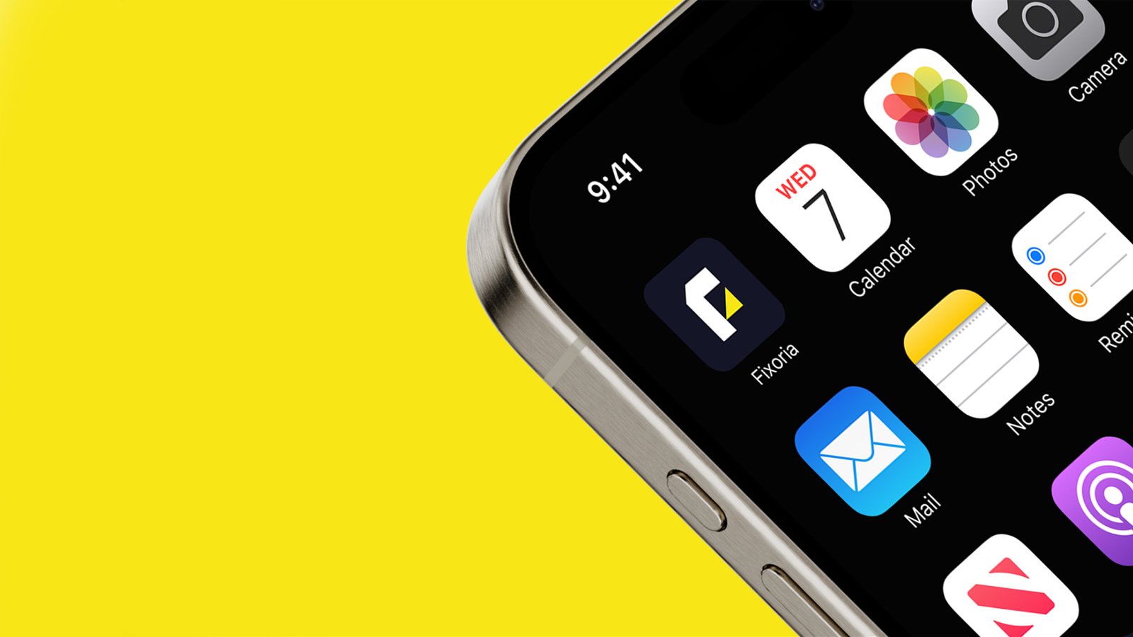
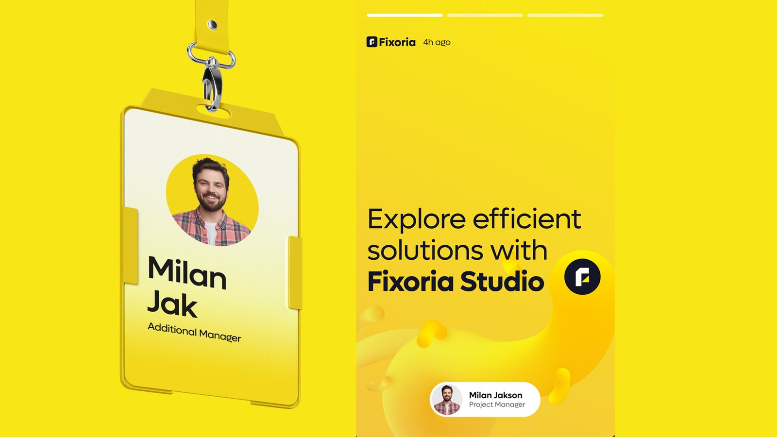
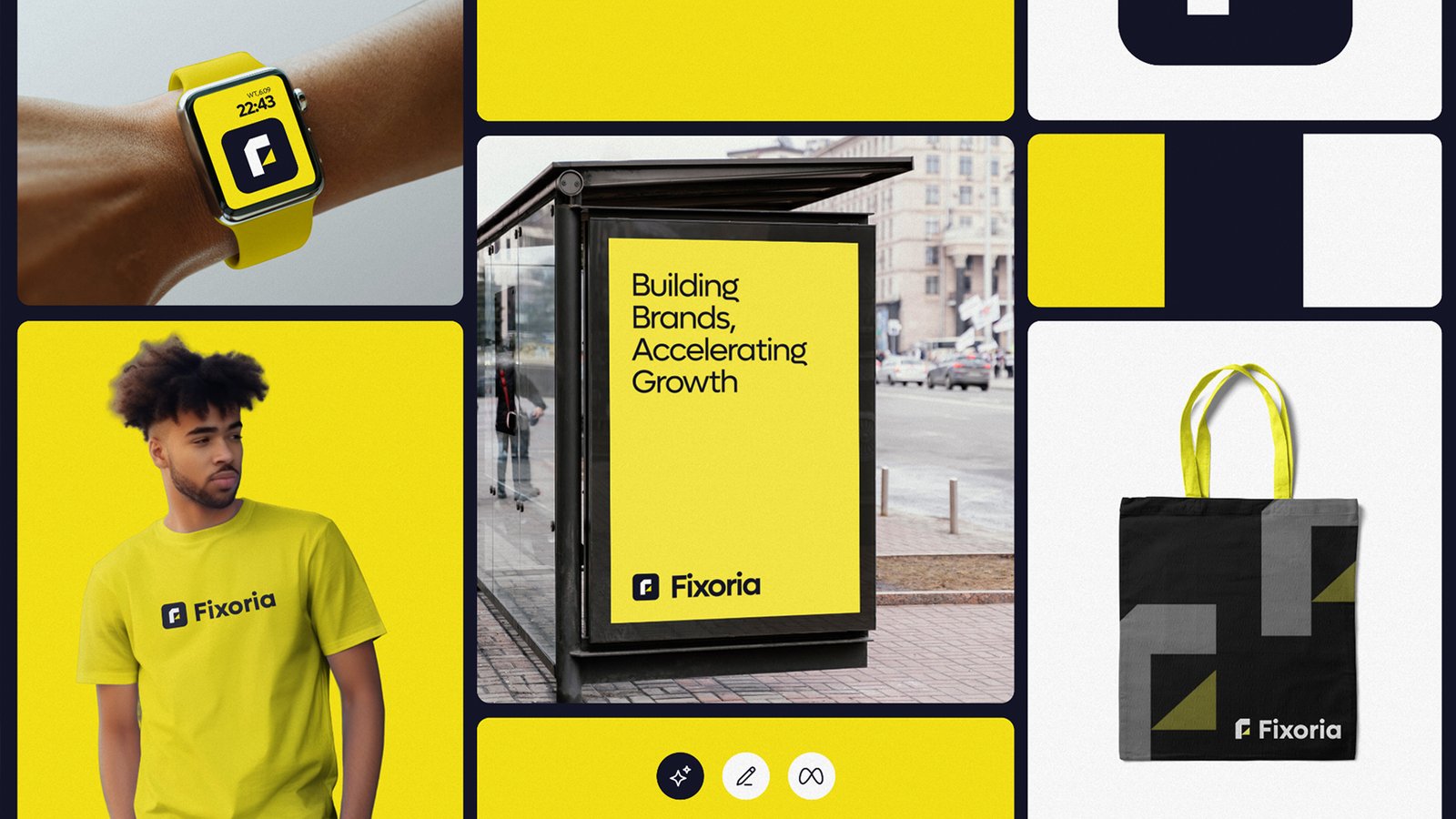
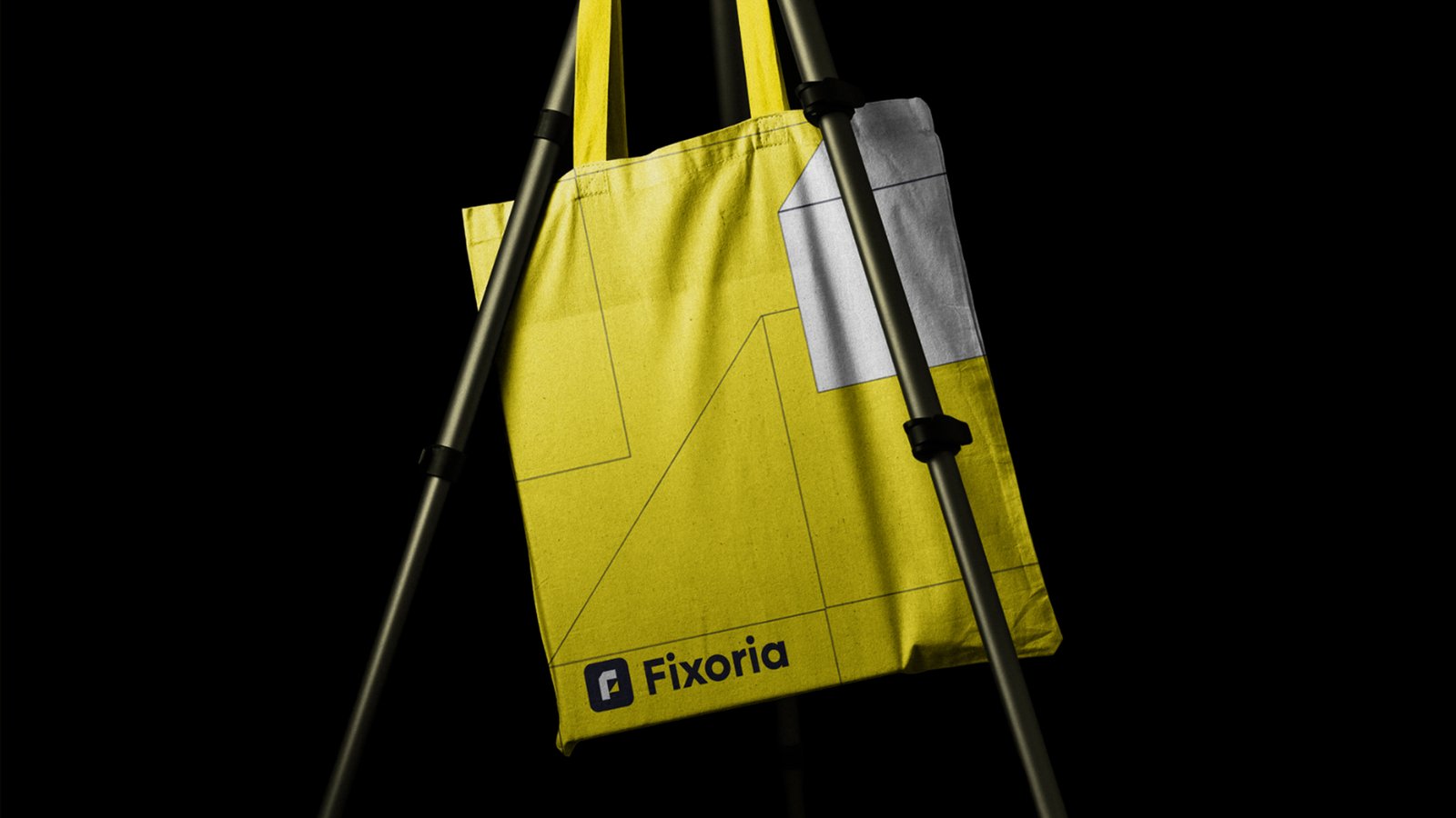
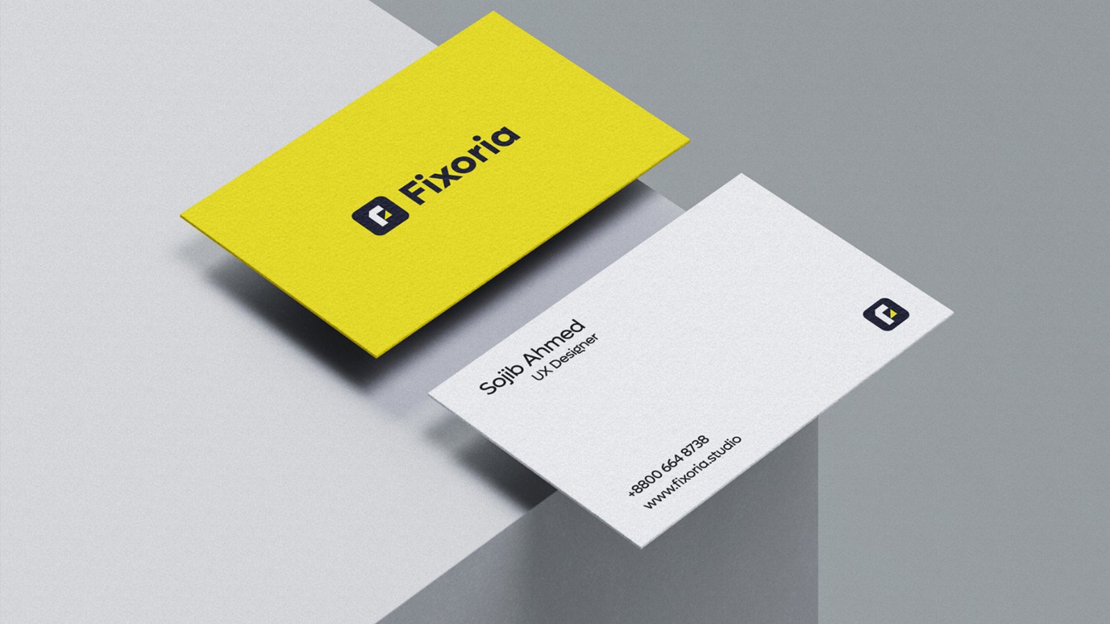
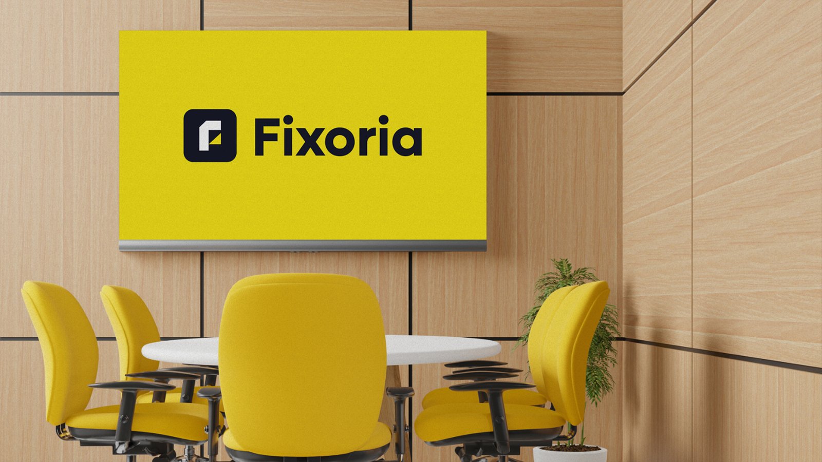
I overhauled the Fixoria brand by establishing a bold, high-contrast visual identity centered around a vibrant yellow and deep navy palette. Focusing on clean geometric precision, I crafted a minimalist, abstract “F” icon that seamlessly balances modern aesthetic sophistication with strong corporate reliability.
I overhauled the Fixoria brand by establishing a bold, high-contrast visual identity centered around a vibrant yellow and deep navy palette. Focusing on clean geometric precision, I crafted a minimalist, abstract “F” icon that seamlessly balances modern aesthetic sophistication with strong corporate reliability.
'PureStand' Visual Identity
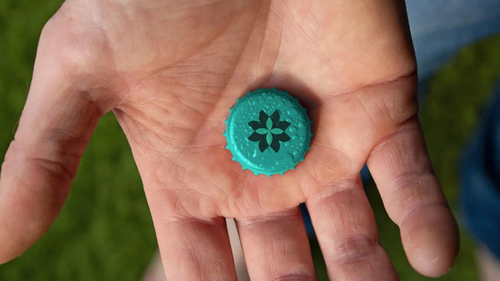
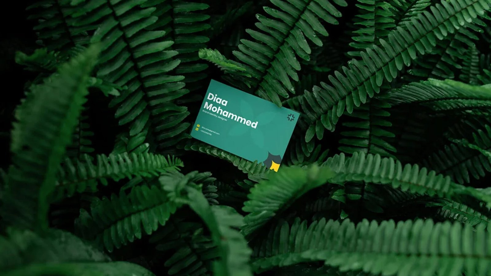

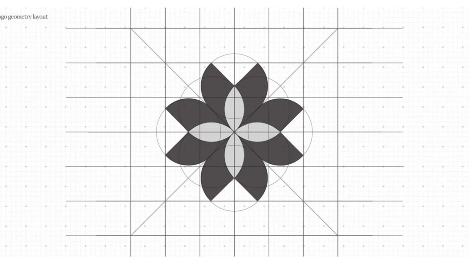
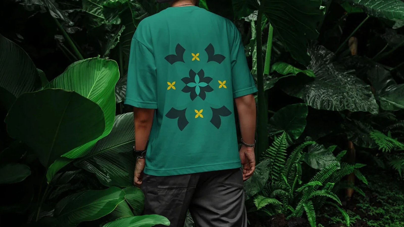
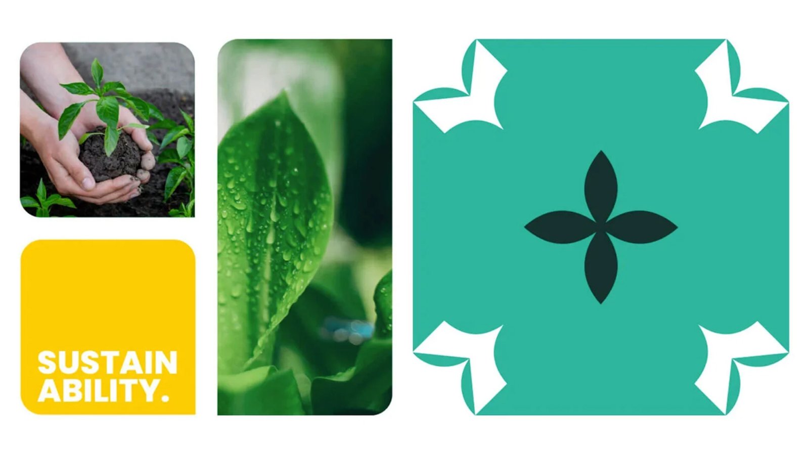
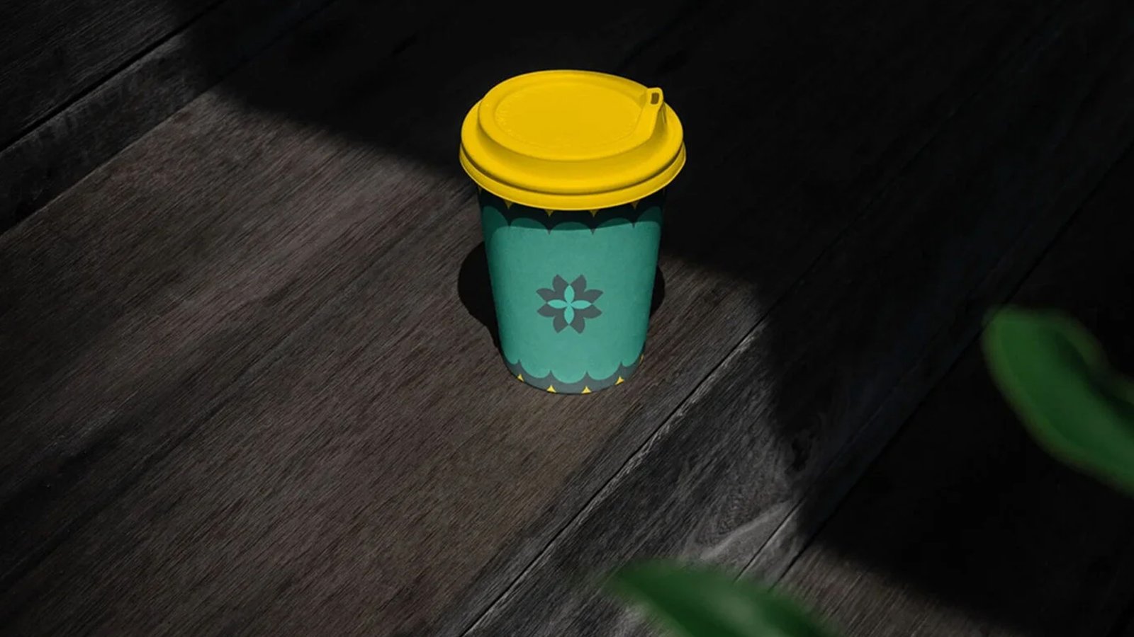

PureStrand’s branding uses a matte, nature-inspired design to frame bio-polymer filtration as a premium lifestyle piece. Its interlocking logo and teal palette replace clinical styling with high-tech, eco-friendly performance for the conscious consumer.
PureStrand’s branding uses a matte, nature-inspired design to frame bio-polymer filtration as a premium lifestyle piece. Its interlocking logo and teal palette replace clinical styling with high-tech, eco-friendly performance for the conscious consumer.
'Omega Kevin' Personal Brand
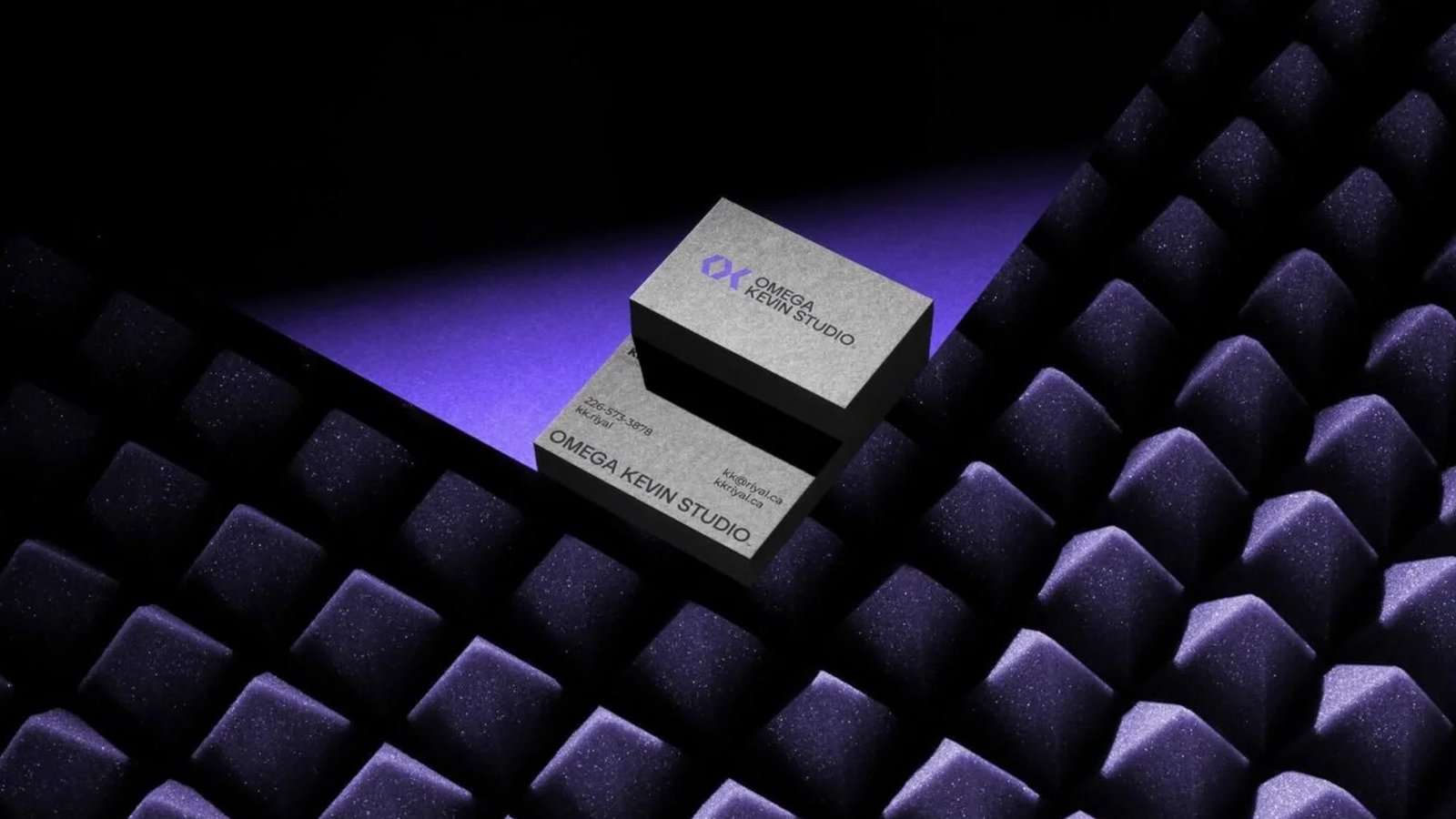
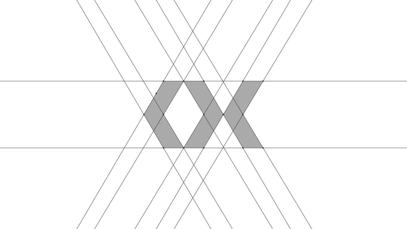
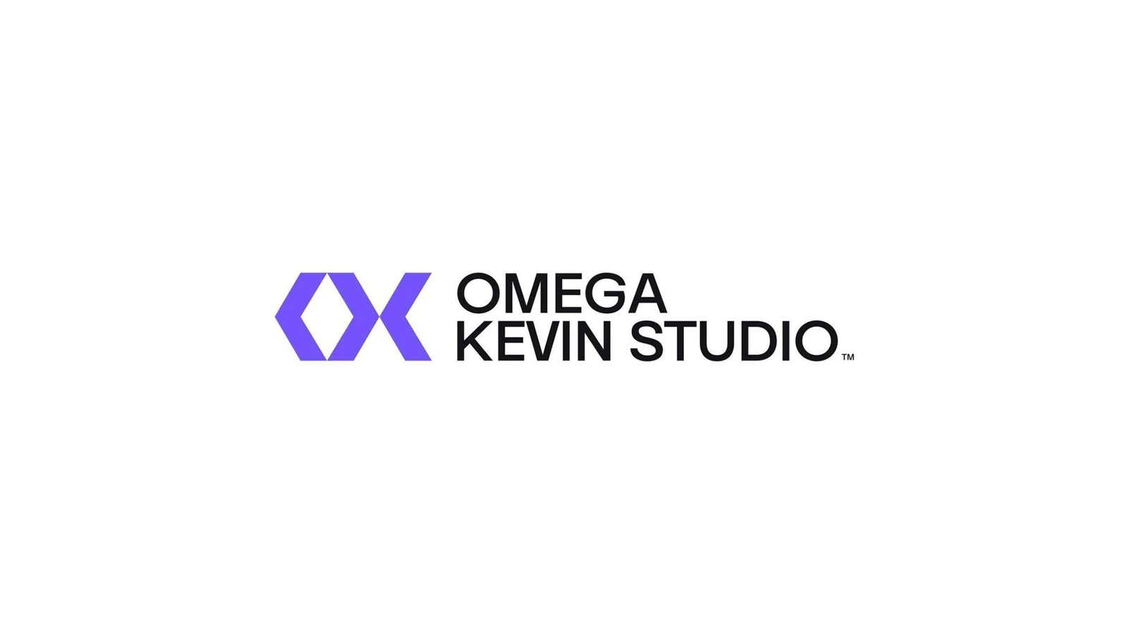
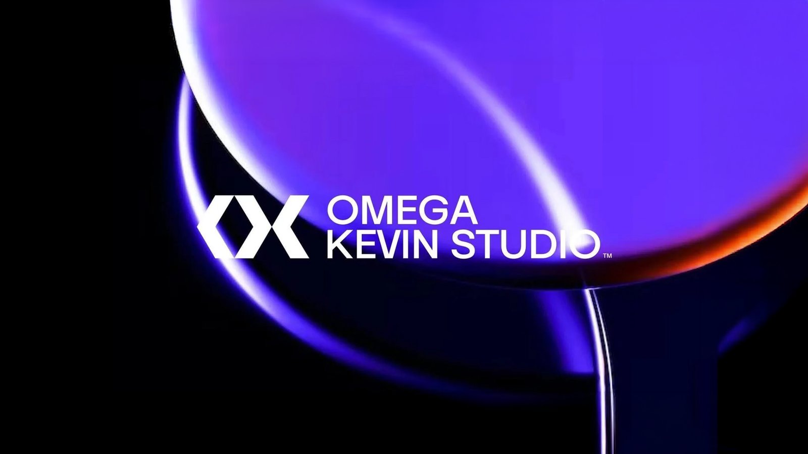
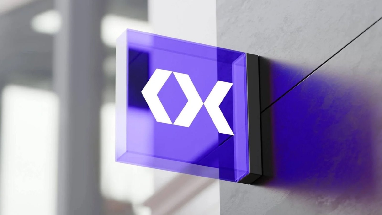
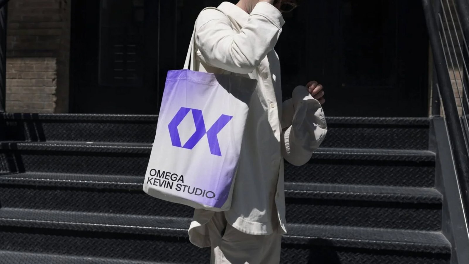
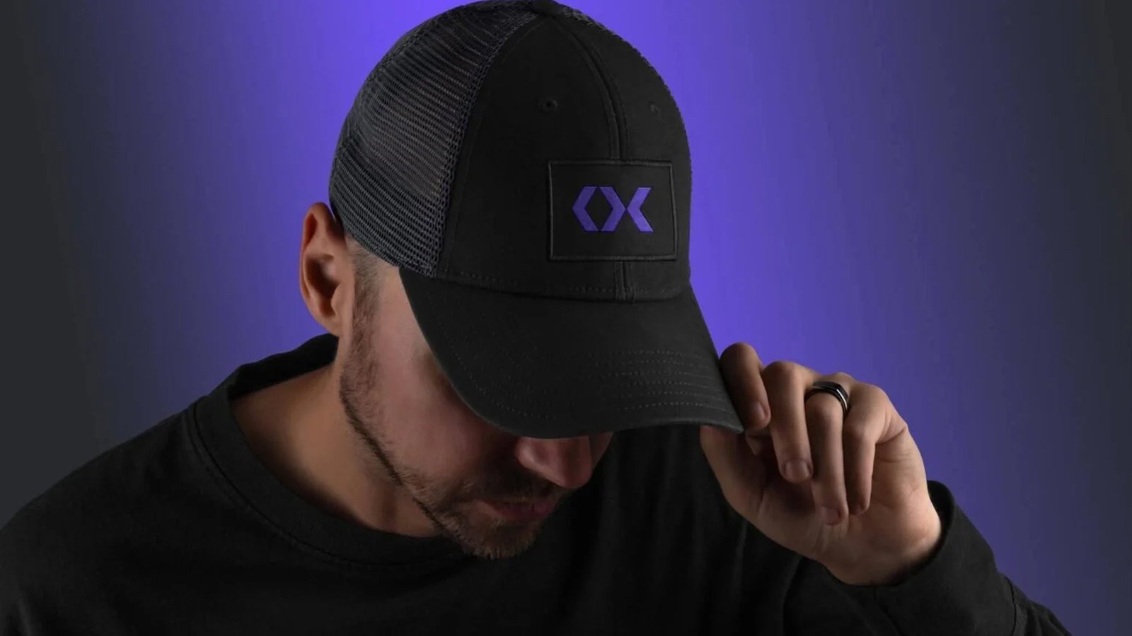
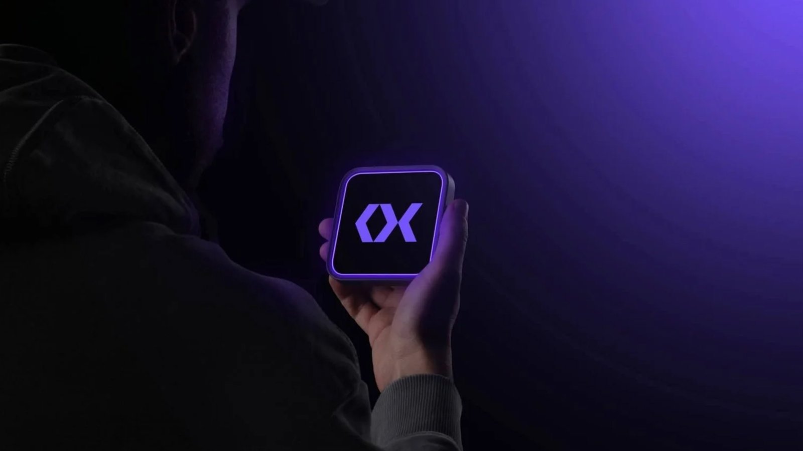
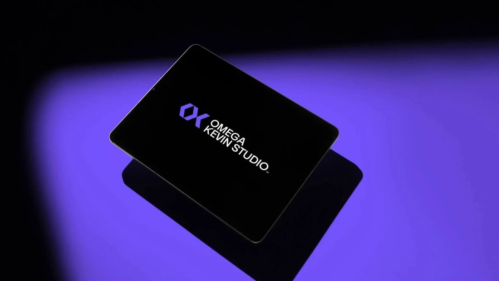

I spearheaded the comprehensive overhaul of Omega Kevin Studio brand, seamlessly blending technical precision with fluid, modern aesthetics. By engineering a bold, geometric monogram that unites the ‘O’ and ‘K’ inside a structured grid, I transformed the brand into a versatile, high-impact identity that commands attention across both digital interfaces and physical merchandise.
I spearheaded the comprehensive overhaul of Omega Kevin Studio brand, seamlessly blending technical precision with fluid, modern aesthetics. By engineering a bold, geometric monogram that unites the ‘O’ and ‘K’ inside a structured grid, I transformed the brand into a versatile, high-impact identity that commands attention across both digital interfaces and physical merchandise.
'Kerwin Rae' Brand elements
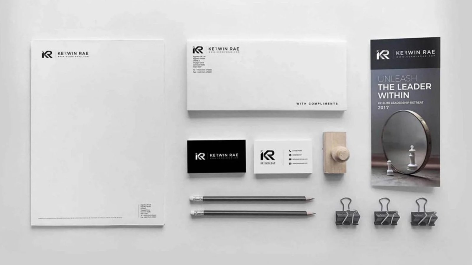
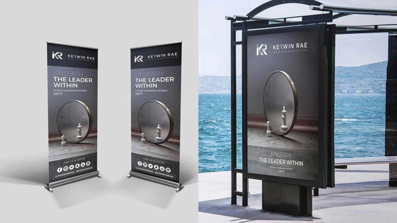
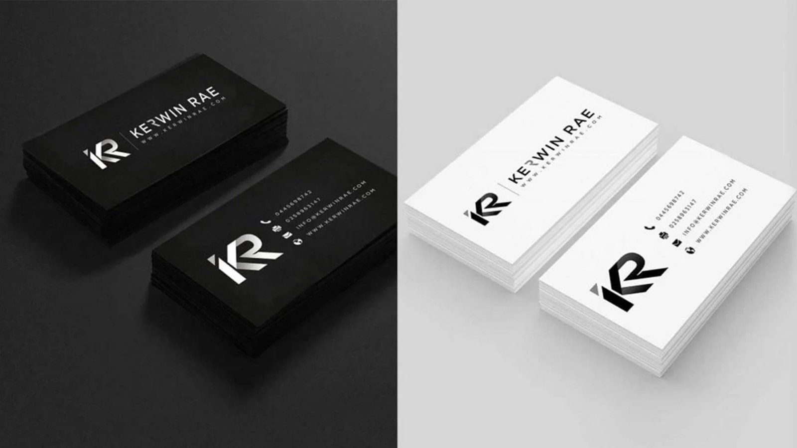
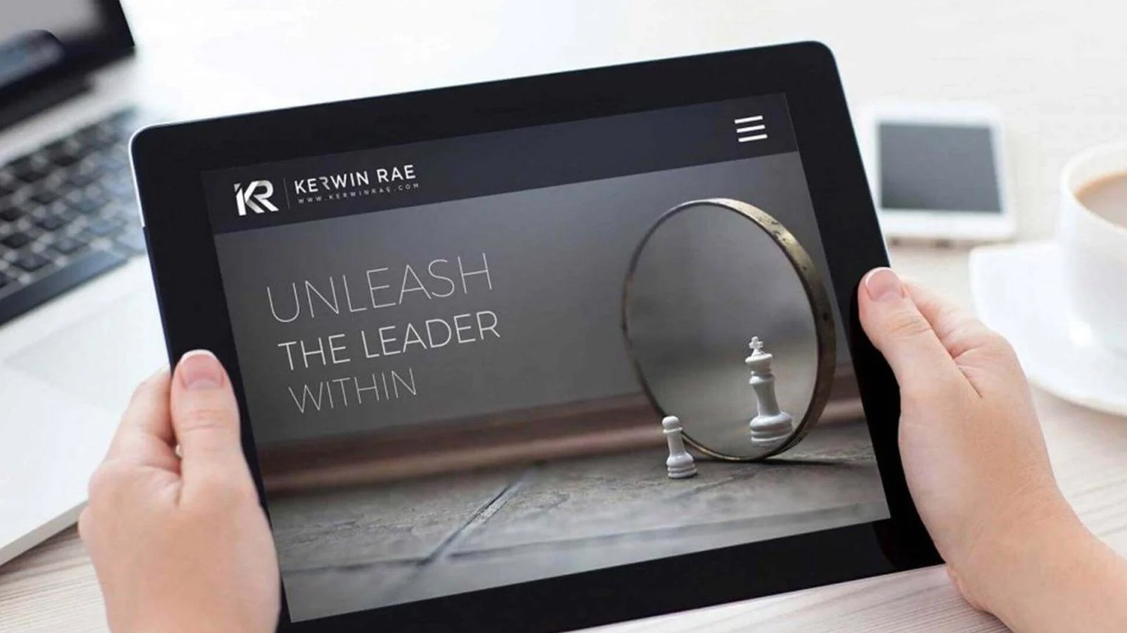
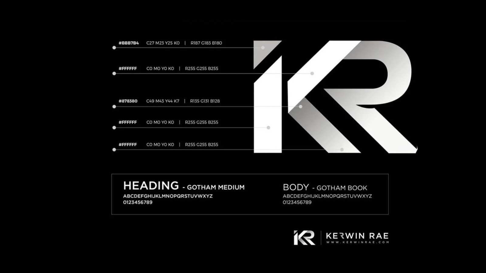
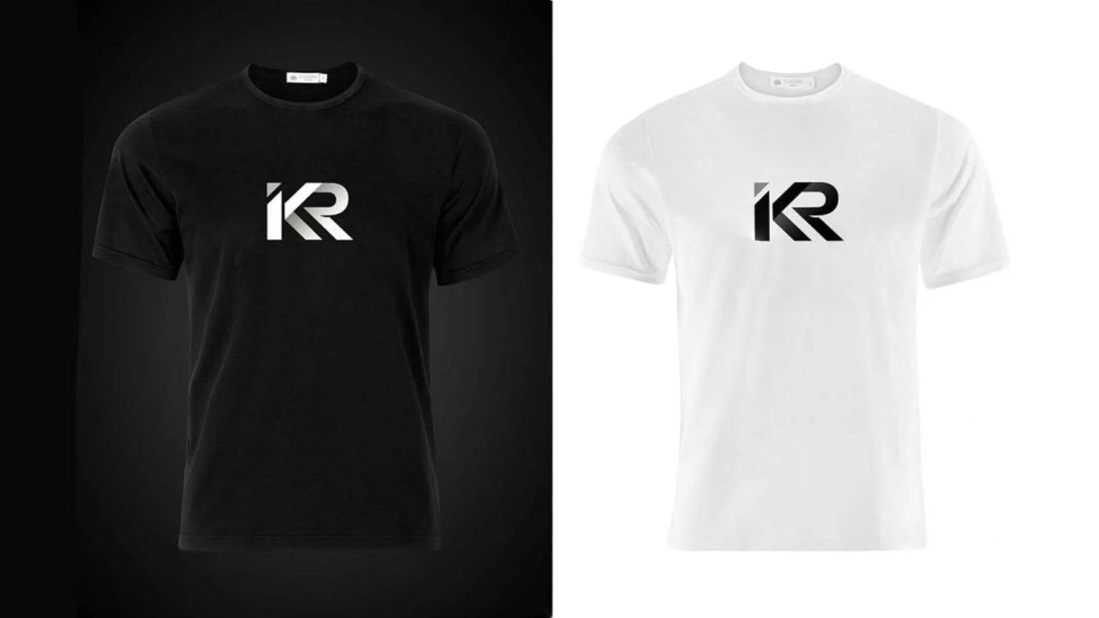

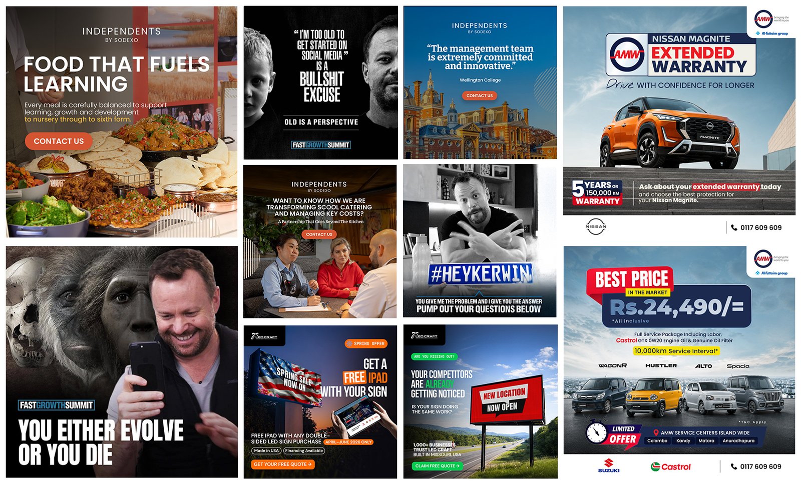
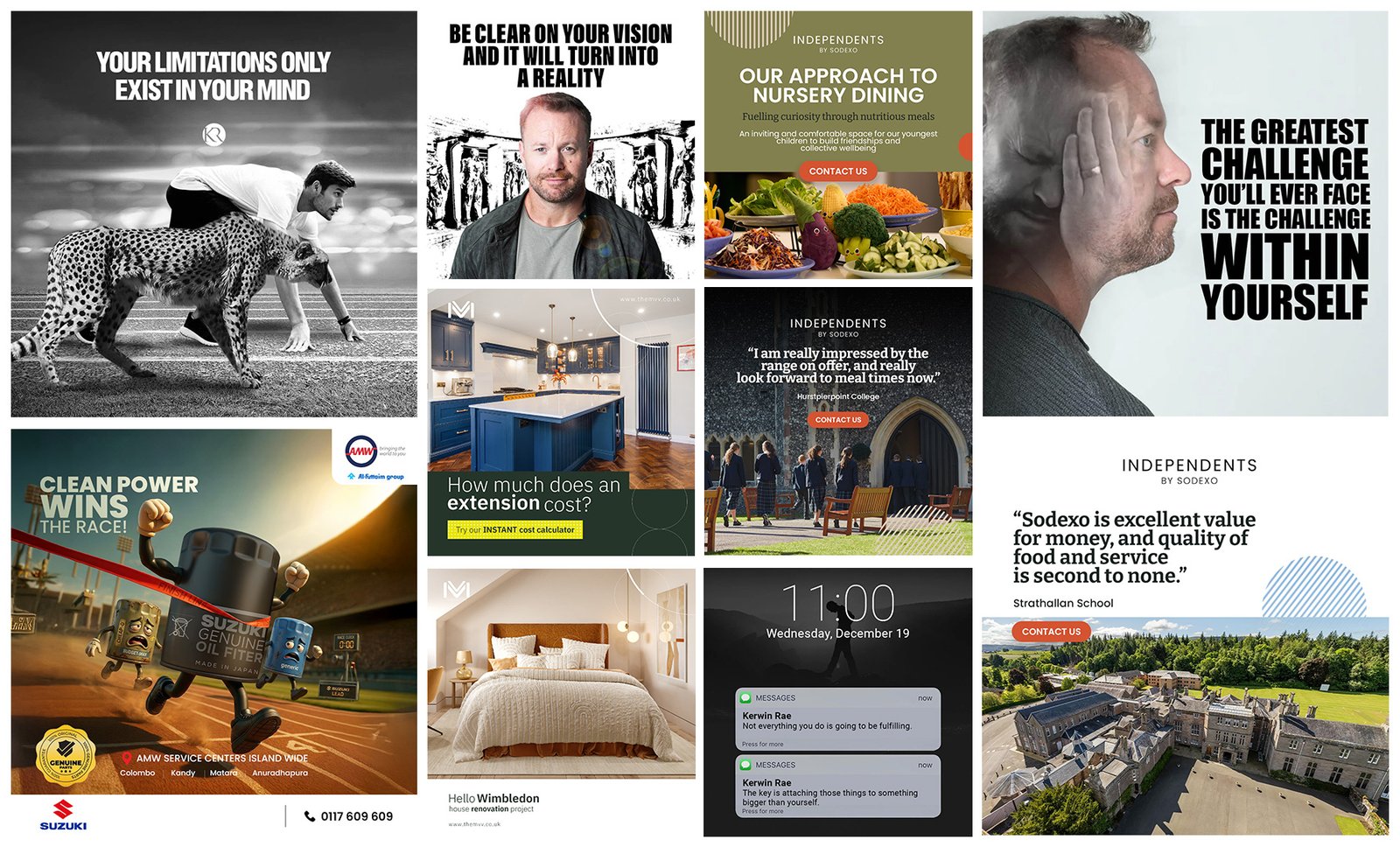
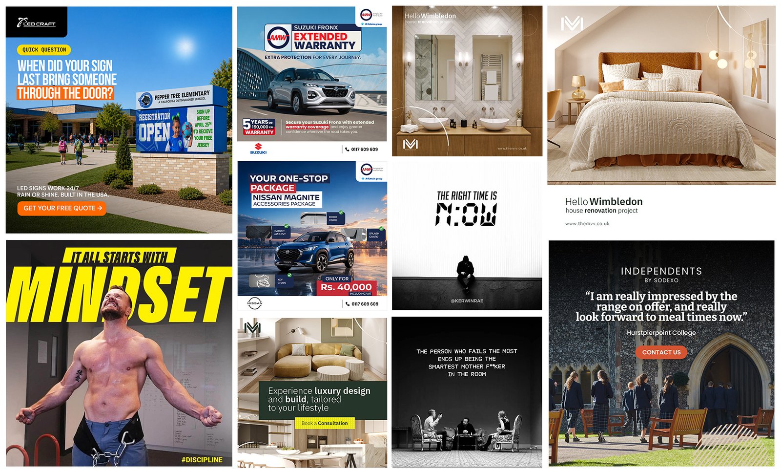
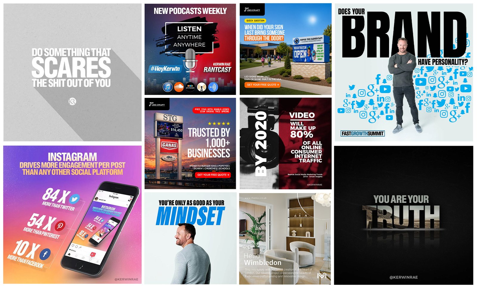
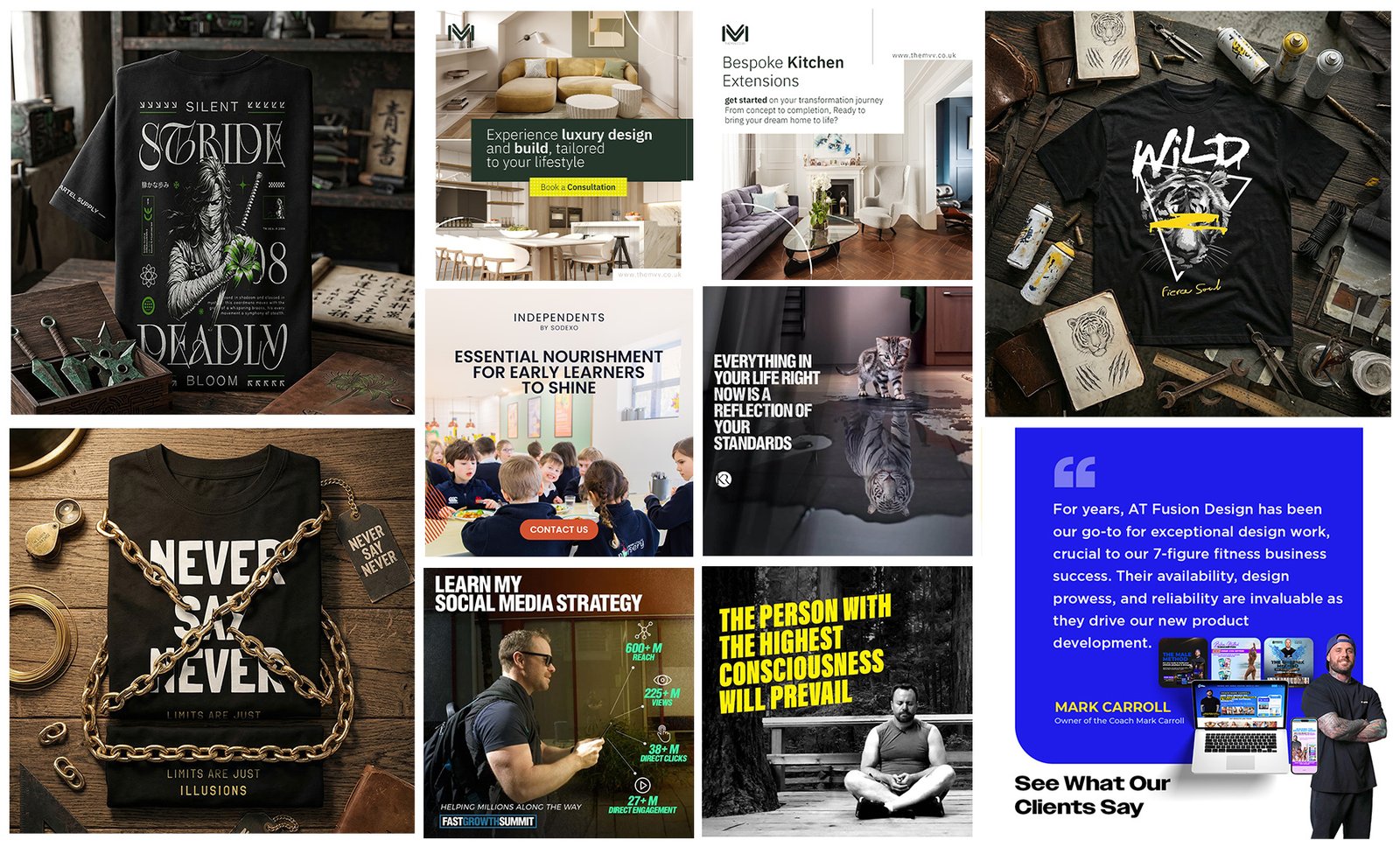
As Digital Designer for Kerwin Rae, I led a bold, energetic visual rebrand transitioning his identity from business coach to high-performance strategist. The website UX/UI, social templates, and event motion graphics overhauled to maximize conversion, audience engagement, and digital ecosystem growth.
As Digital Designer for Kerwin Rae, I led a bold, energetic visual rebrand transitioning his identity from business coach to high-performance strategist. The website UX/UI, social templates, and event motion graphics overhauled to maximize conversion, audience engagement, and digital ecosystem growth.
Taste of Korea
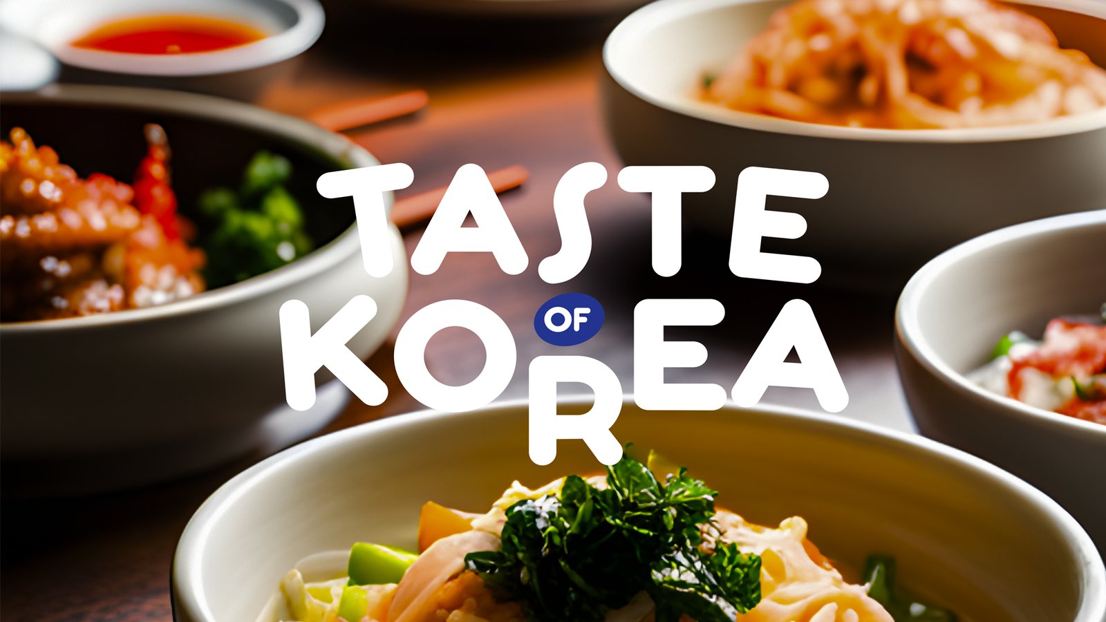
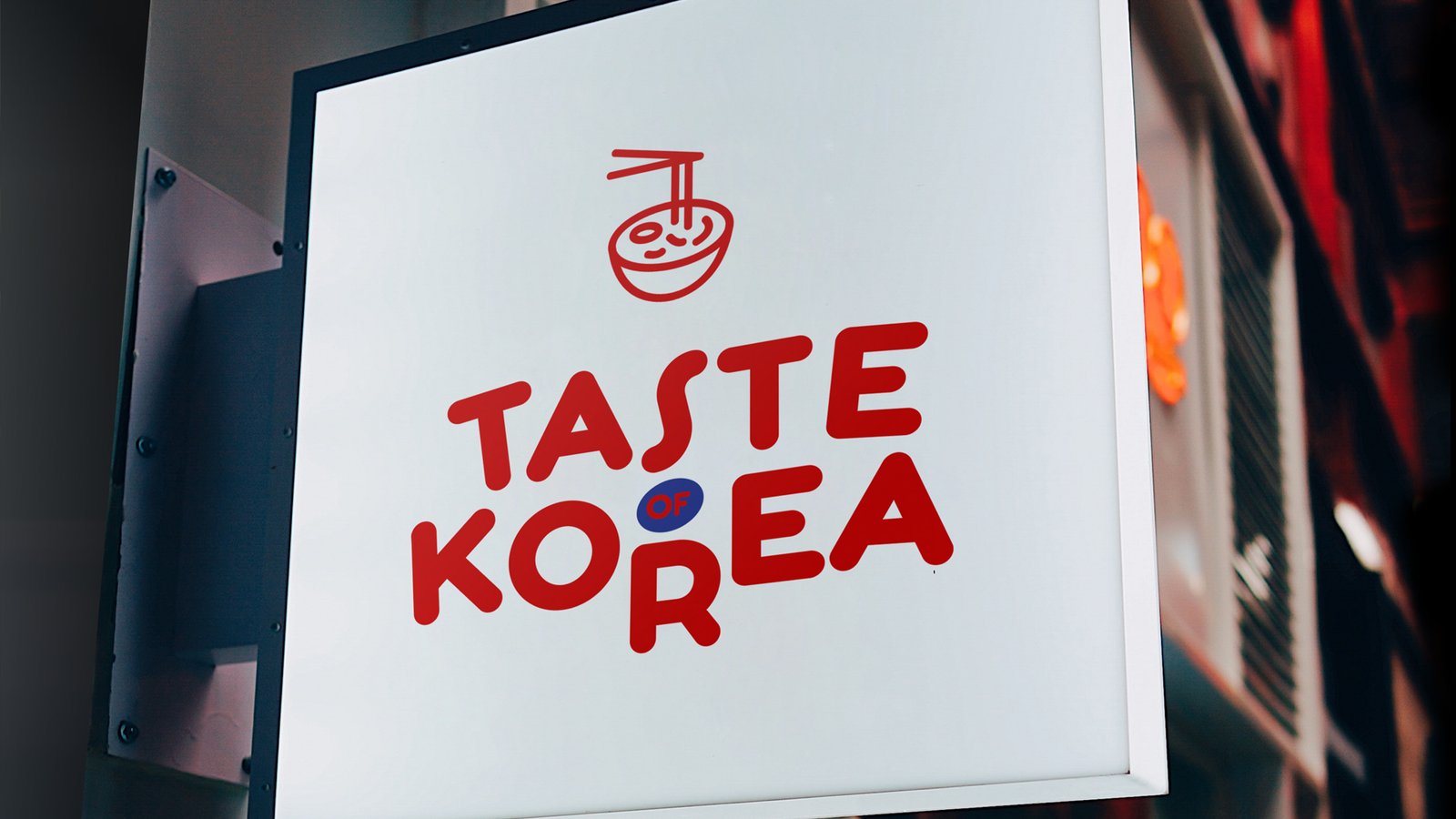
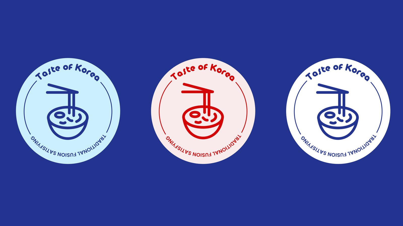
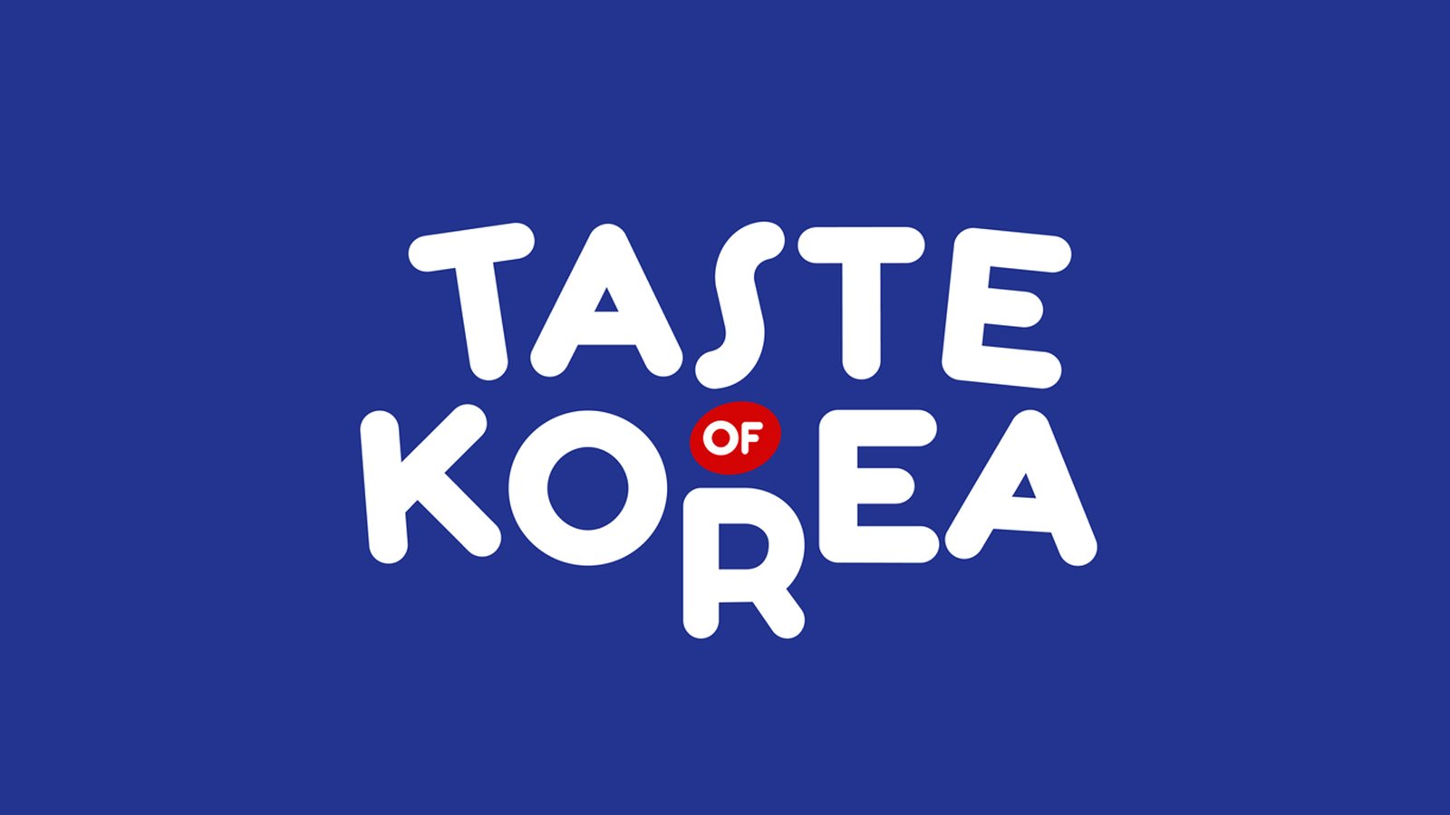
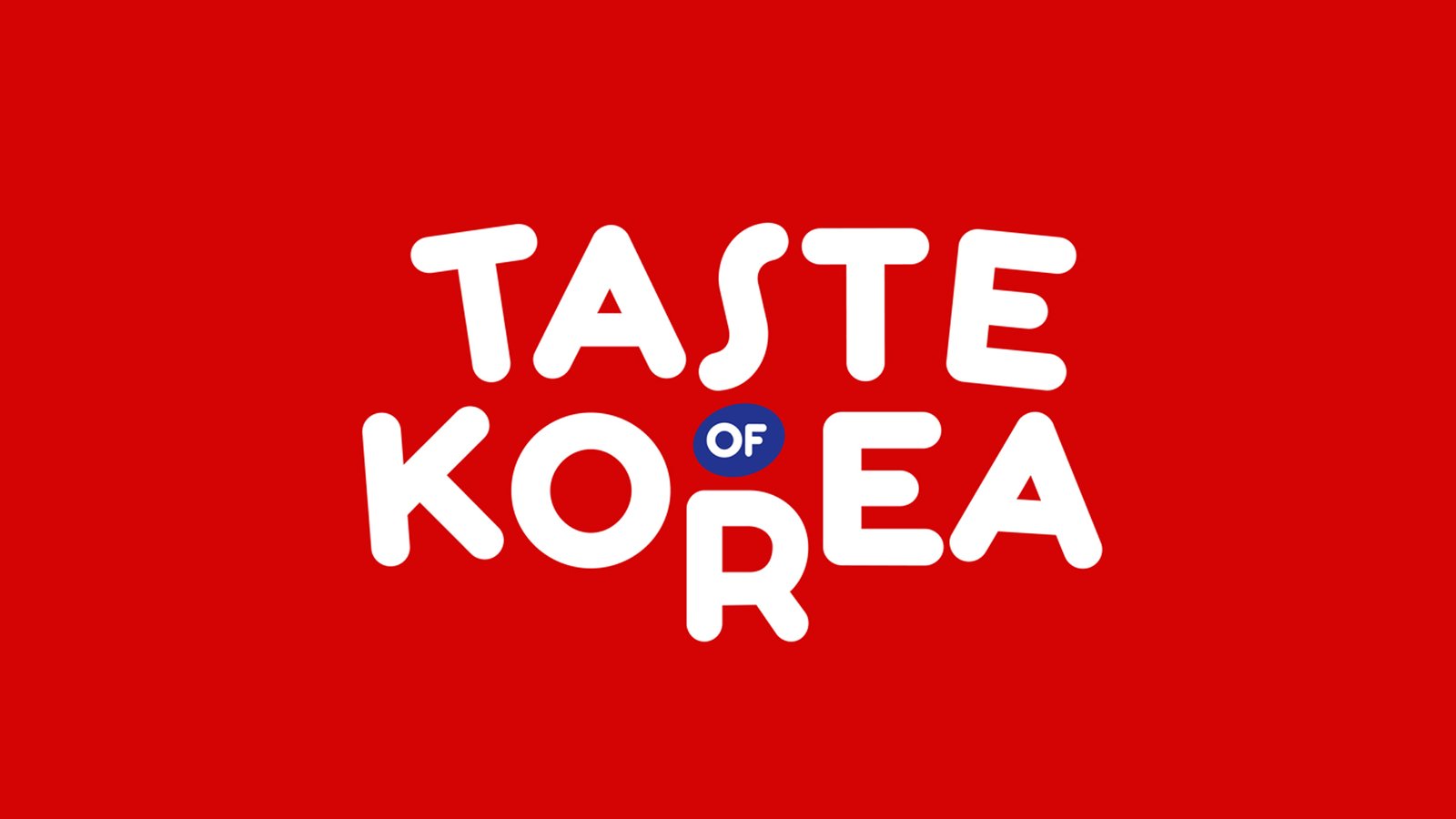
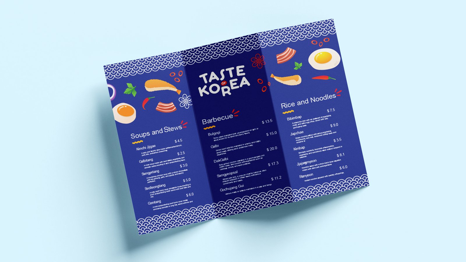
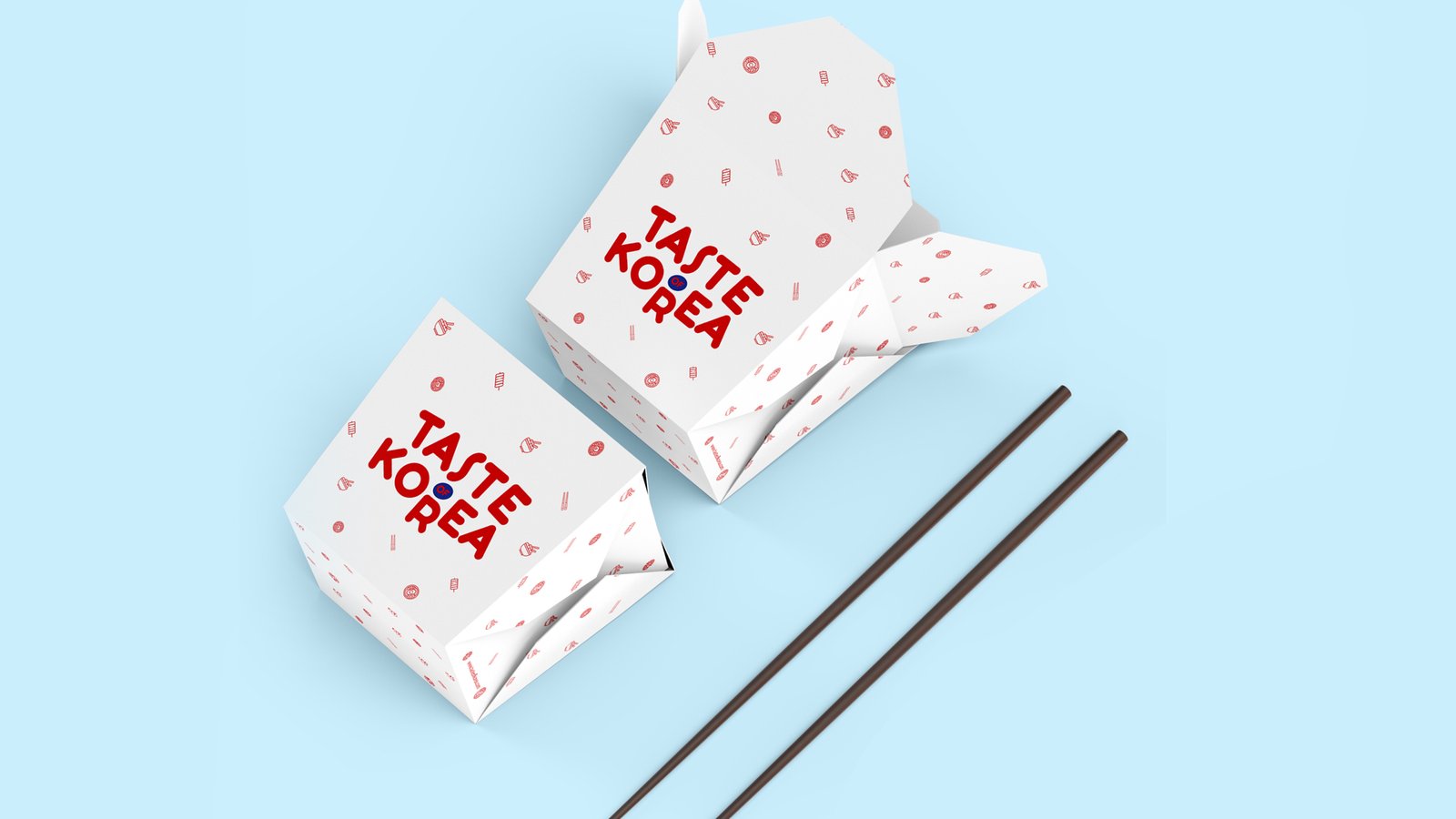
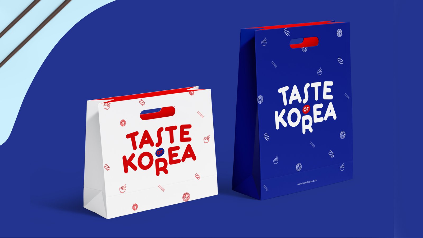
I overhauled the “Taste of Korea” brand by establishing a vibrant visual identity anchored in a rich cobalt blue, deep red, and crisp white palette that reflects traditional Korean cultural tones. By introducing a playful, custom hand-drawn wordmark alongside clean typography and stylized food motifs—as highlighted on the packaging in 5-Horizontal-Image.jpg—I transformed the brand into an approachable, premium culinary experience.
I overhauled the “Taste of Korea” brand by establishing a vibrant visual identity anchored in a rich cobalt blue, deep red, and crisp white palette that reflects traditional Korean cultural tones. By introducing a playful, custom hand-drawn wordmark alongside clean typography and stylized food motifs—as highlighted on the packaging in 5-Horizontal-Image.jpg—I transformed the brand into an approachable, premium culinary experience.
ART DIRECTION
& creative leadership
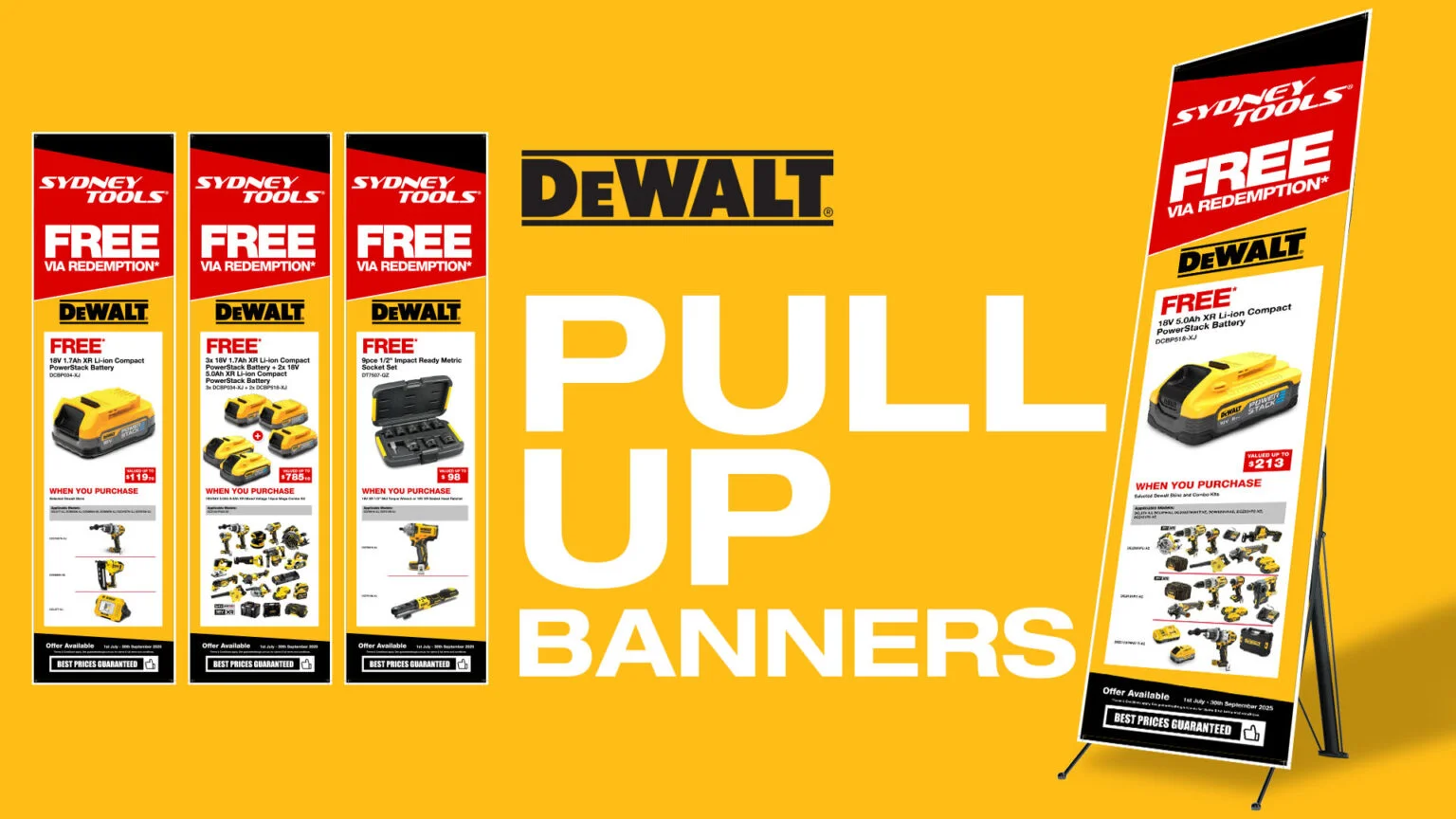
'Sydney Tools' Creatives
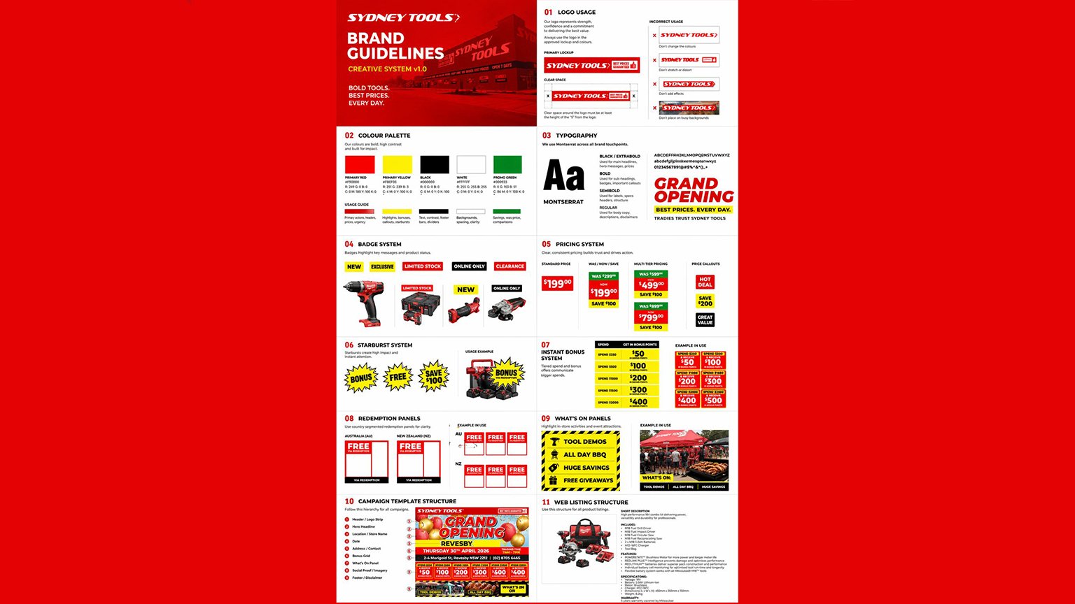

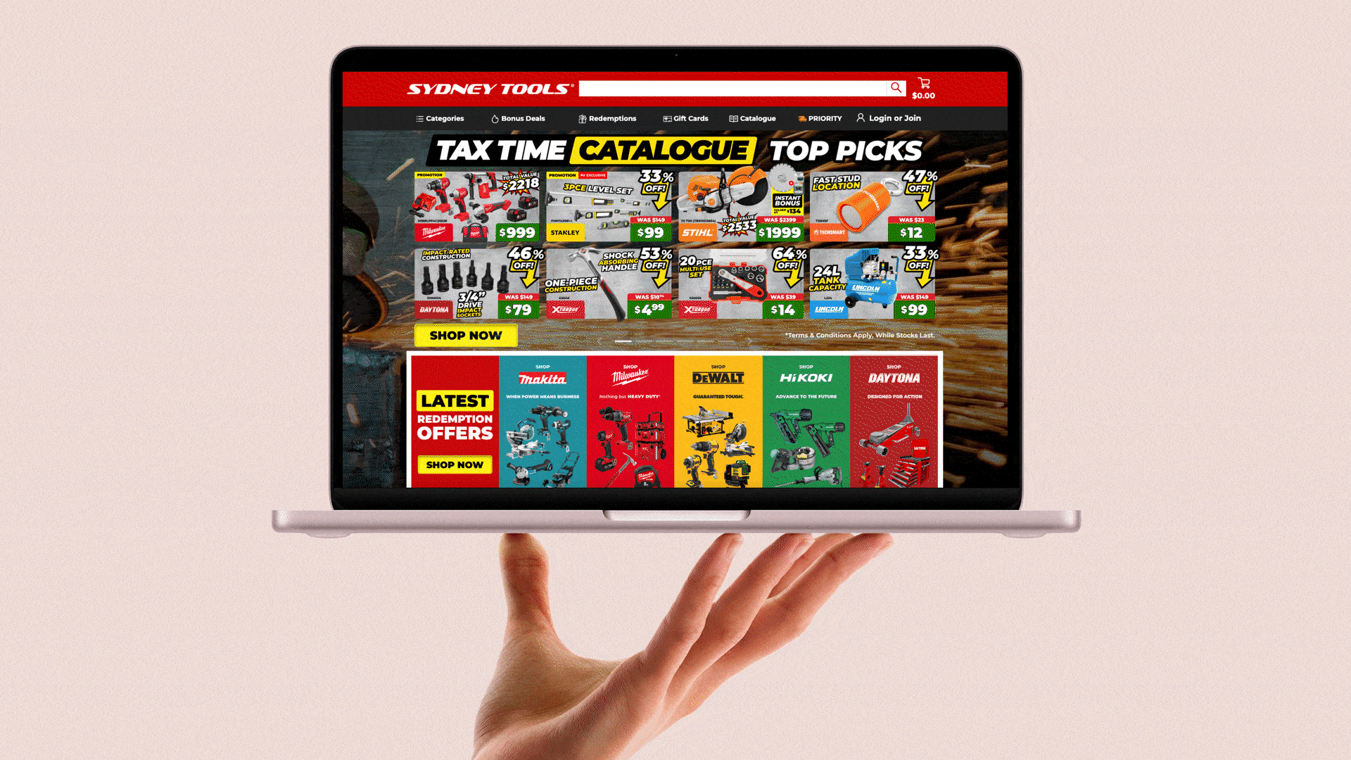
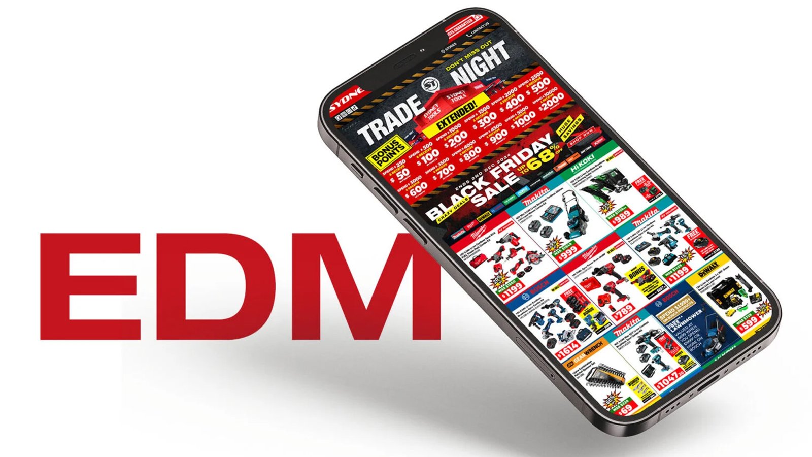
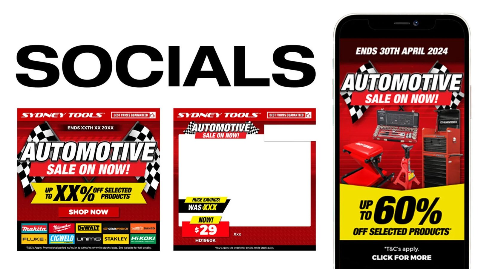
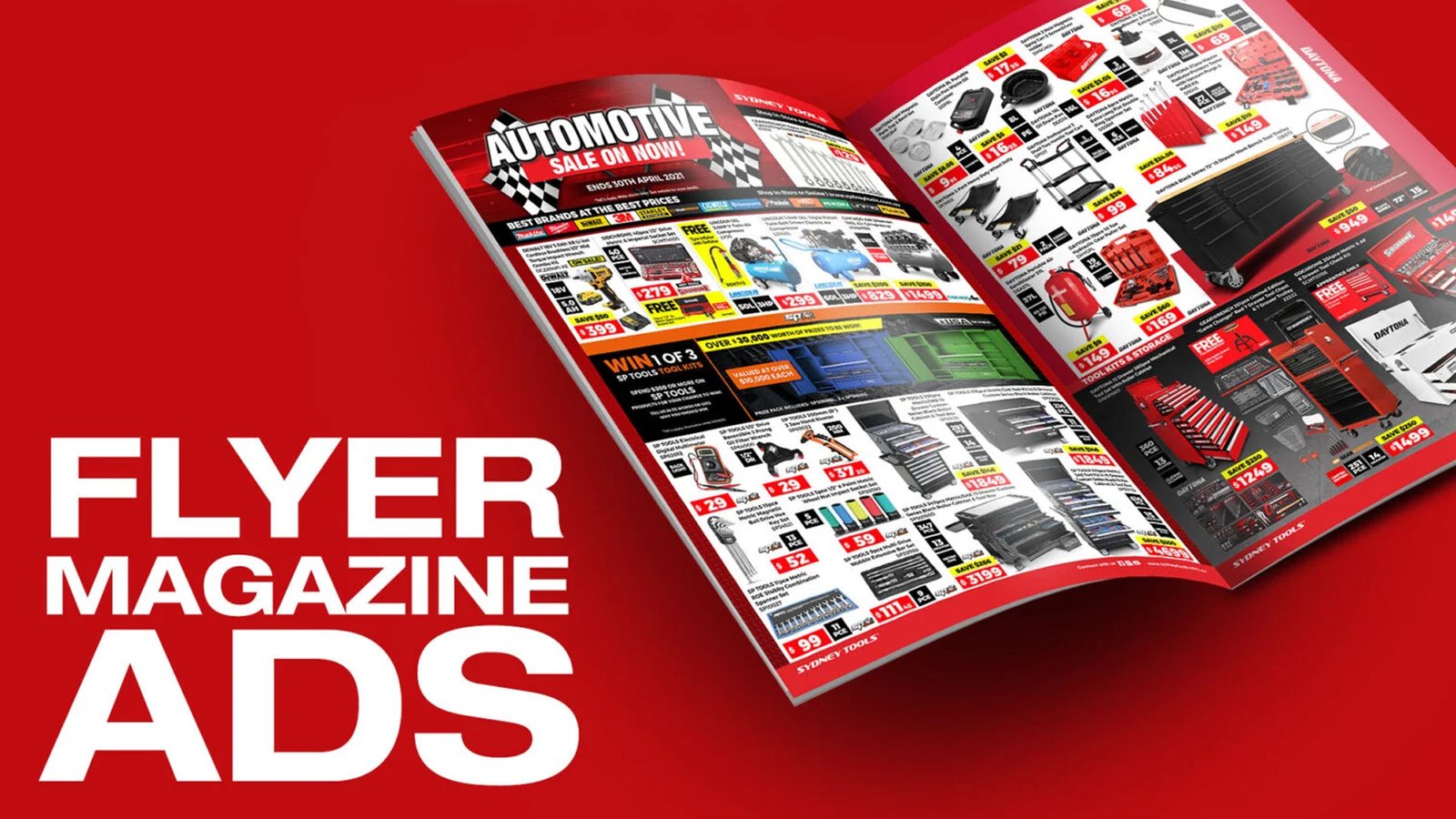
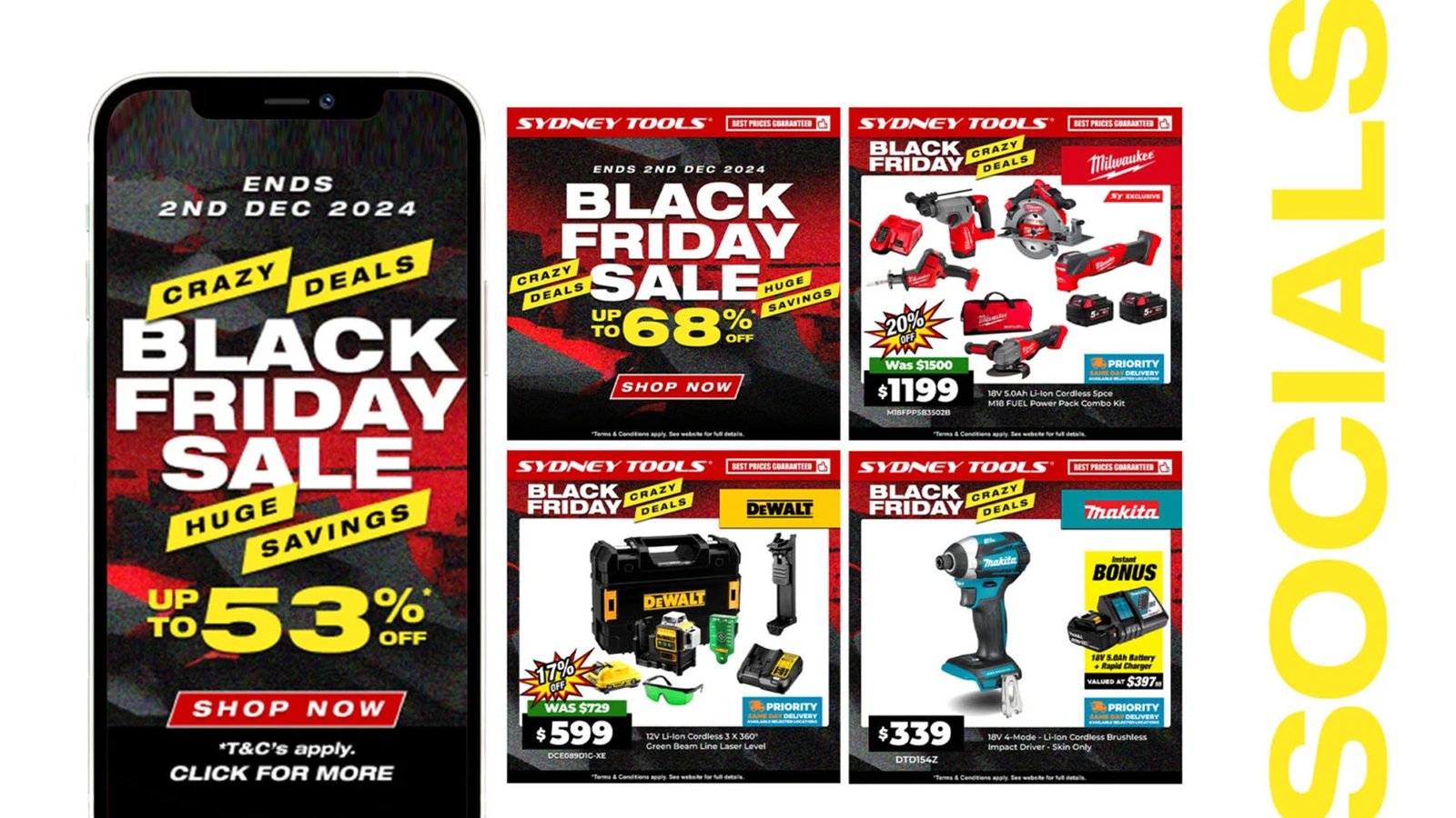


Led the strategic overhaul of ‘Sydney Tools’ visual identity, introducing a vibrant, modern aesthetic to maximize market presence. Directed all creative execution to successfully reposition the brand against premium competitors like Bunnings and Total Tools.
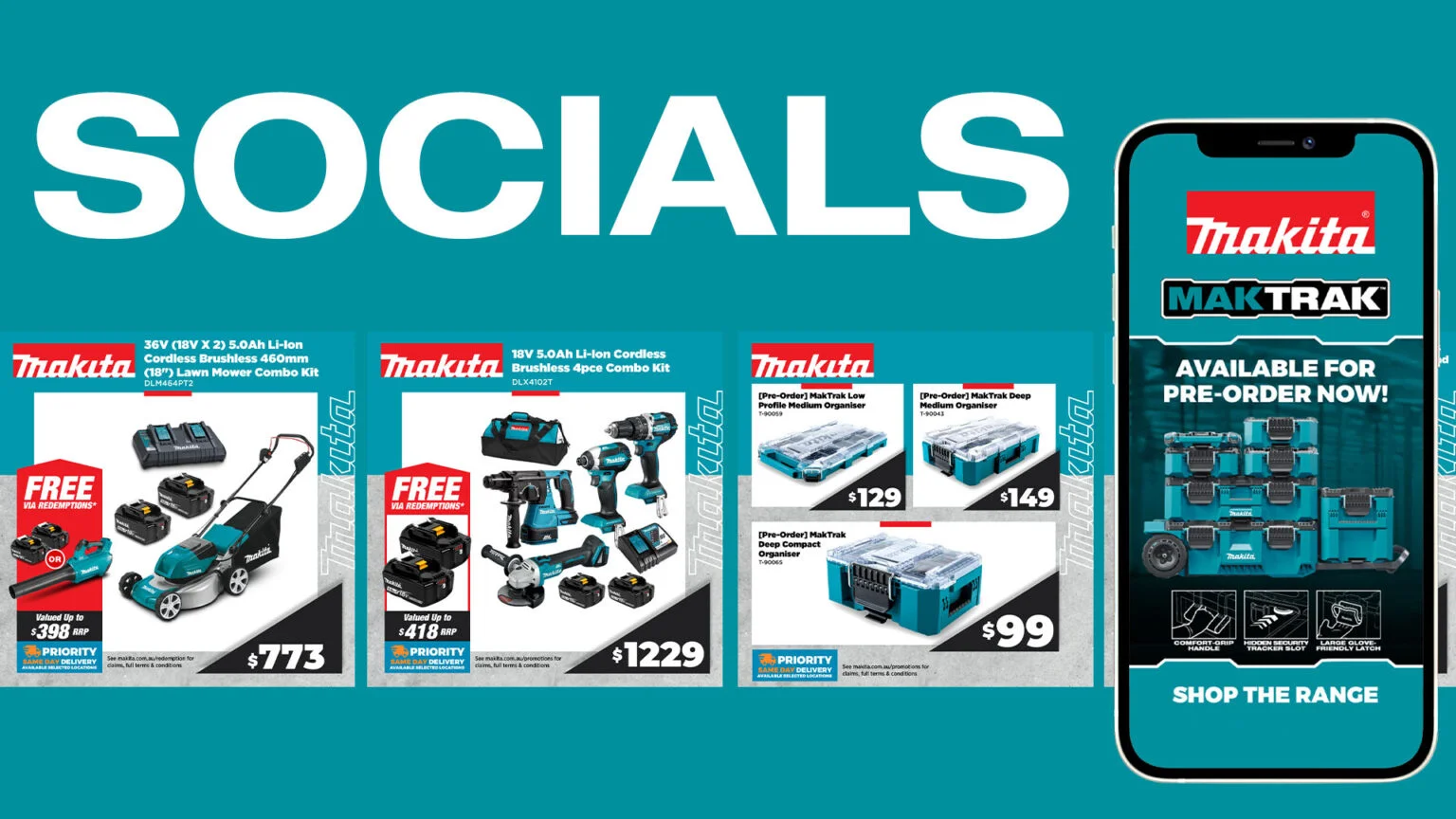
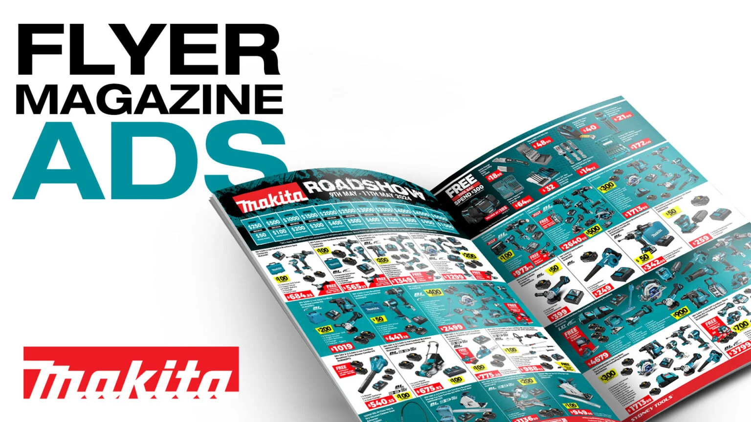
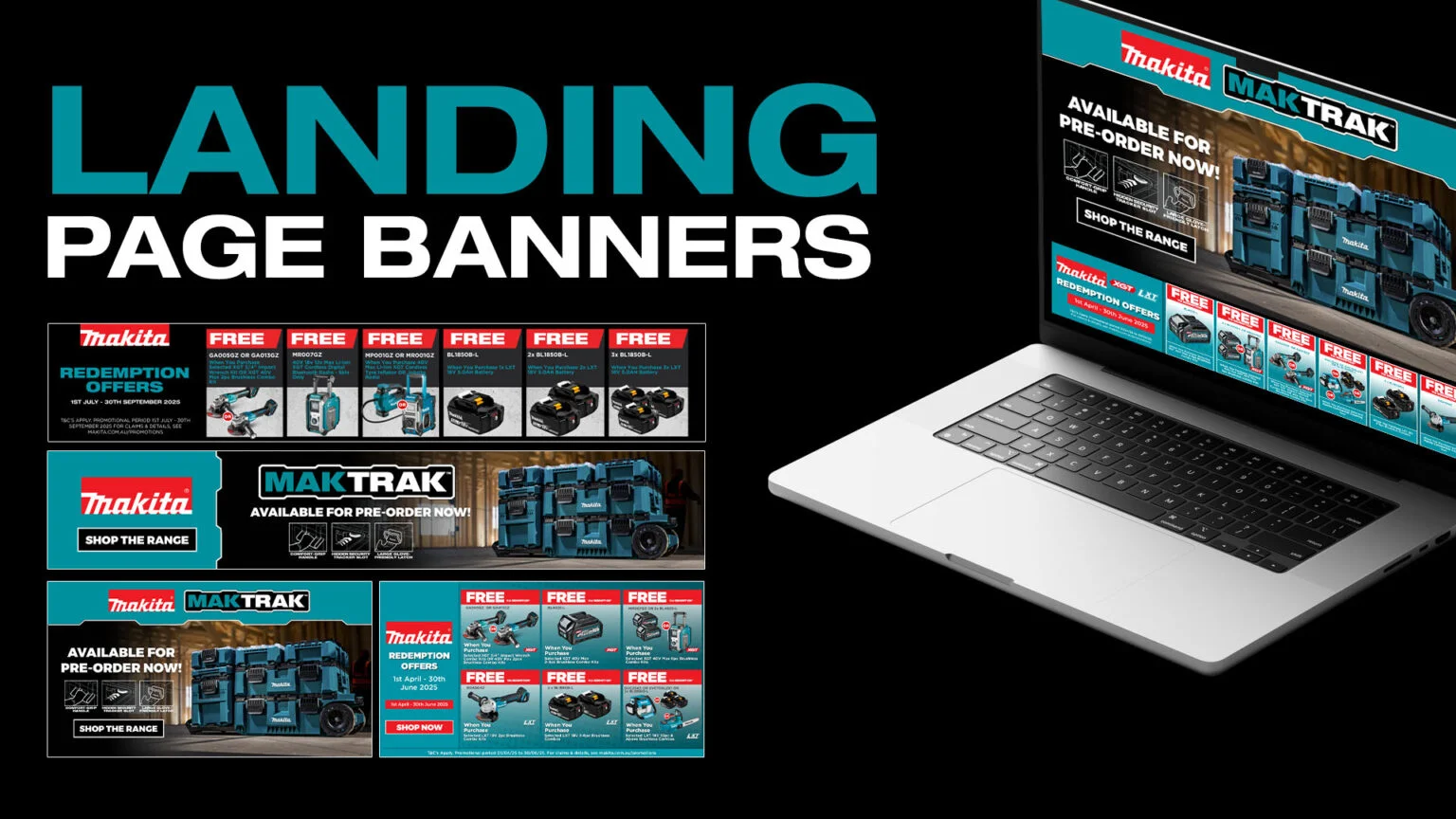
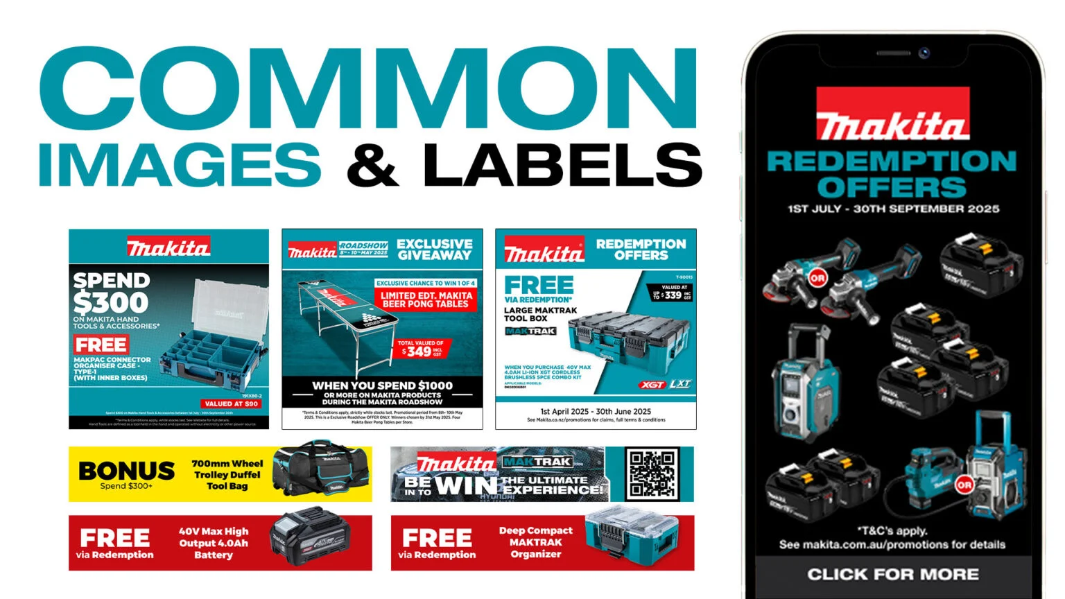
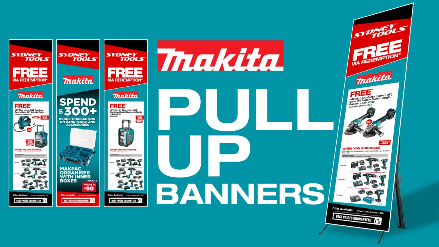
Makita
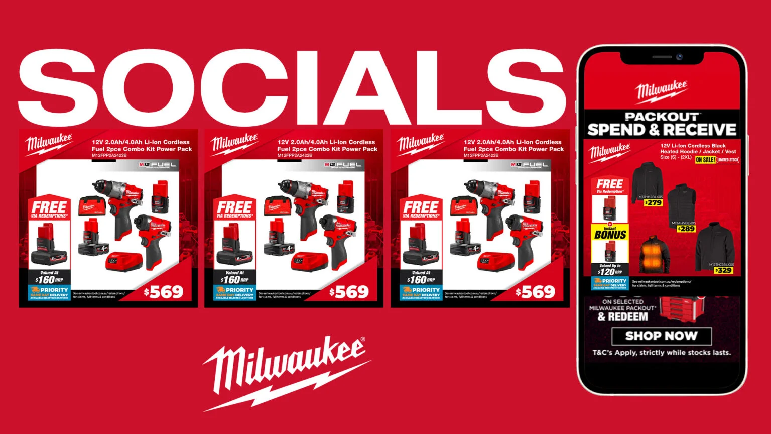
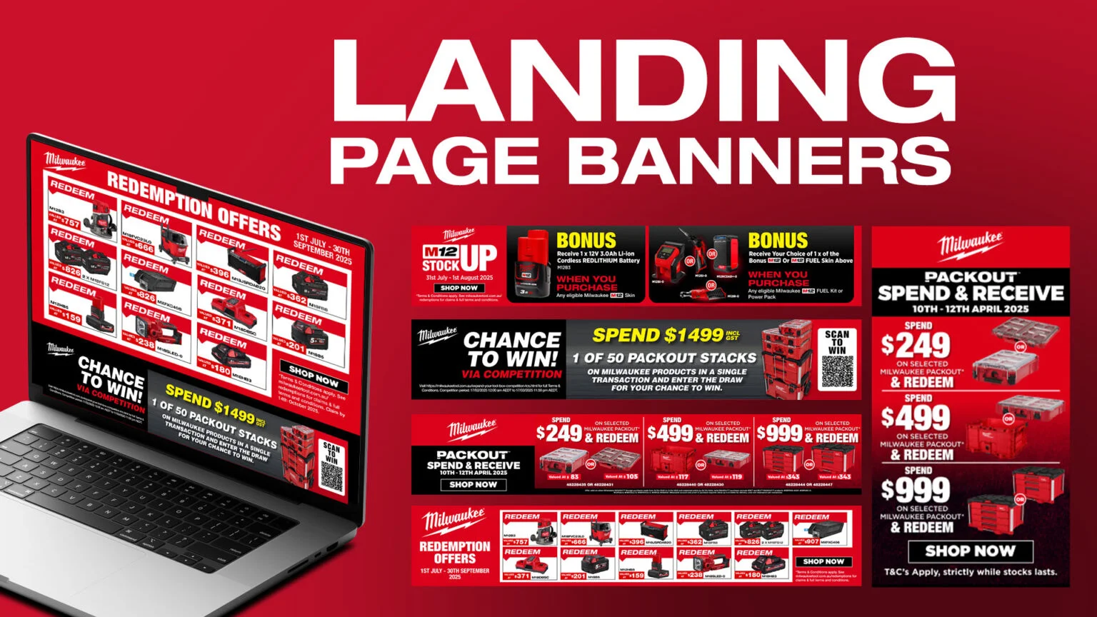
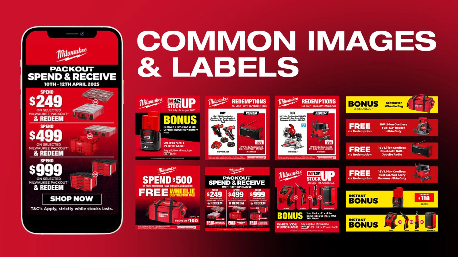
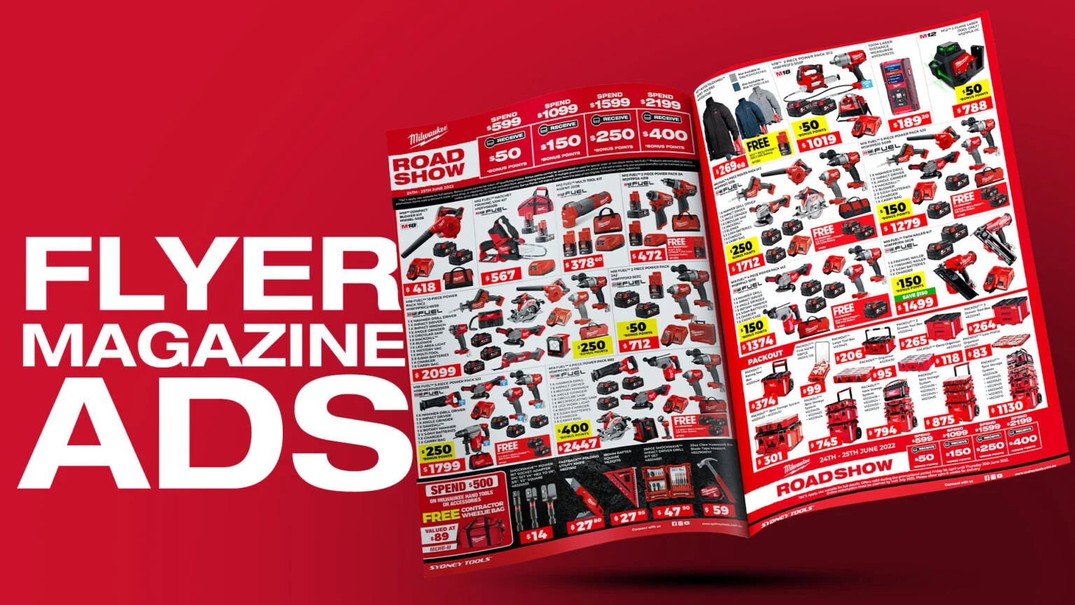
Milwaukee
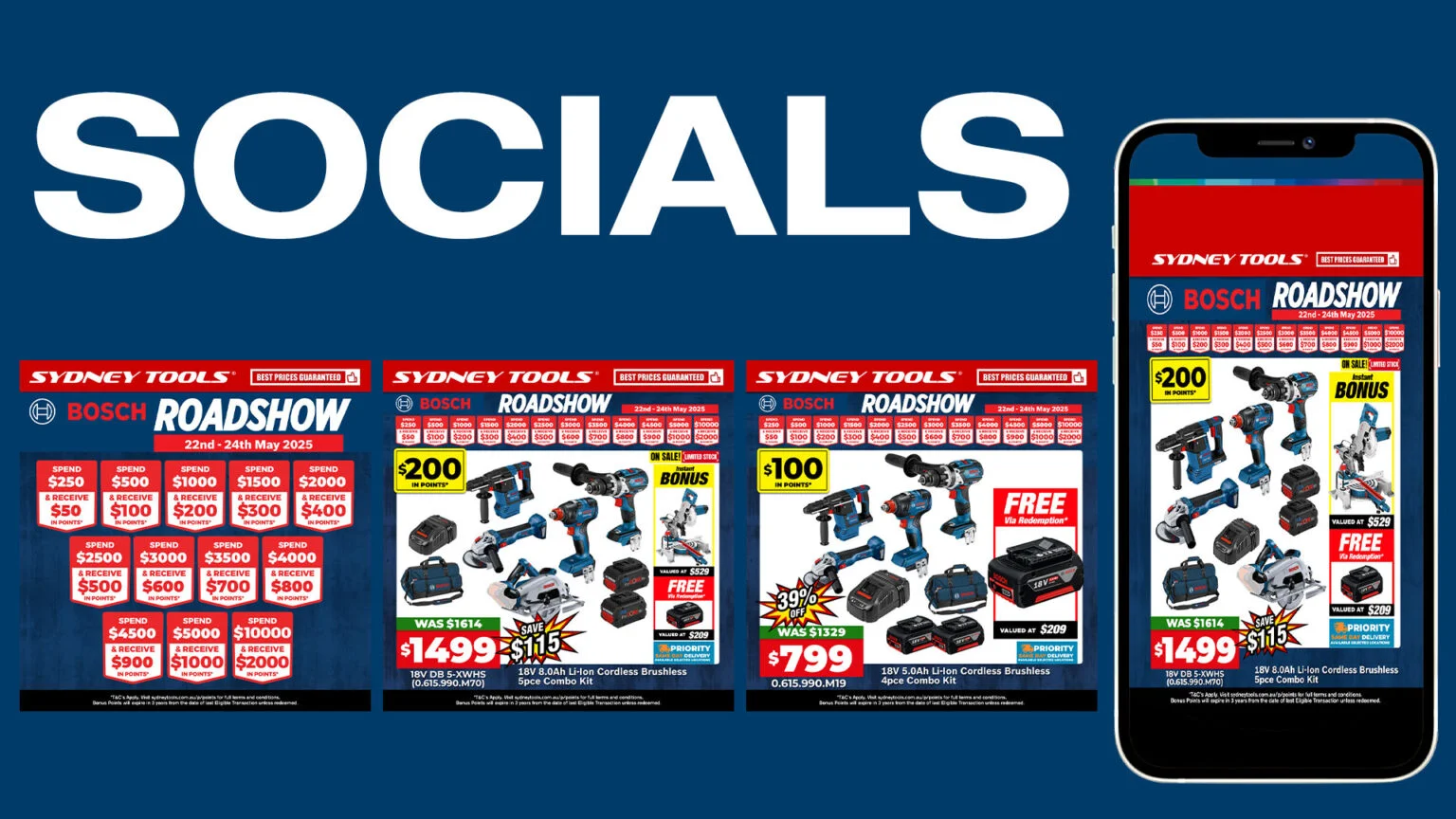
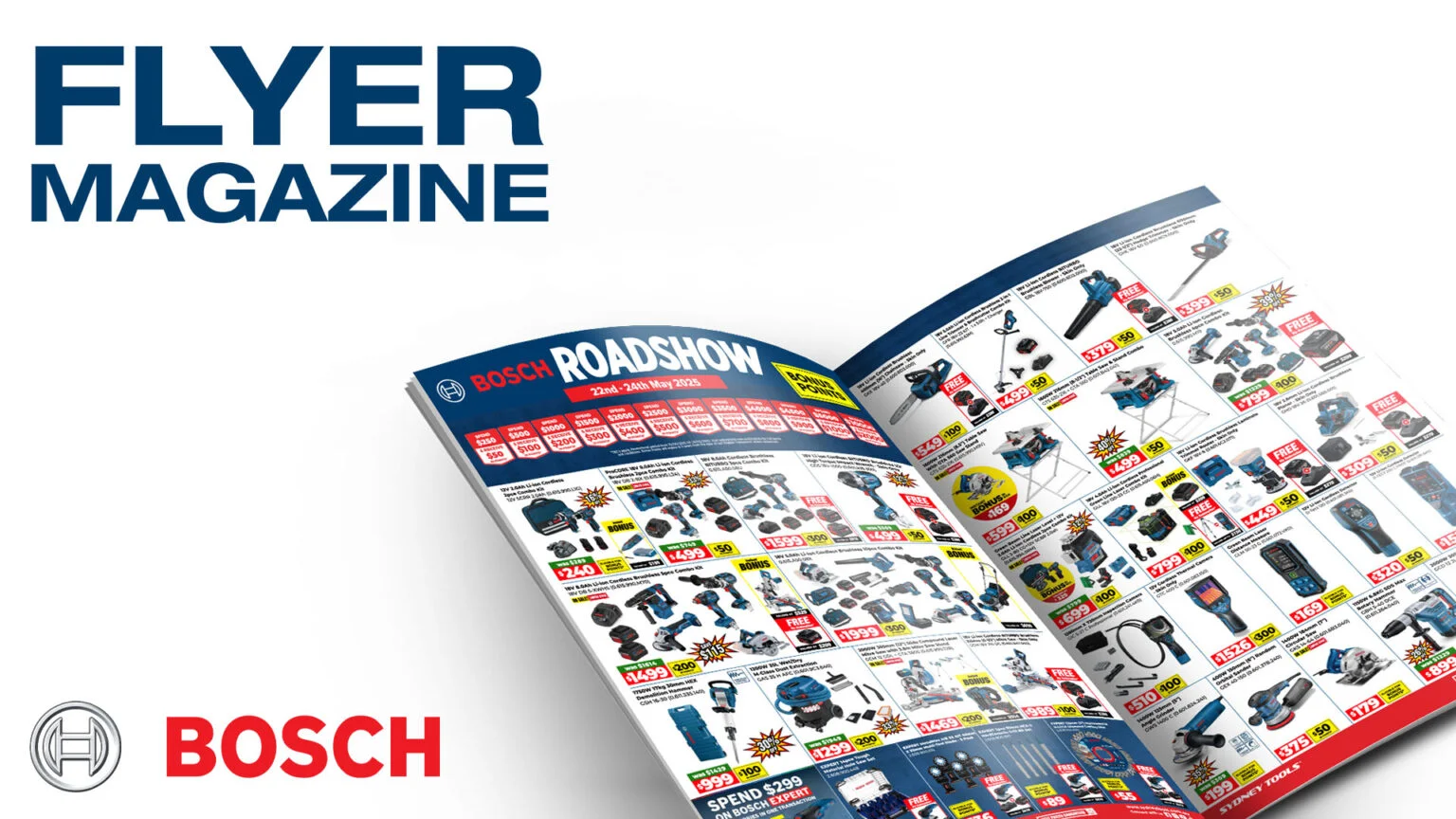

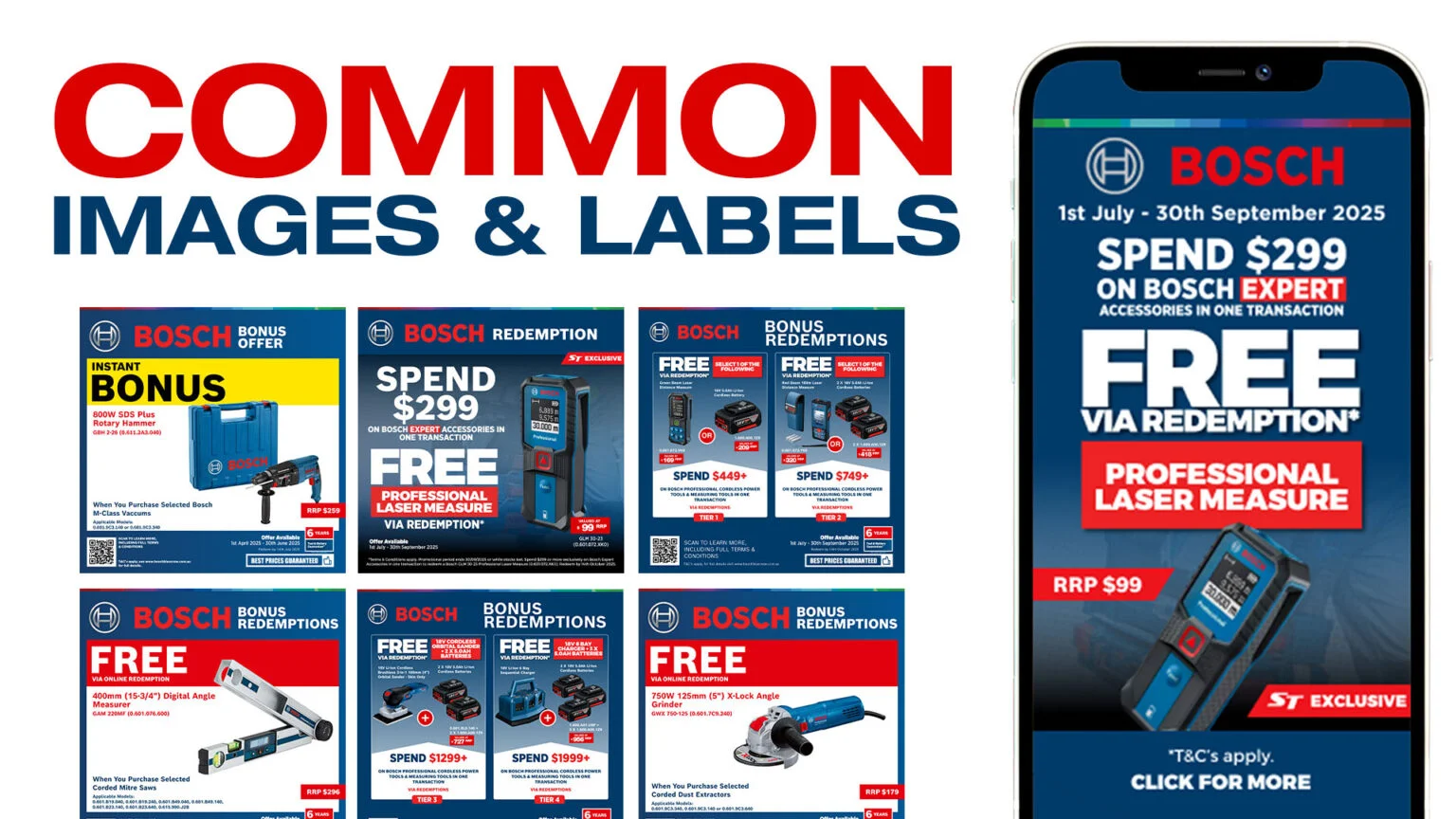
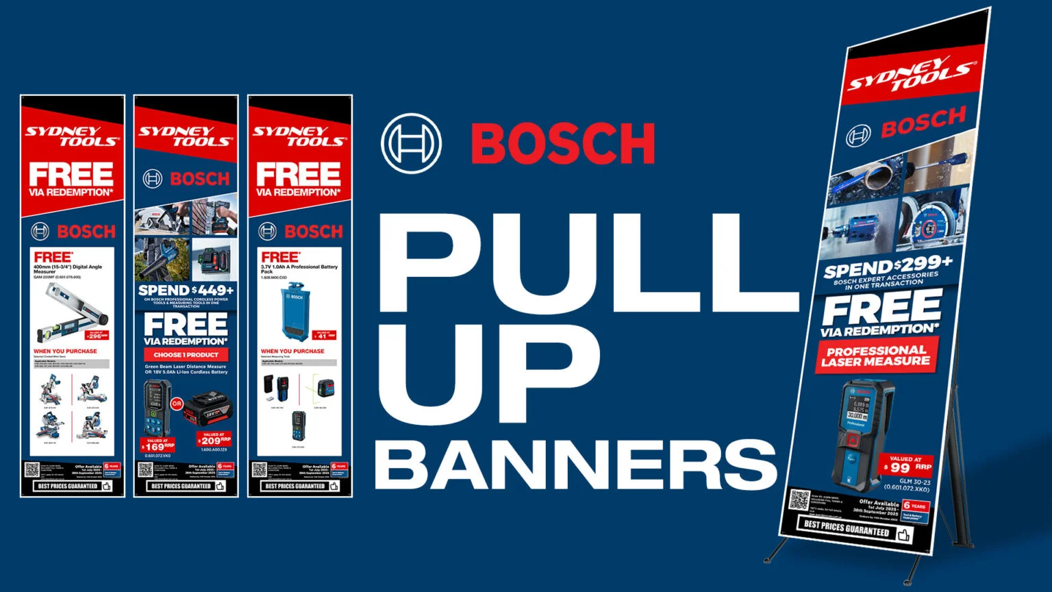
Bosch
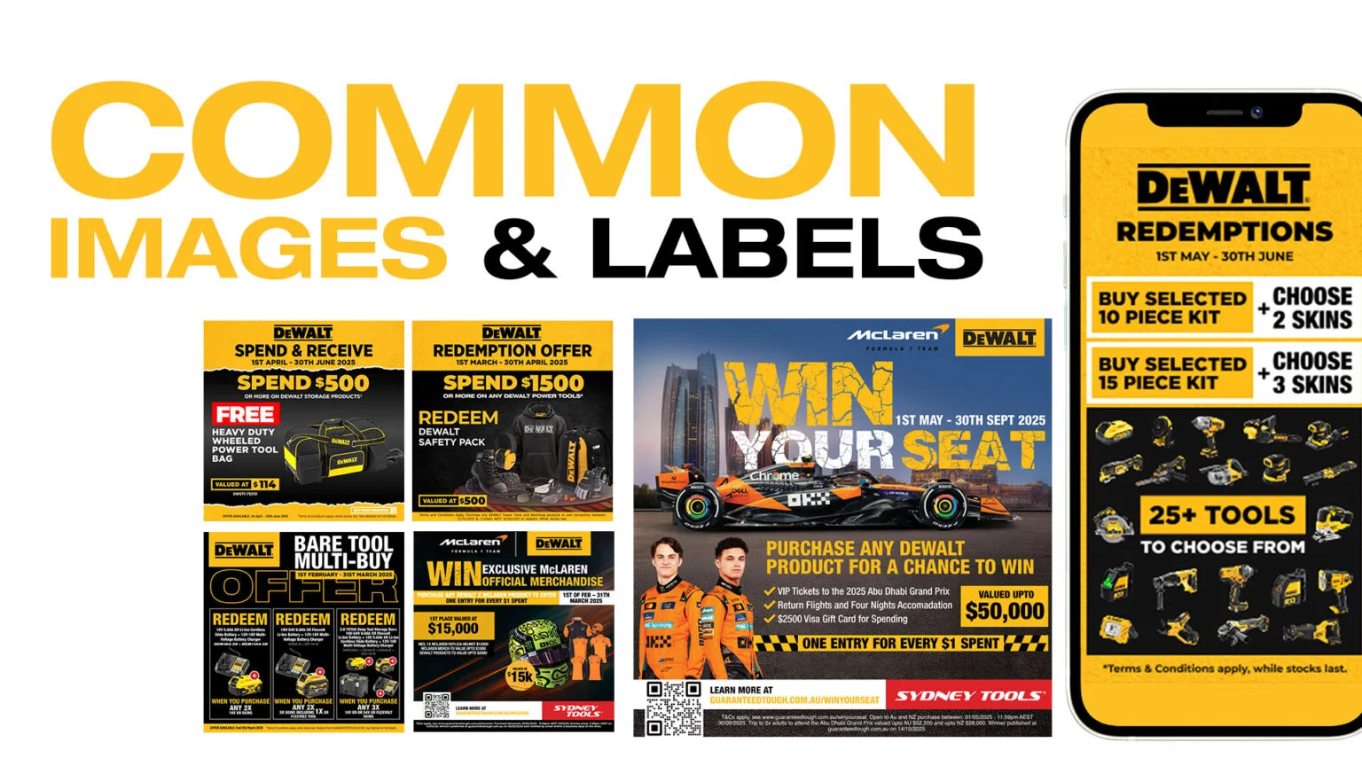
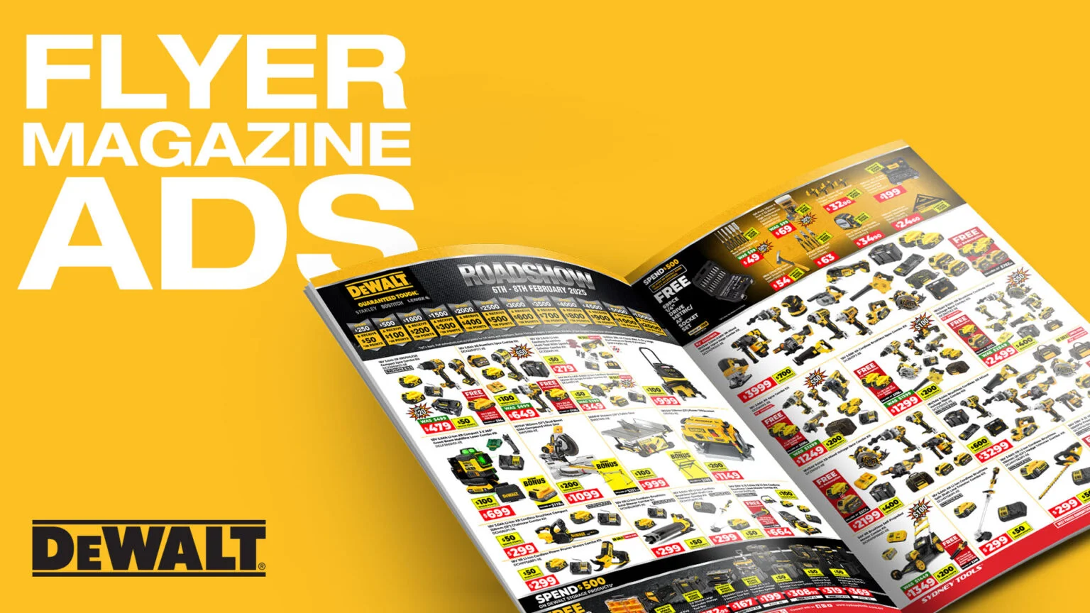

Dewalt
'PopSlice' Visuals
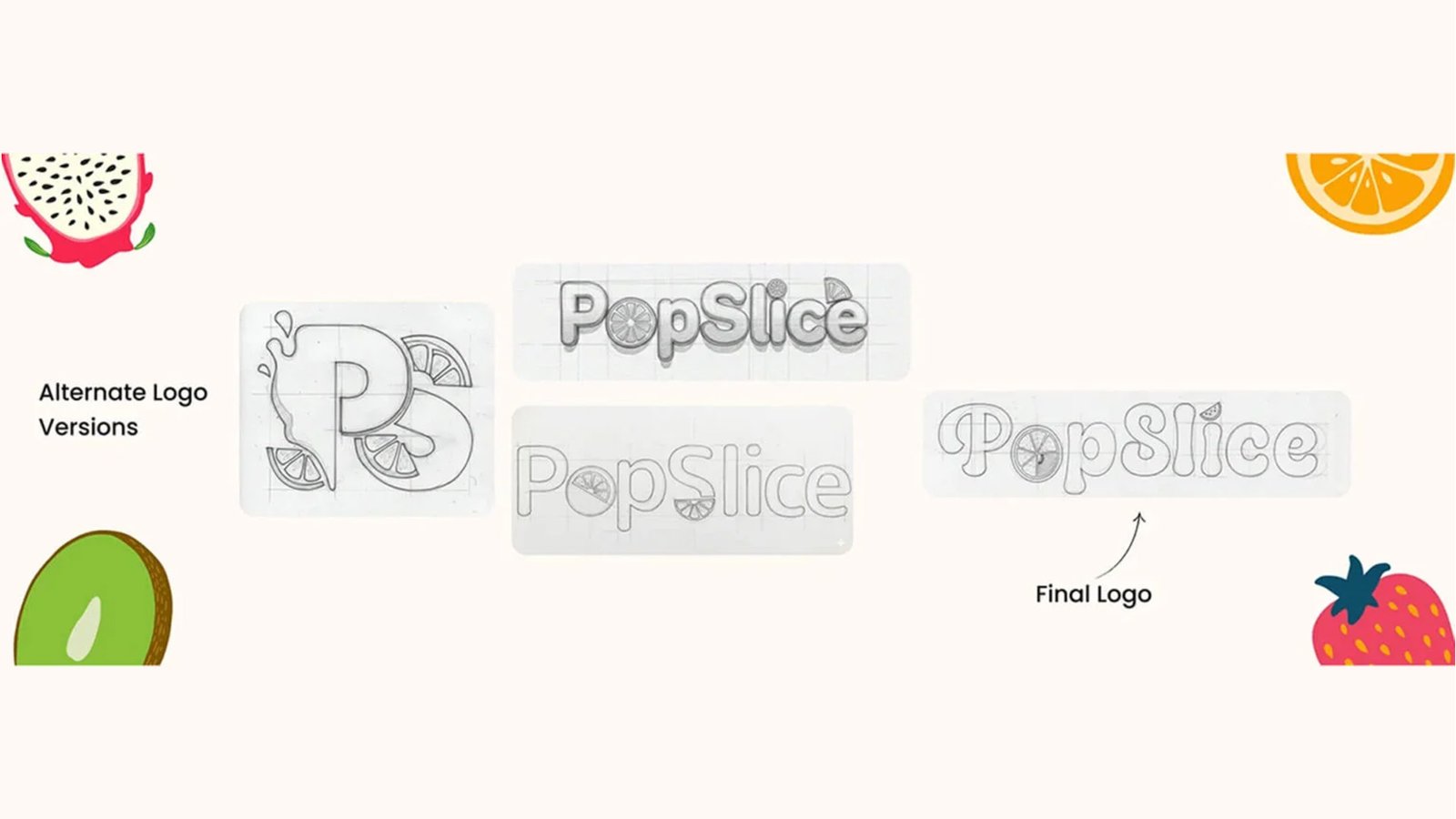
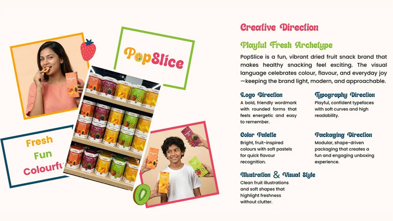
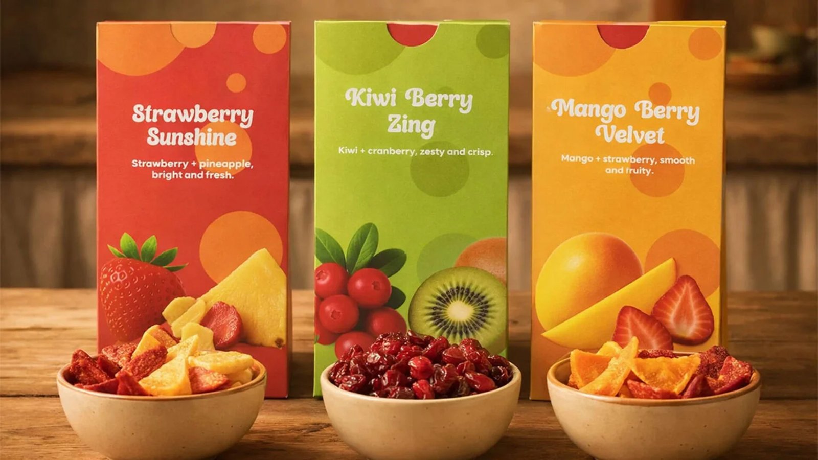
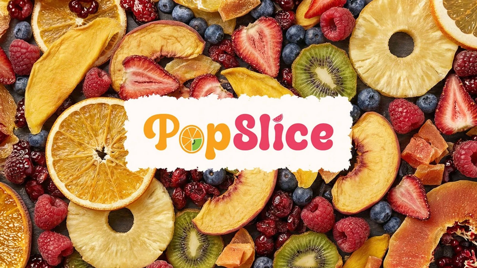
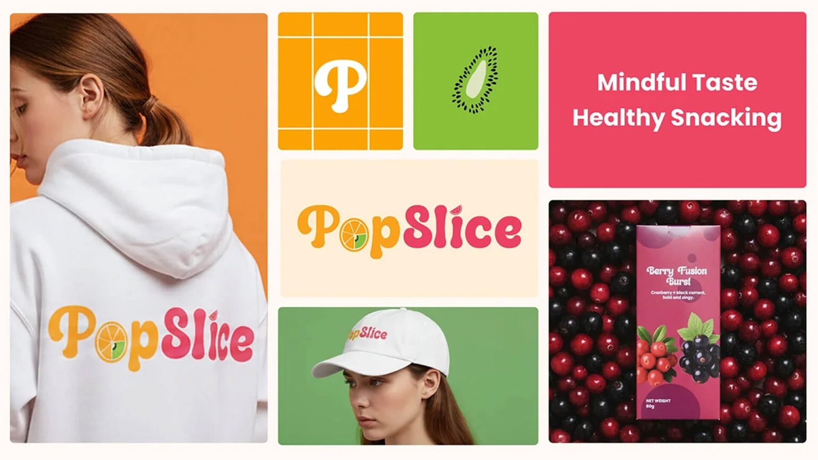
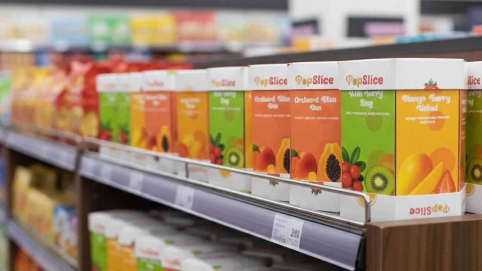
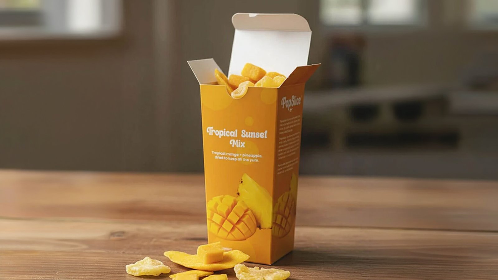
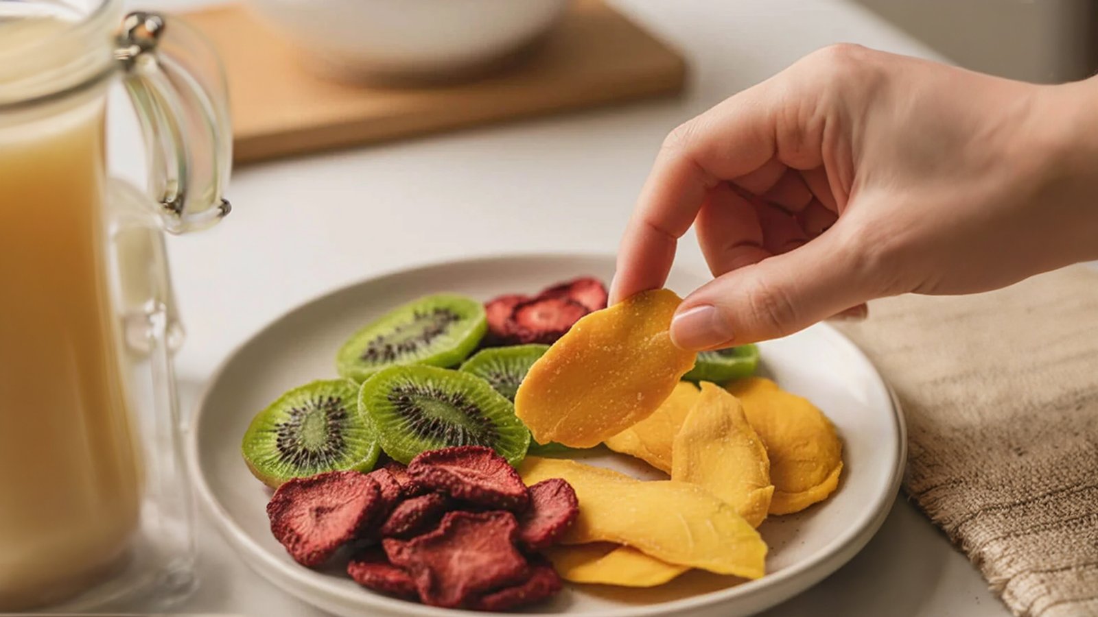
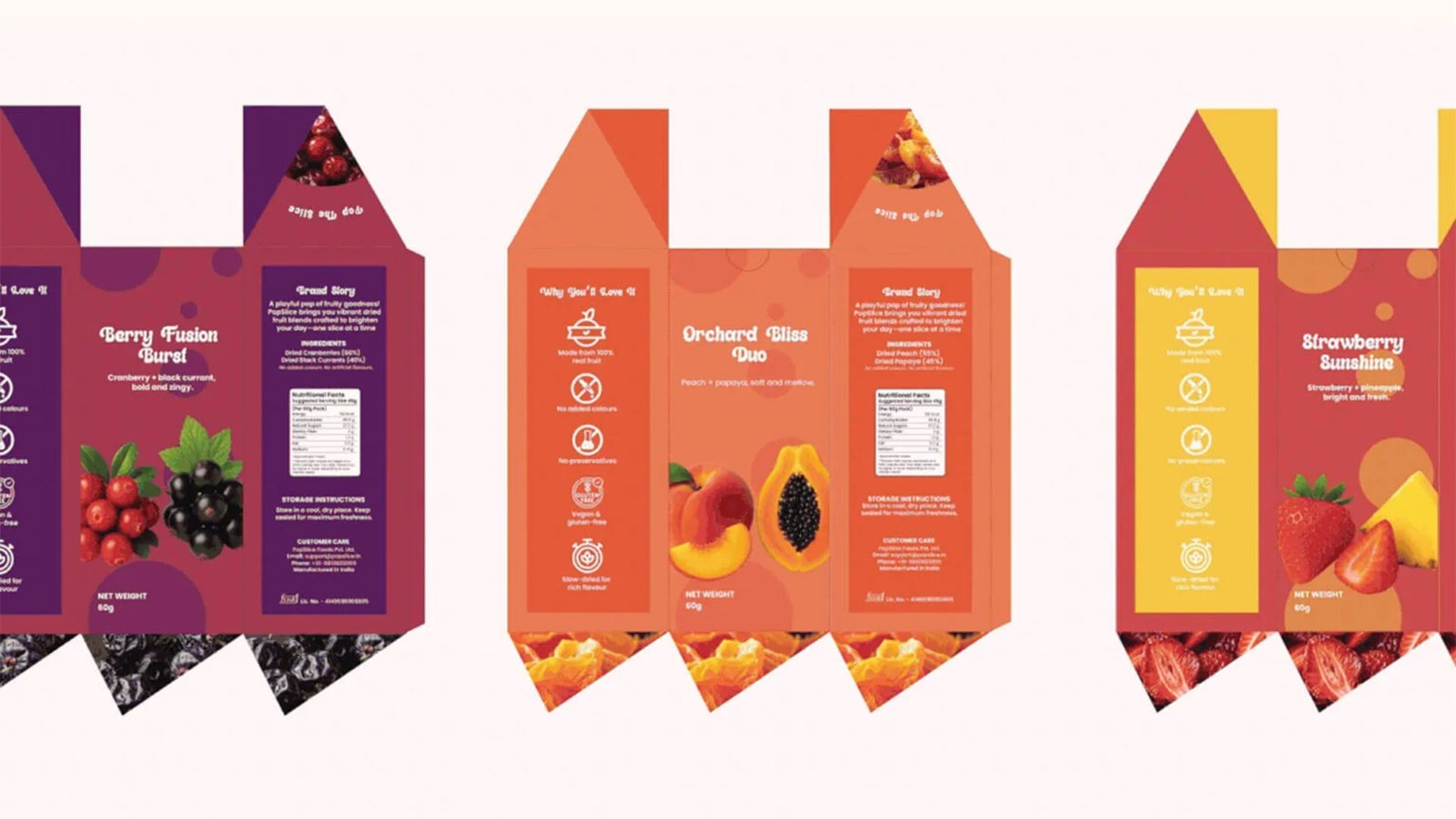
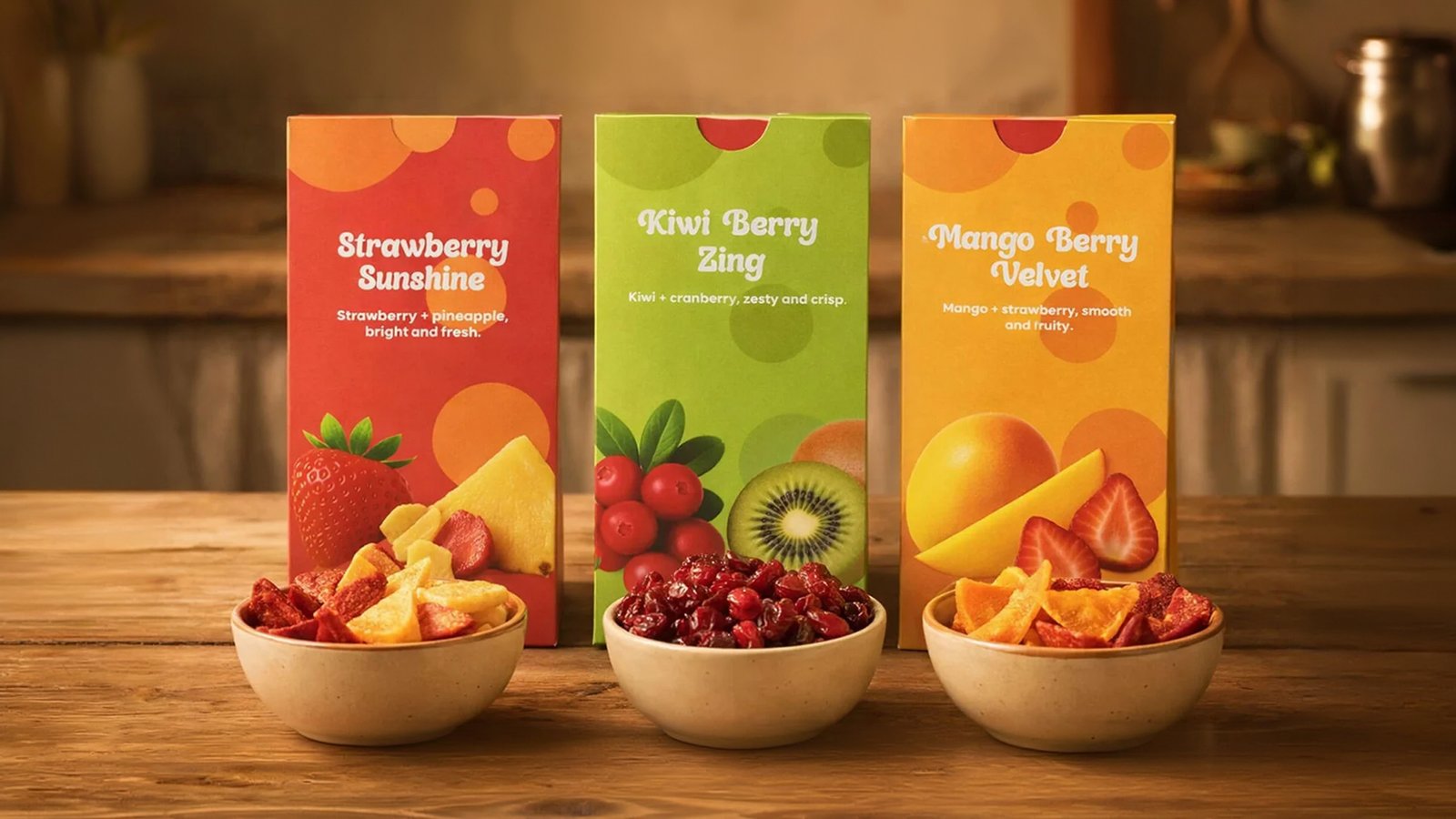

Under my art direction, the PopSlice visual identity was built on strategic color blocking and custom, retro-bubbly typography to command a vibrant, modern shelf presence. I led the creative execution to seamlessly marry organic vector motifs with rich, textured fruit photography, positioning the snack brand as a joyful, premium, and natural escape.
'Total Tools' Brand Launch
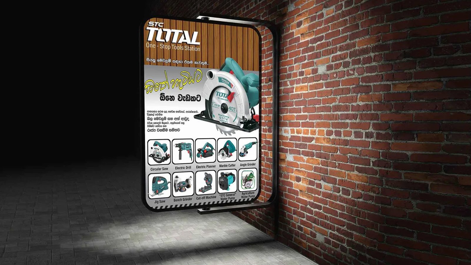
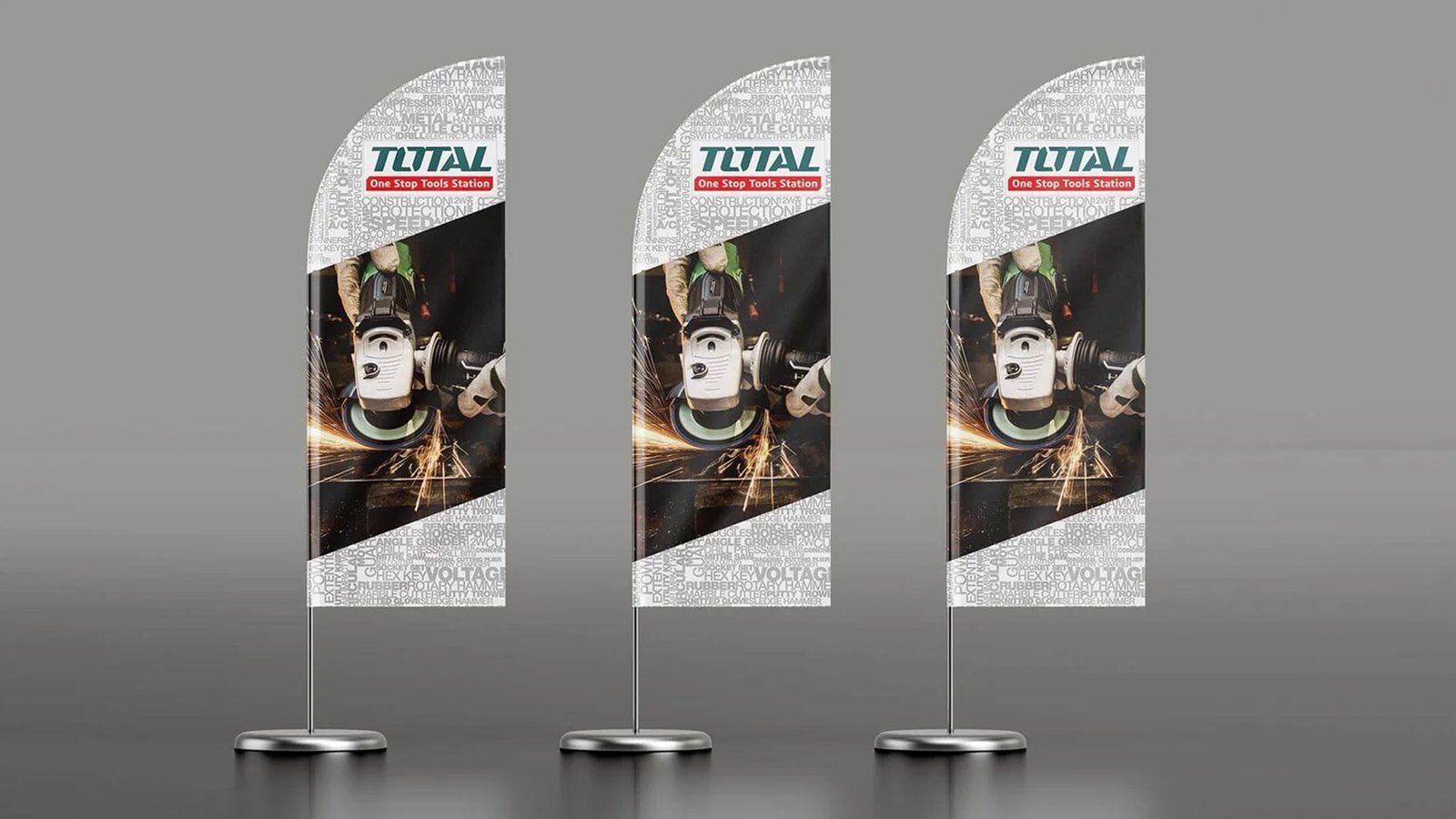
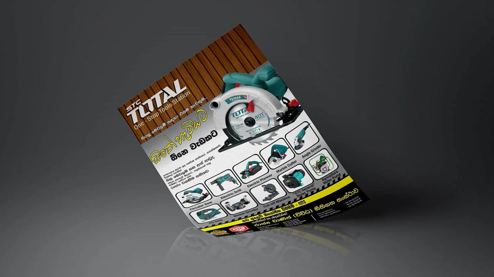

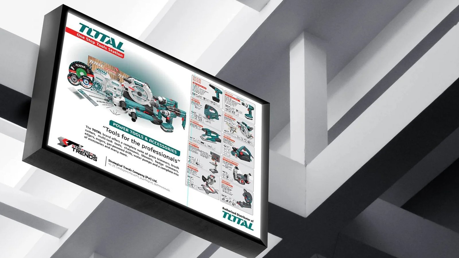
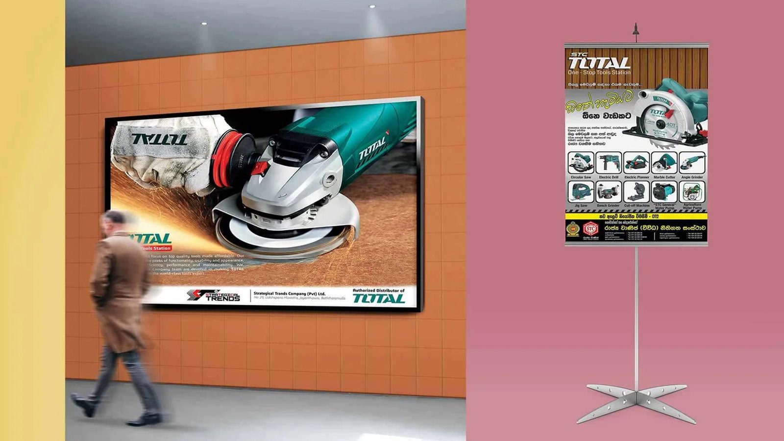
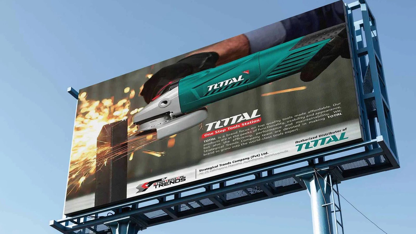
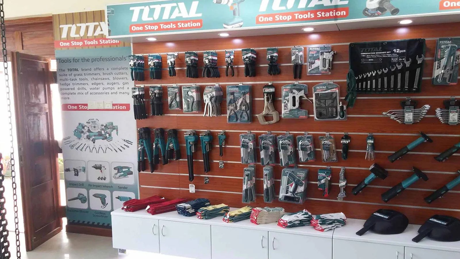
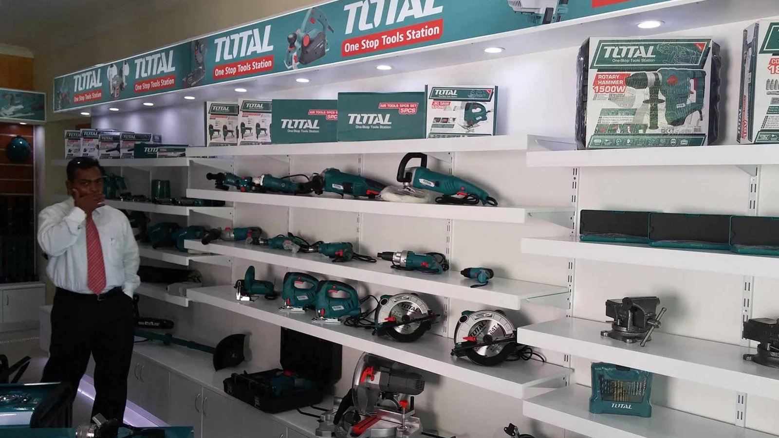
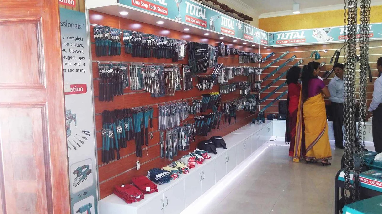

I overhauled the marketing collateral for the Total tools station by replacing generic hardware layouts with a dynamic, high-impact product feature and an organized icon grid. By balancing raw industrial power with clean, structured typography and a professional dark backdrop, I transformed the promotional material into an engaging, clear, and modern experience for trade professionals.
'Barbar' Brand Build
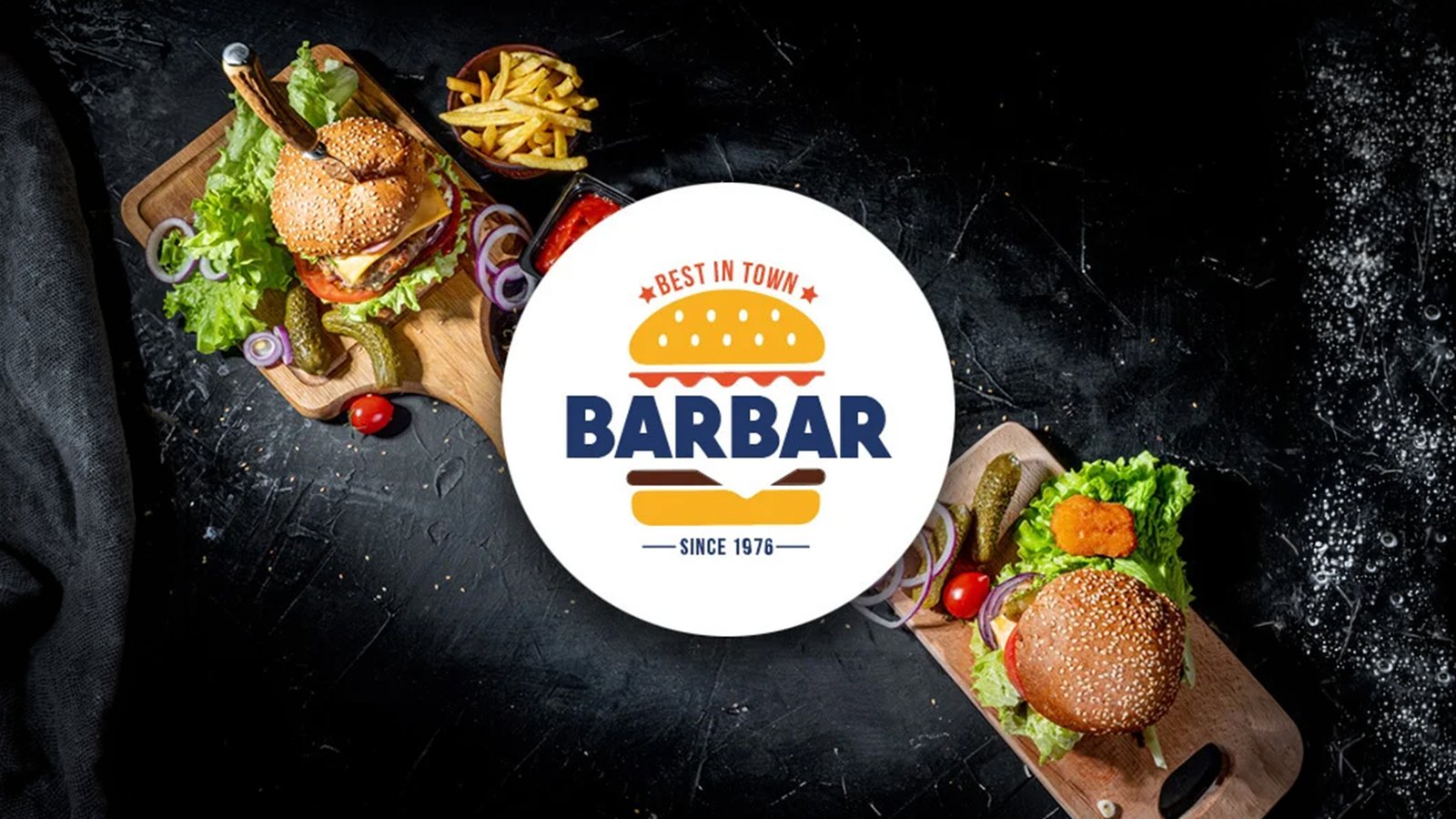
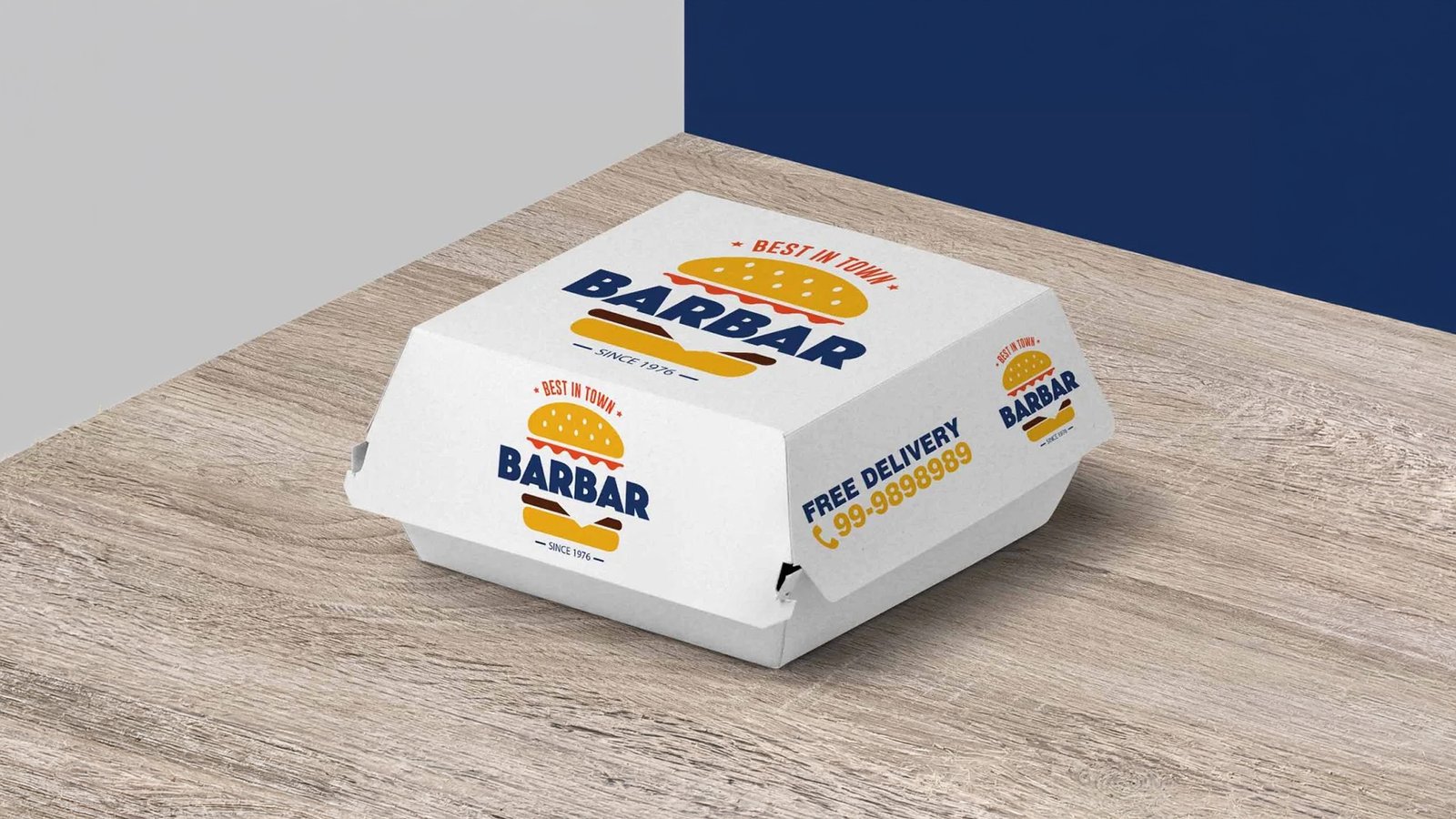
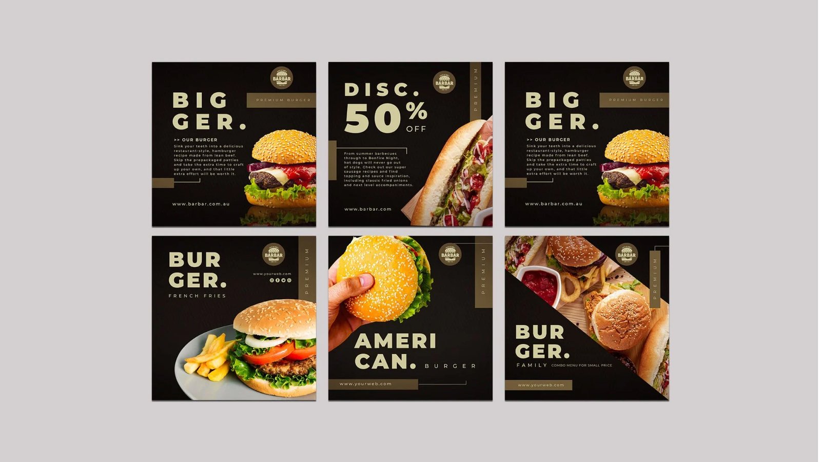
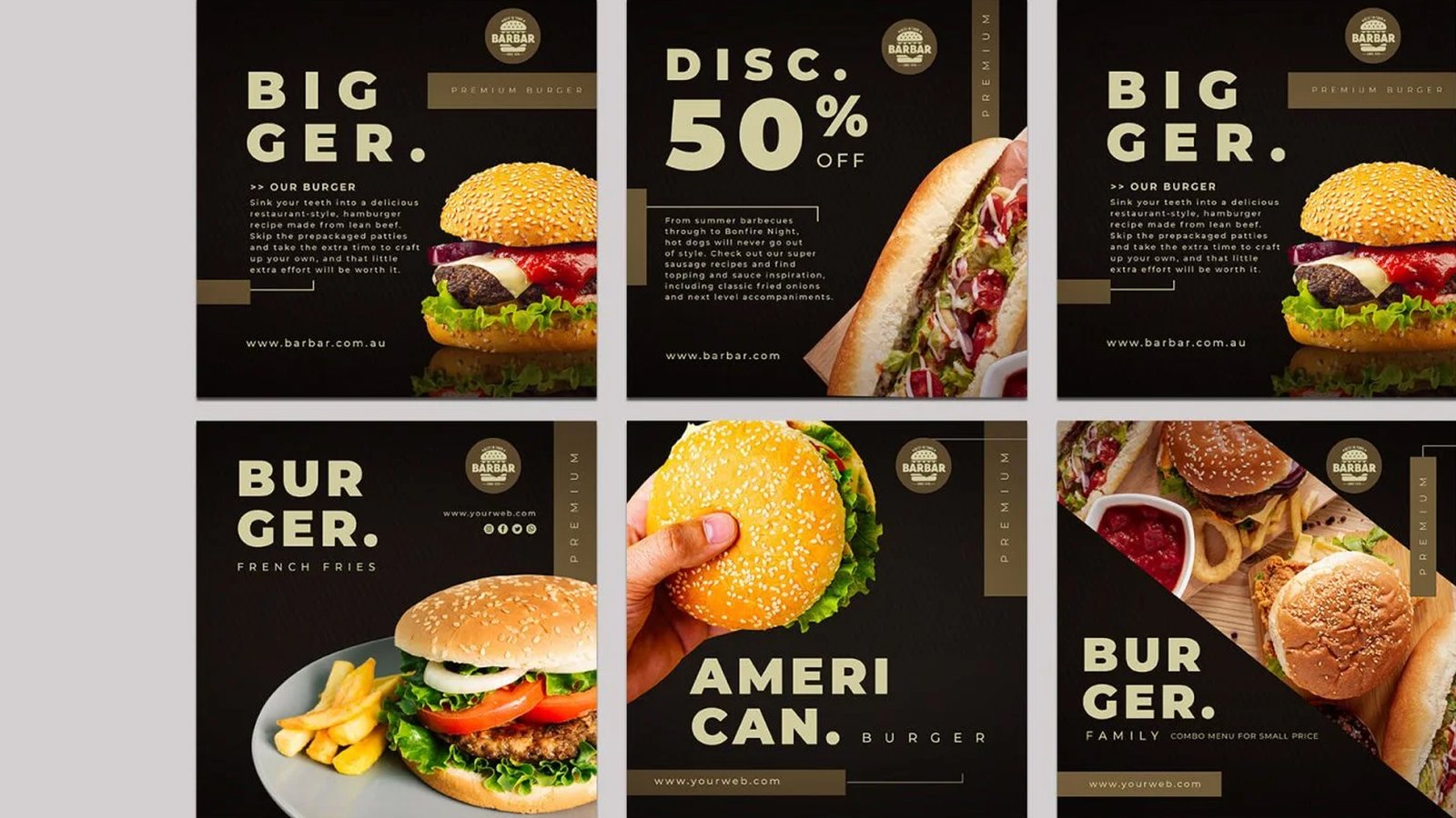
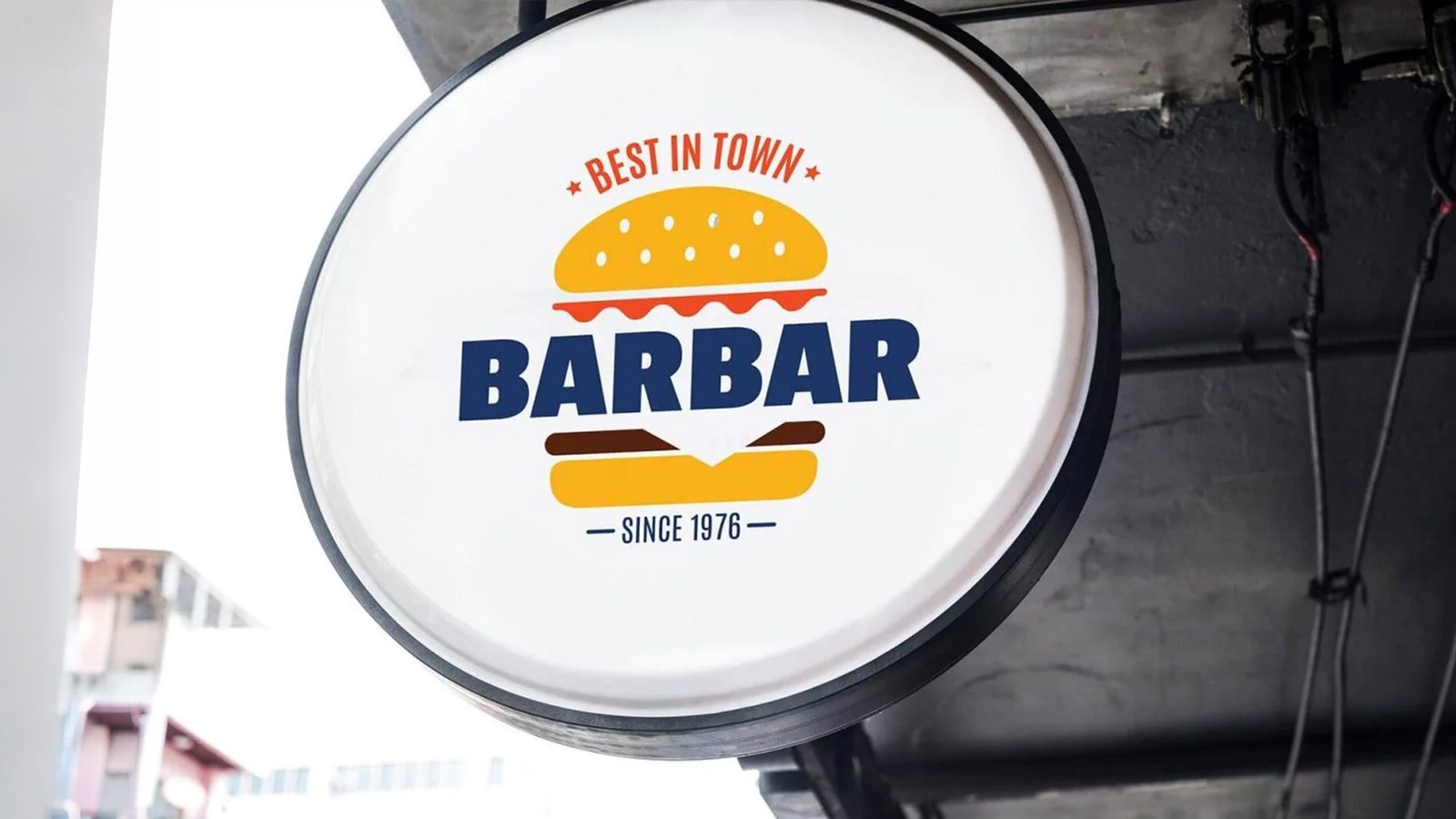
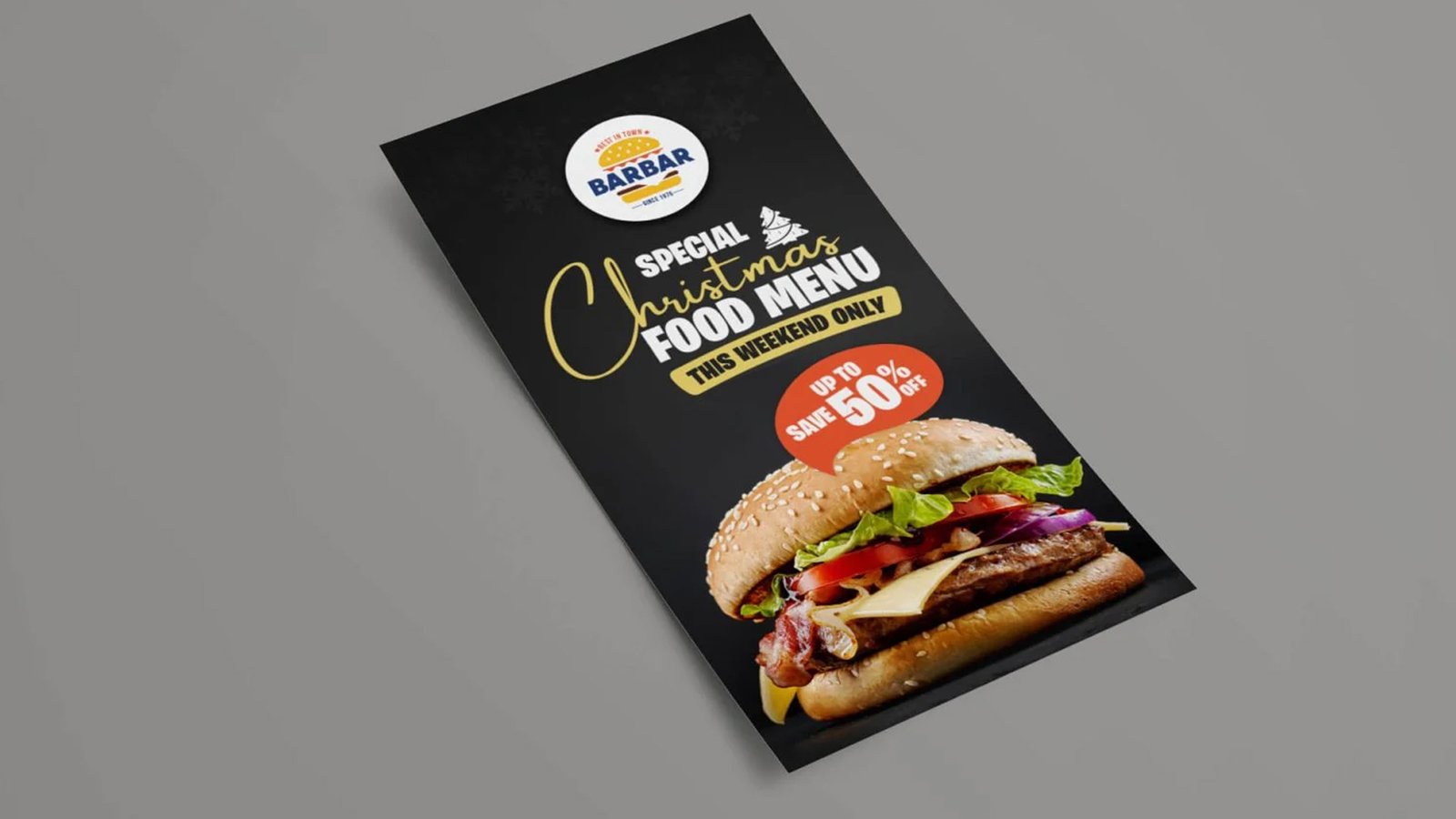
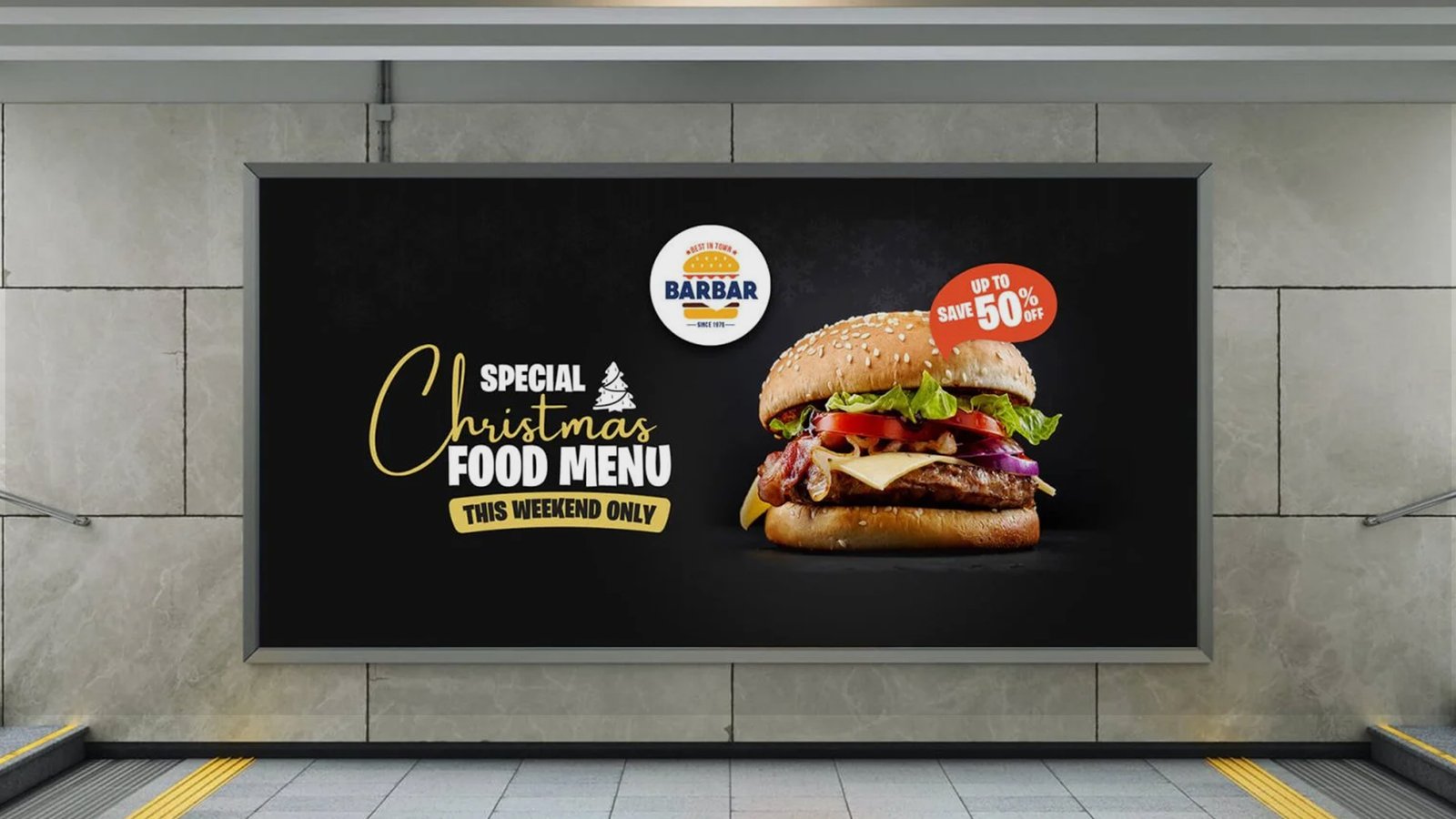
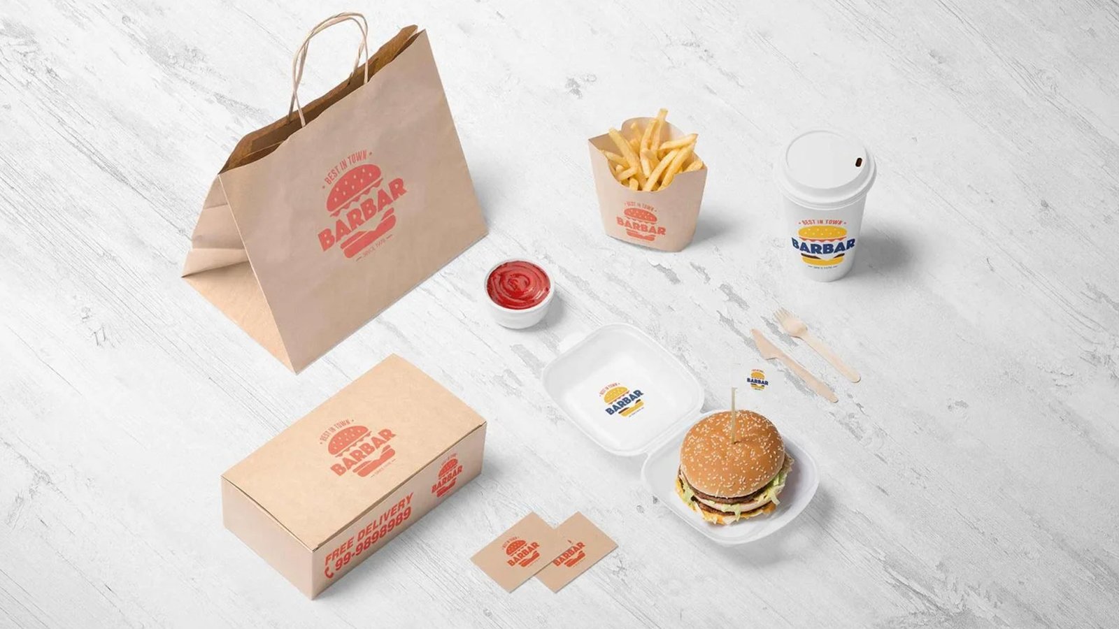
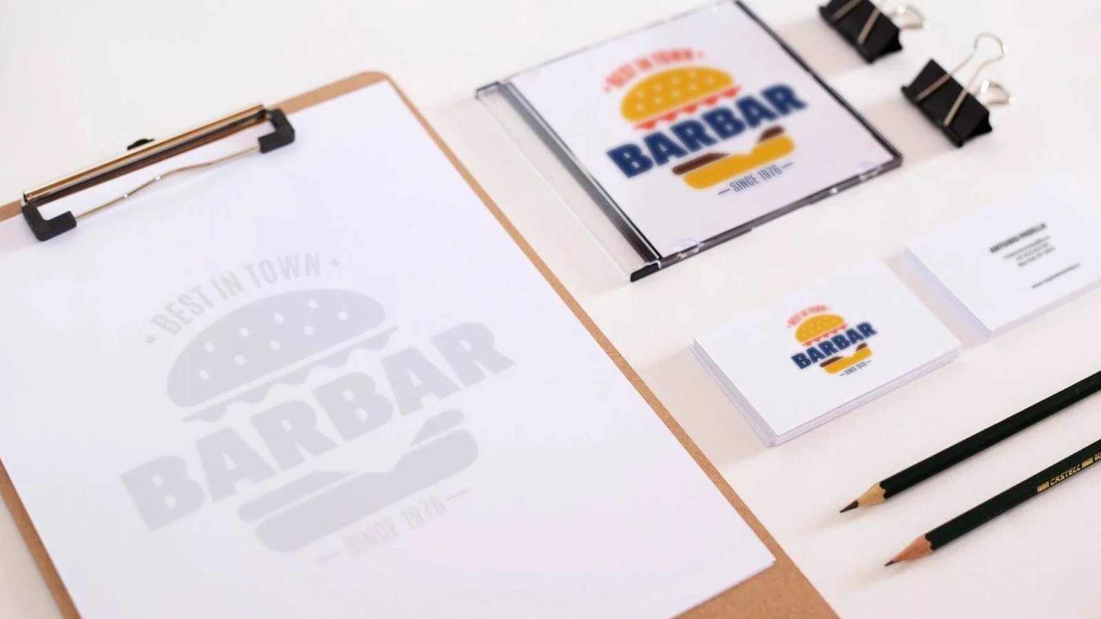
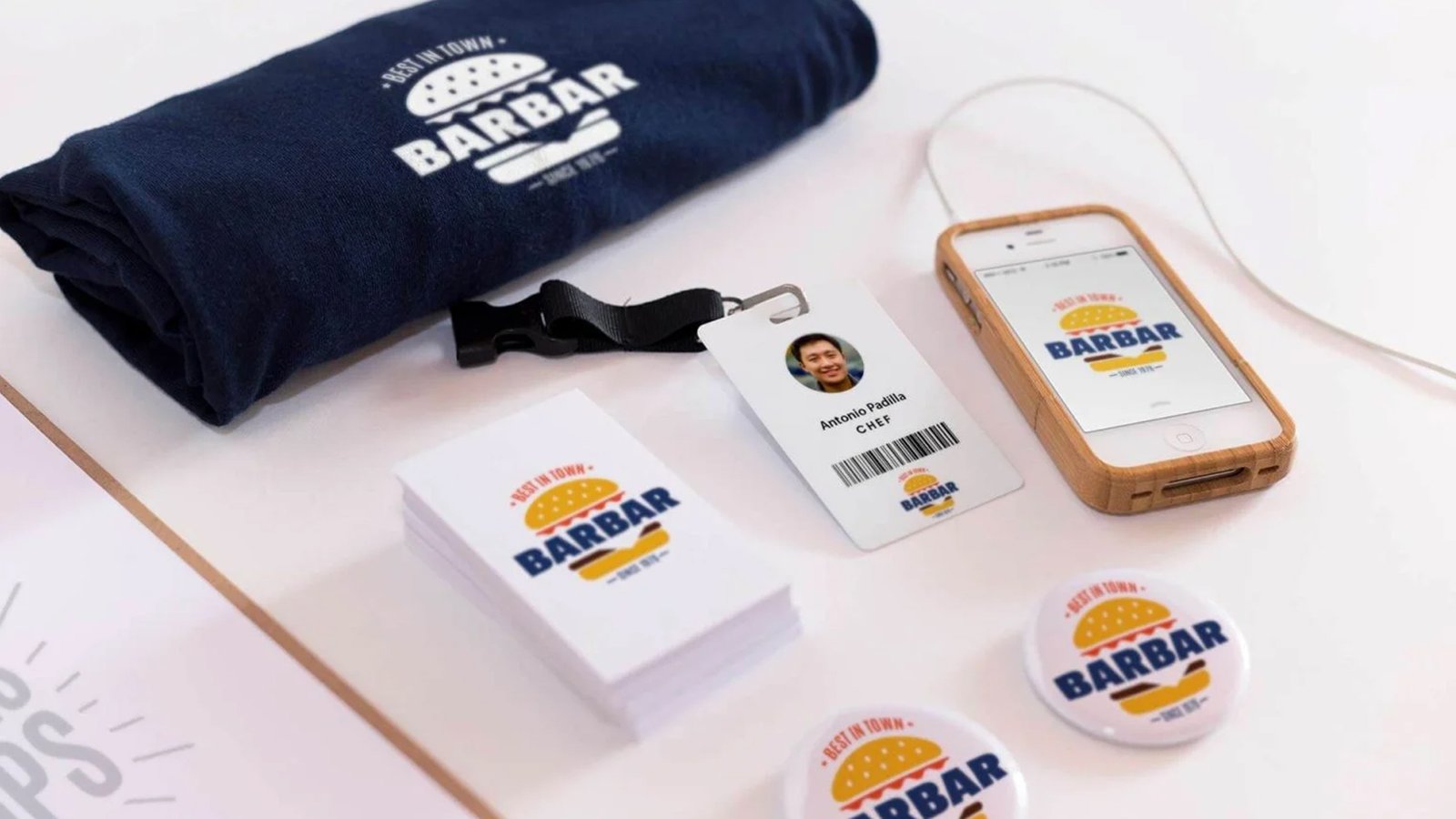
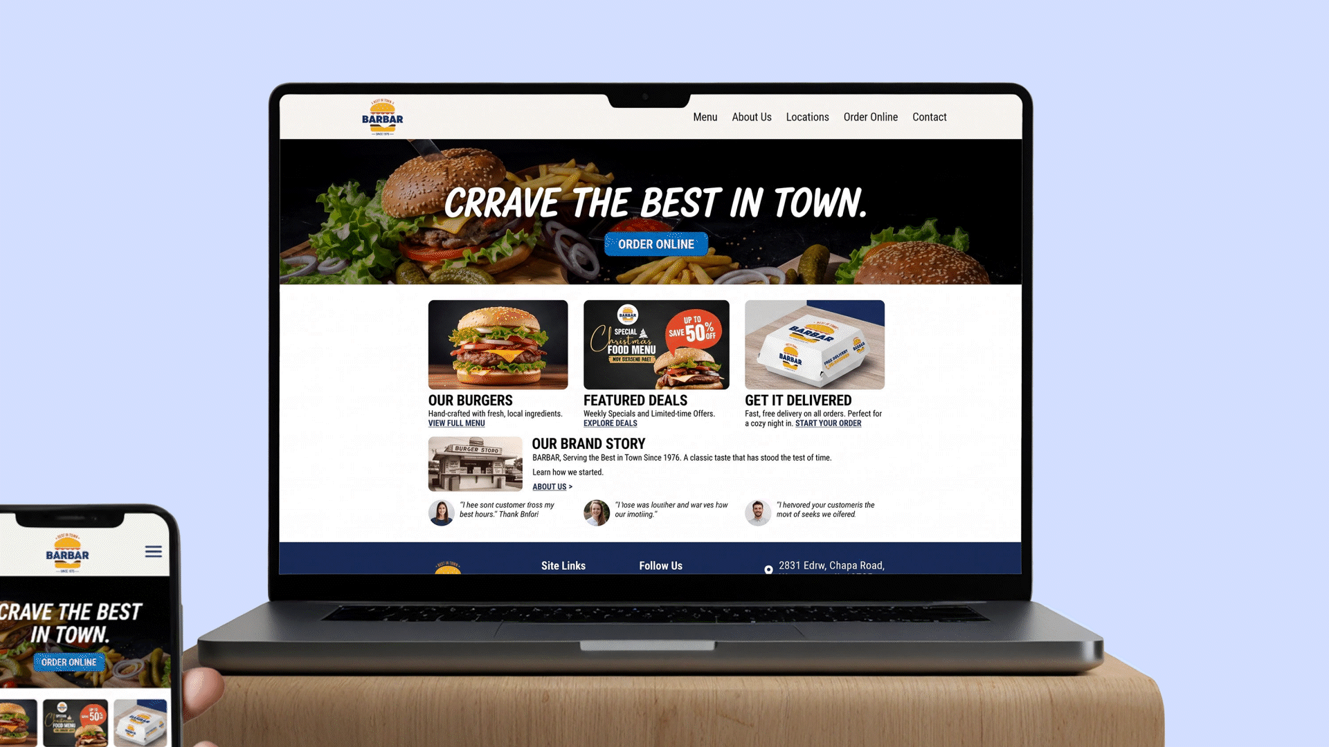
Inspired by the authenticity of the BARBAR brand, the redesign creates a simple, premium connection for foodies. Utilizing an industry-inspired red, blue, and yellow palette, the logo features impactful food imagery to foster a sense of brotherhood.
'Zisis' visual identity
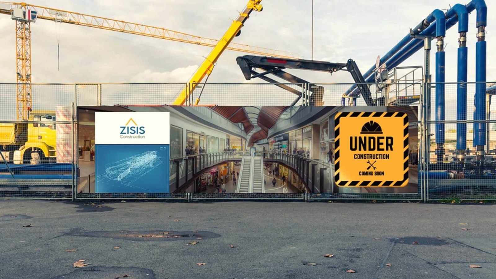
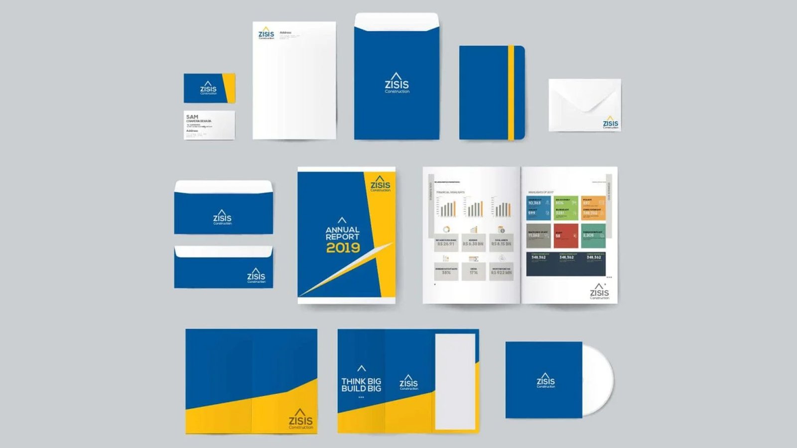


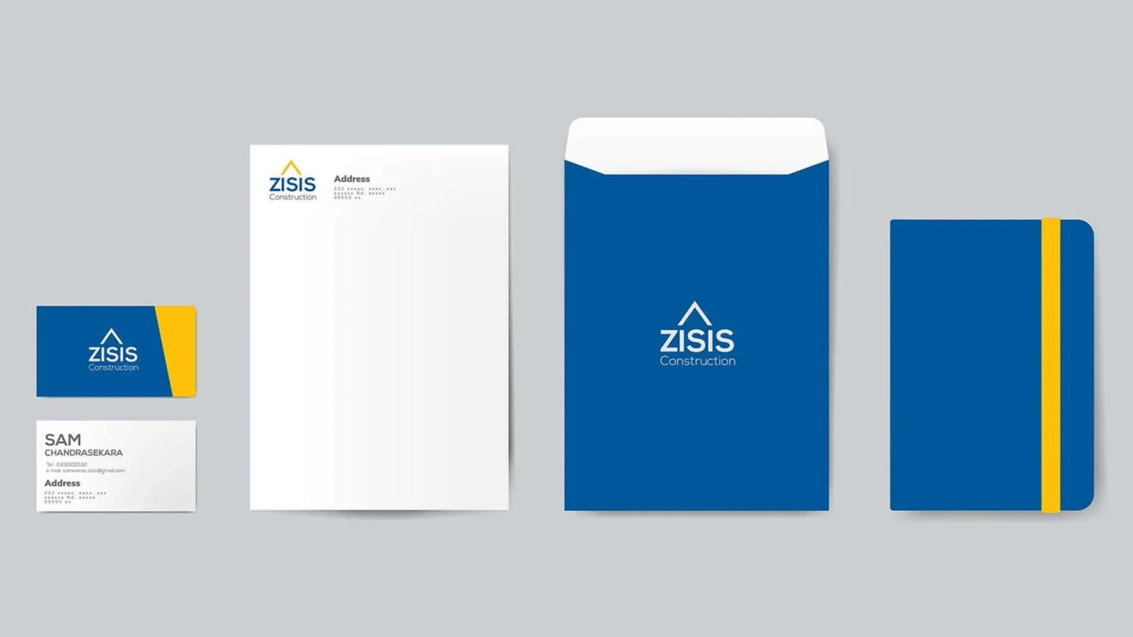
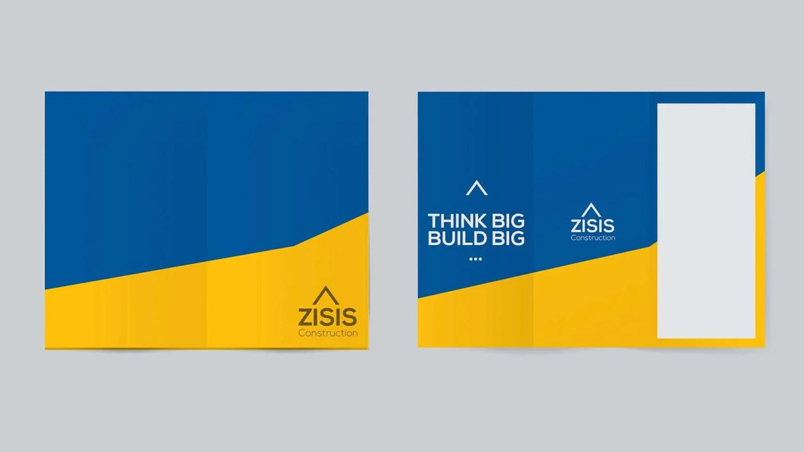
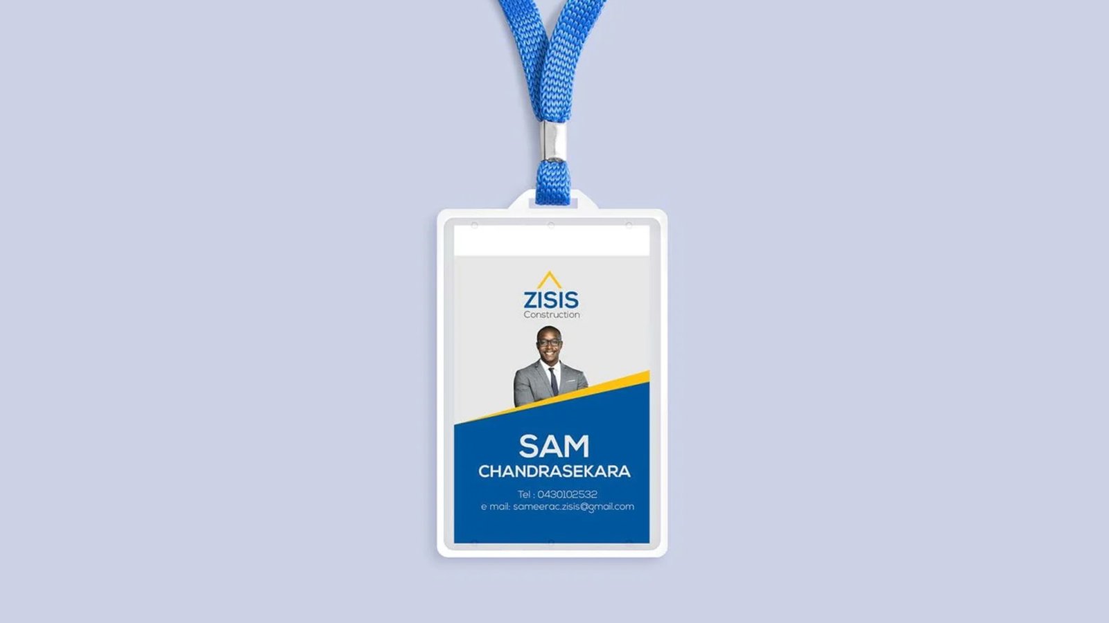
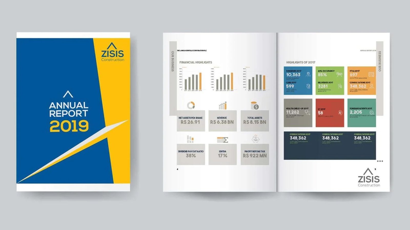
With high online competition, construction companies need strong branding. Zisis’s elegant, multi-colored logo offers a bright, professional, and easily customizable digital presence.
DIGITIAL & PRINT
designs
Product Packaging


During my tenure as Senior Designer at Sydney Tools, I drove the packaging design lifecycle for more than 134 globally recognized brands. This high-volume environment allowed me to deliver impactful, retail-ready packaging solutions on an international scale.
During my tenure as Senior Designer at Sydney Tools, I drove the packaging design lifecycle for more than 134 globally recognized brands. This high-volume environment allowed me to deliver impactful, retail-ready packaging solutions on an international scale.
'Jordan Hartley' Brand & Mobile App
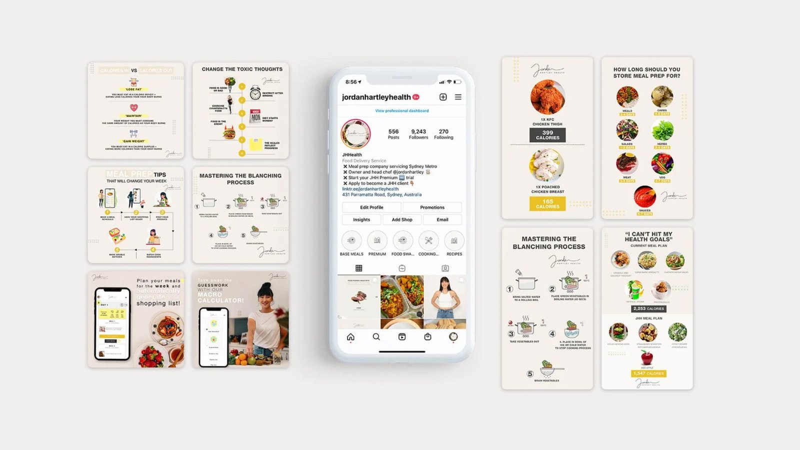
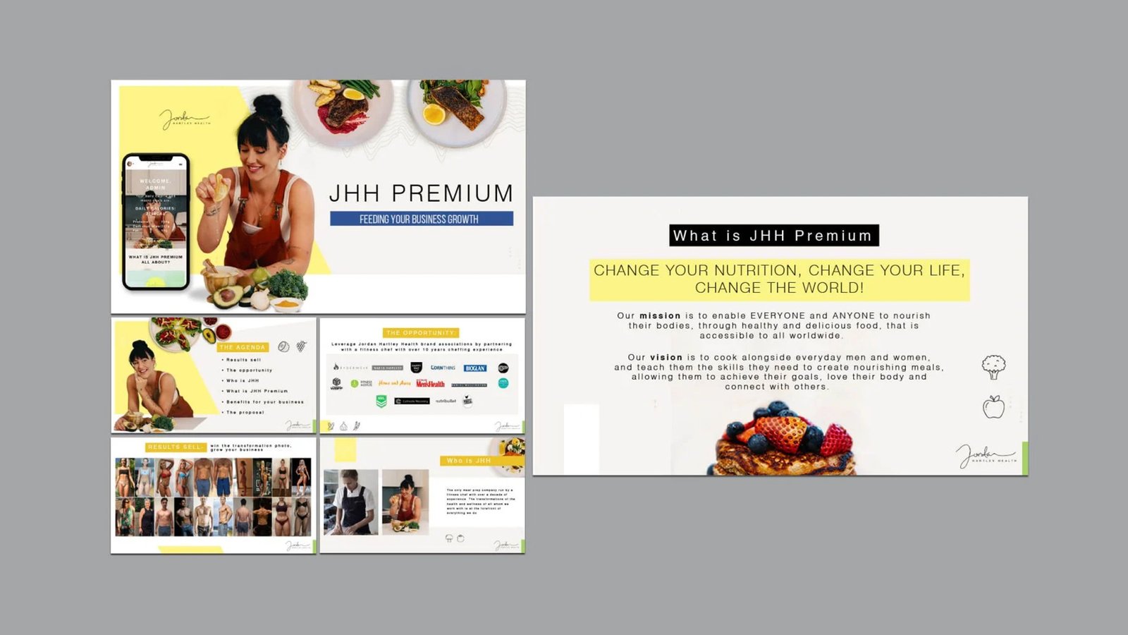
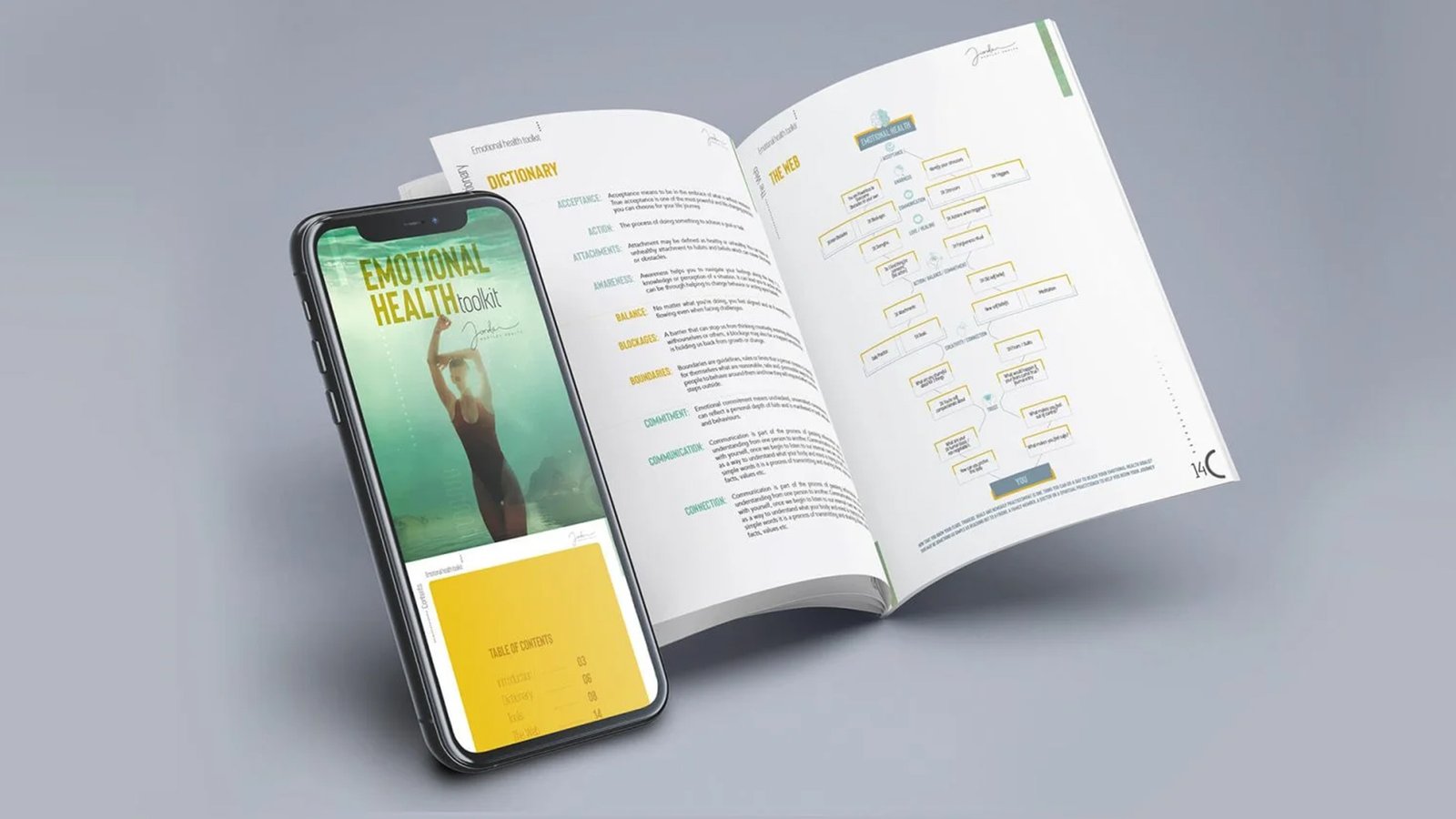
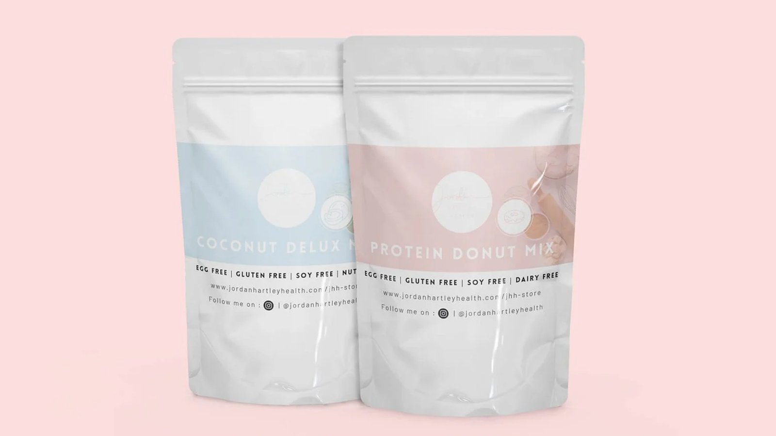
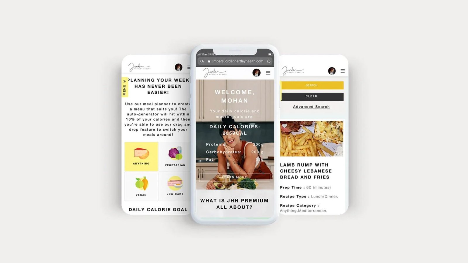
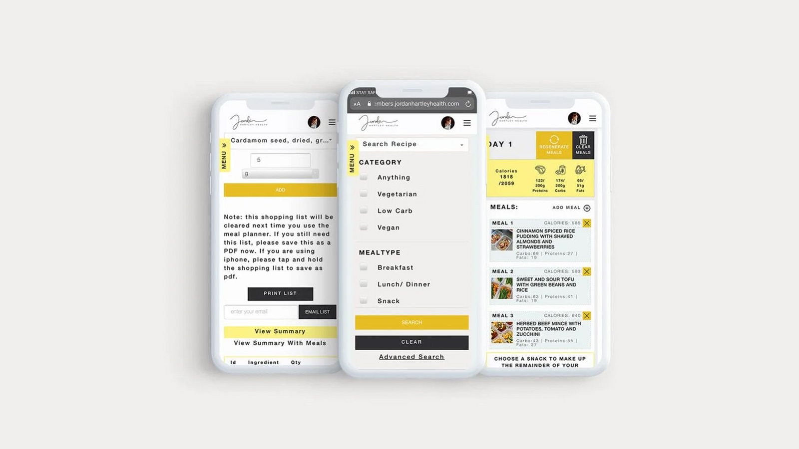
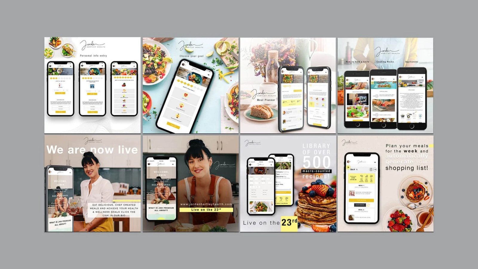
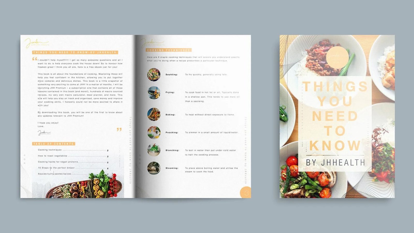
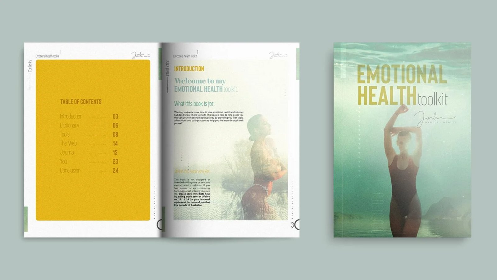
Fitness chef Jordan’s custom e-commerce platform automatically tracks macros and builds personalized meal plans from a 500-recipe database. Built entirely around her distinct personality, the brand pairs carefully curated typography and colors with seamless shopping list and ordering features.
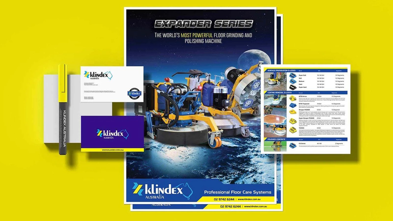
'Klindex' Brand Visuals
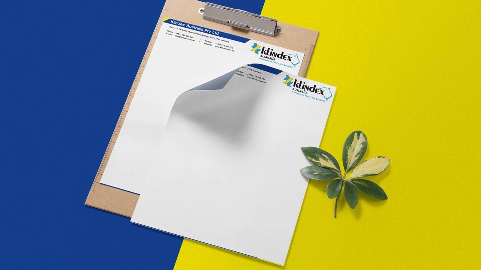
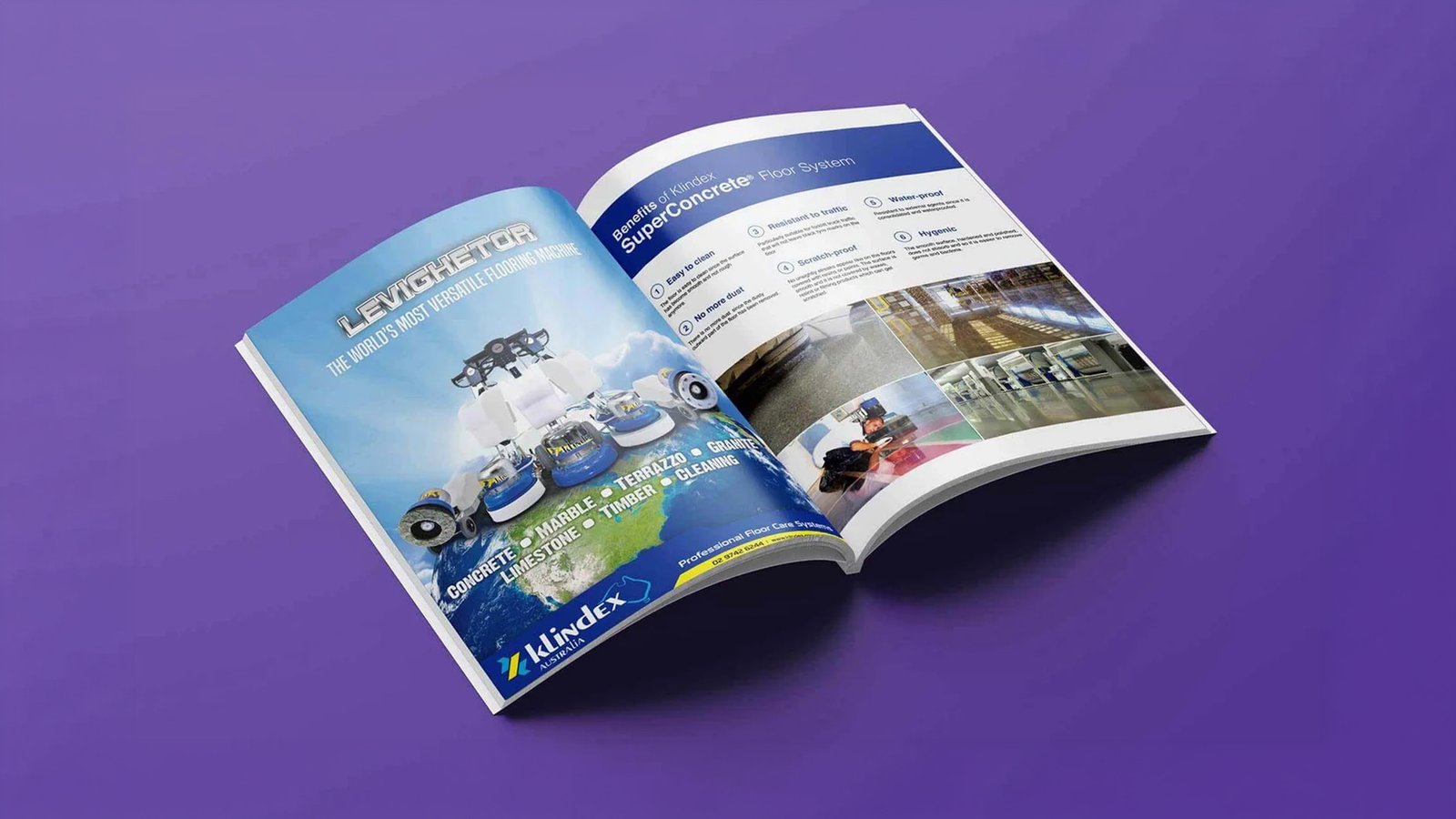
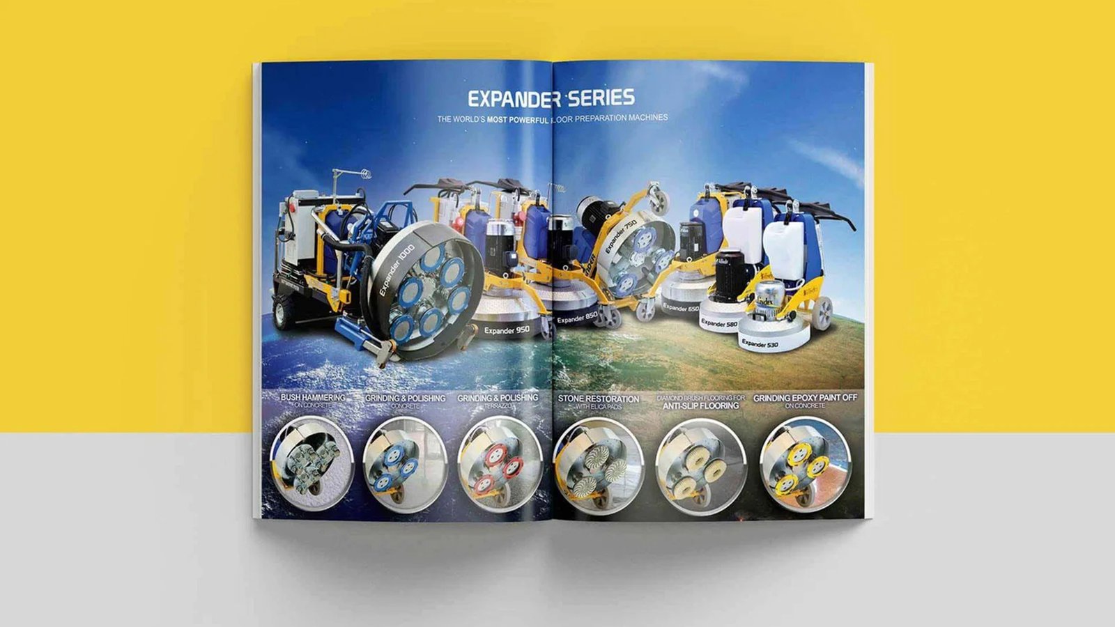
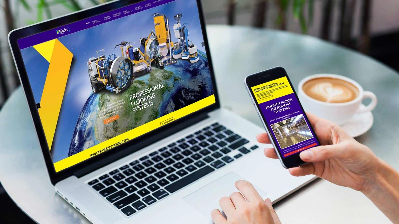
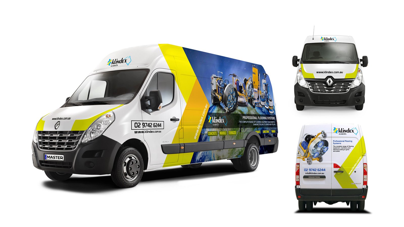
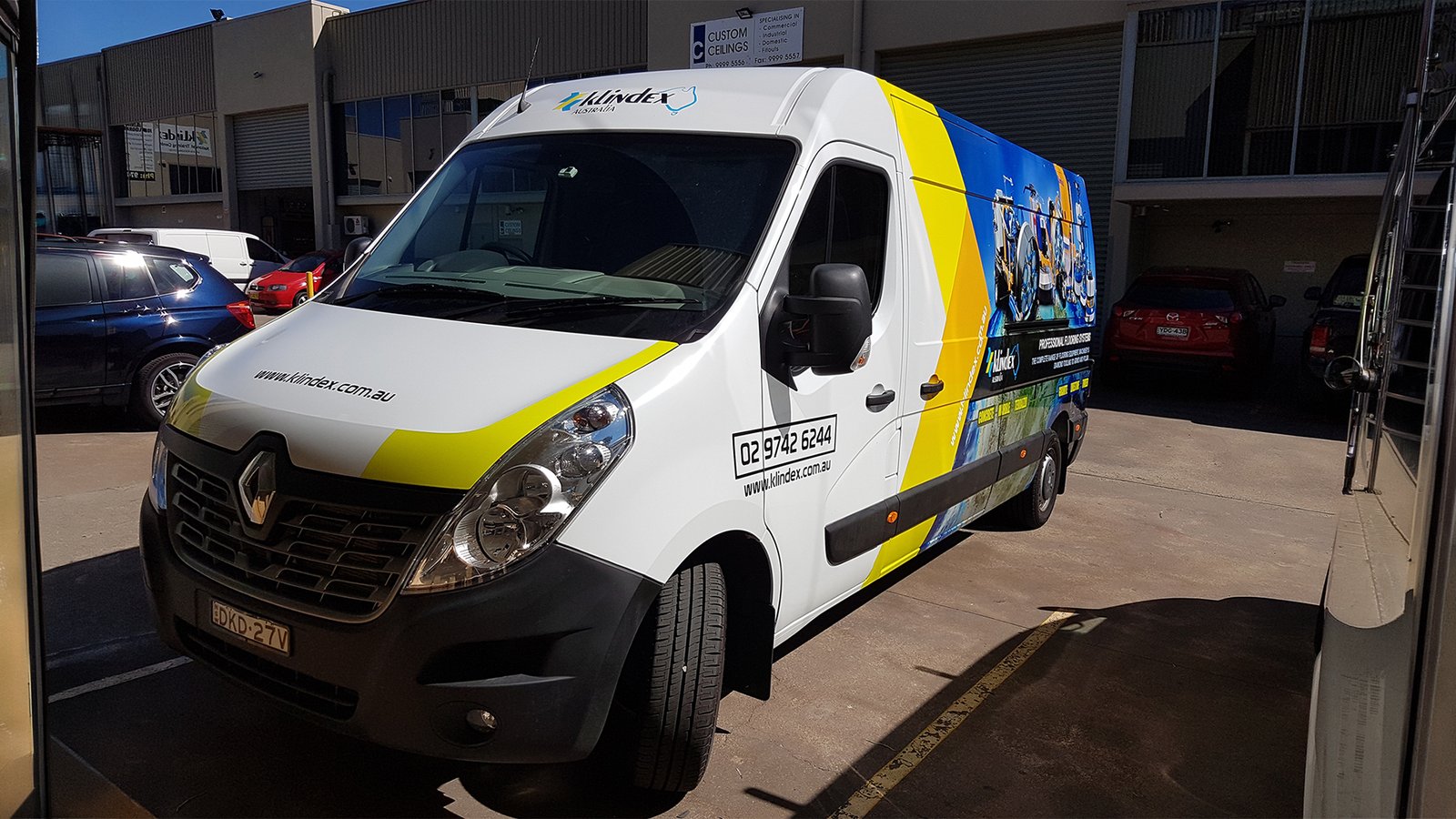
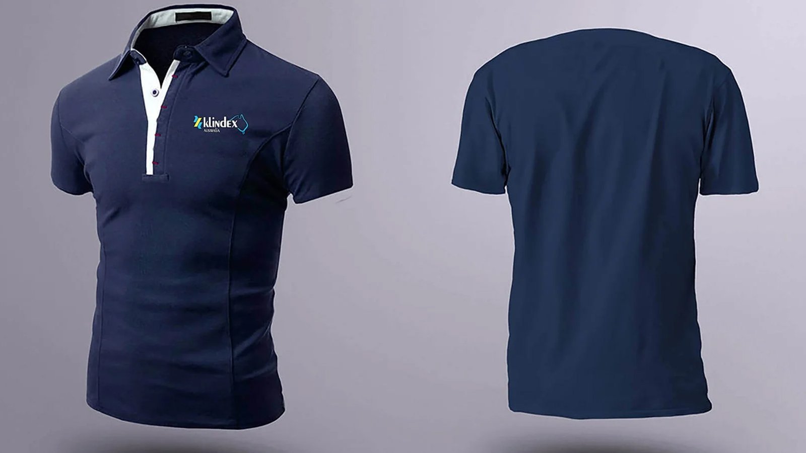
I overhauled the Klindex Australia brand by framing its industrial footprint against a deep purple background and integrating a sharp, patriotic geographic silhouette into the logotype. By designing dynamic multi-page catalogs, technical datasheets, and high-impact vehicle wraps, I built a cohesive, heavy-duty visual ecosystem that commands trust across both print and mobile touchpoints.
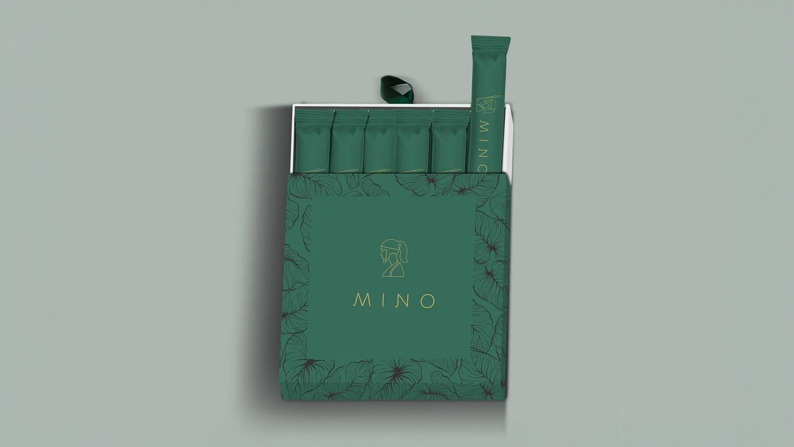
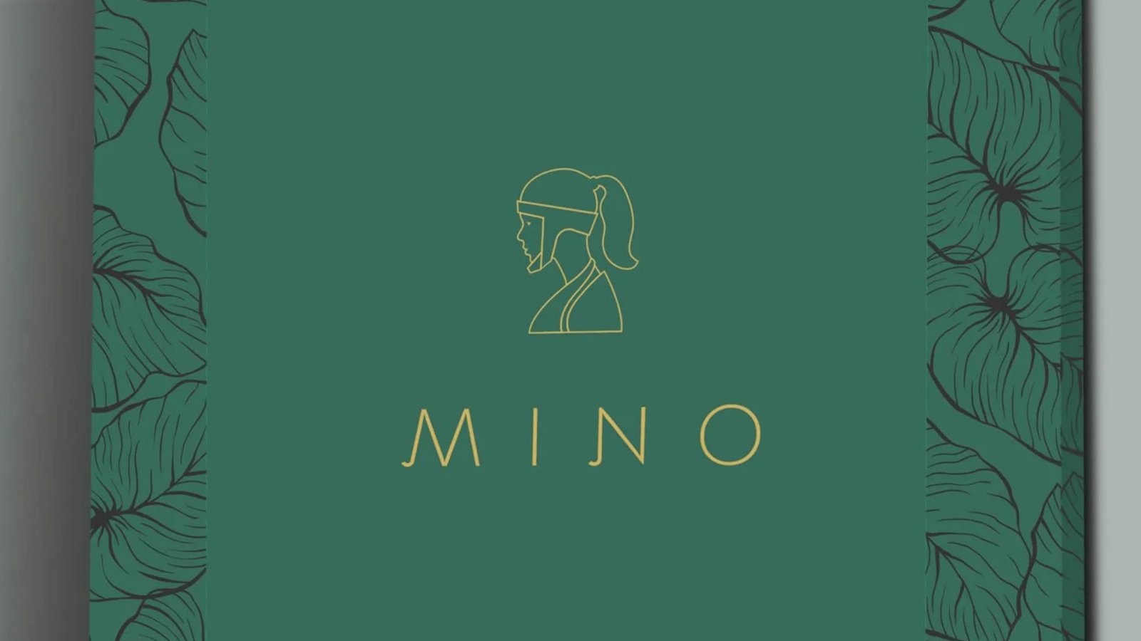
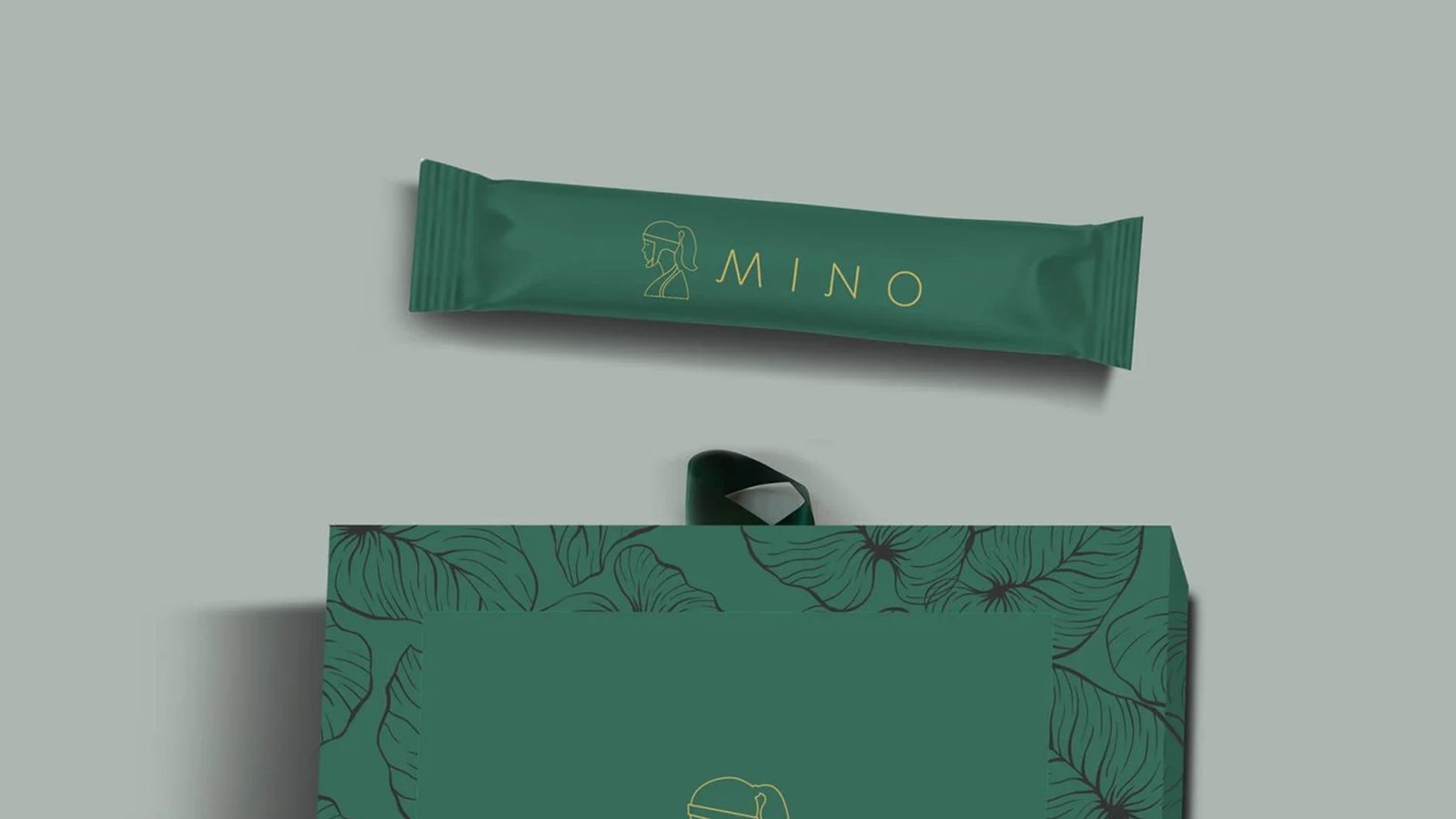
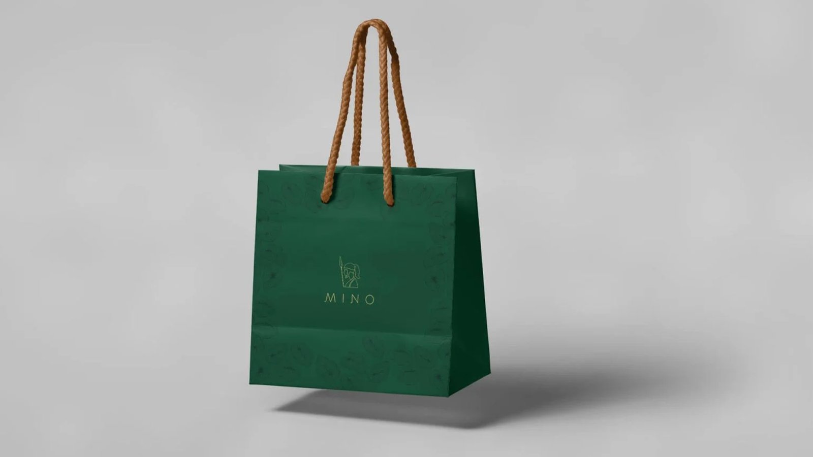
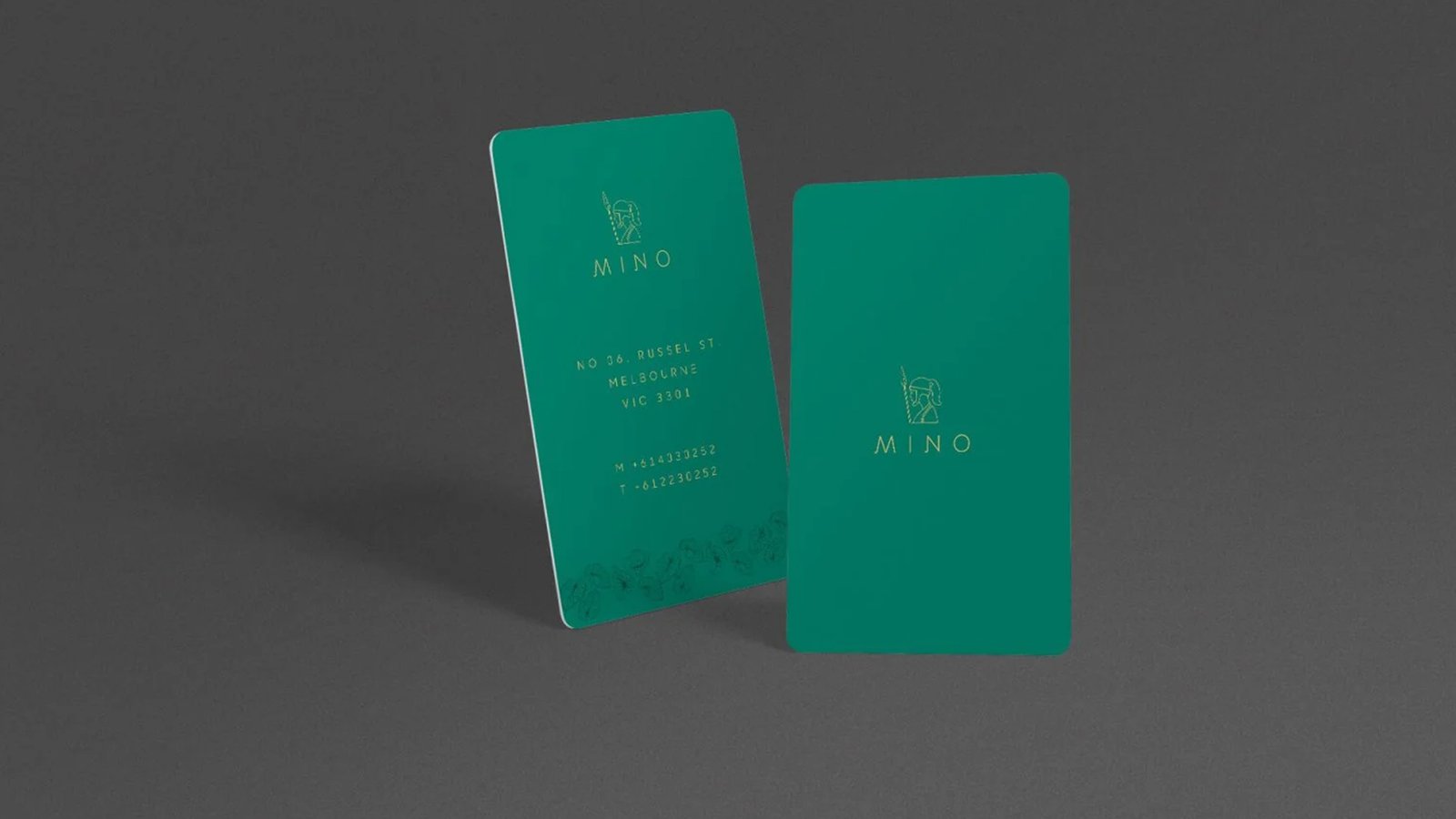
The Mino project delivers a feminine tampon brand featuring minimalist, art-driven designs. The logo balances simplicity and feminine appeal, offering a sense of protection without relying on excessive color codes.
'Mino' Branding & Packaging
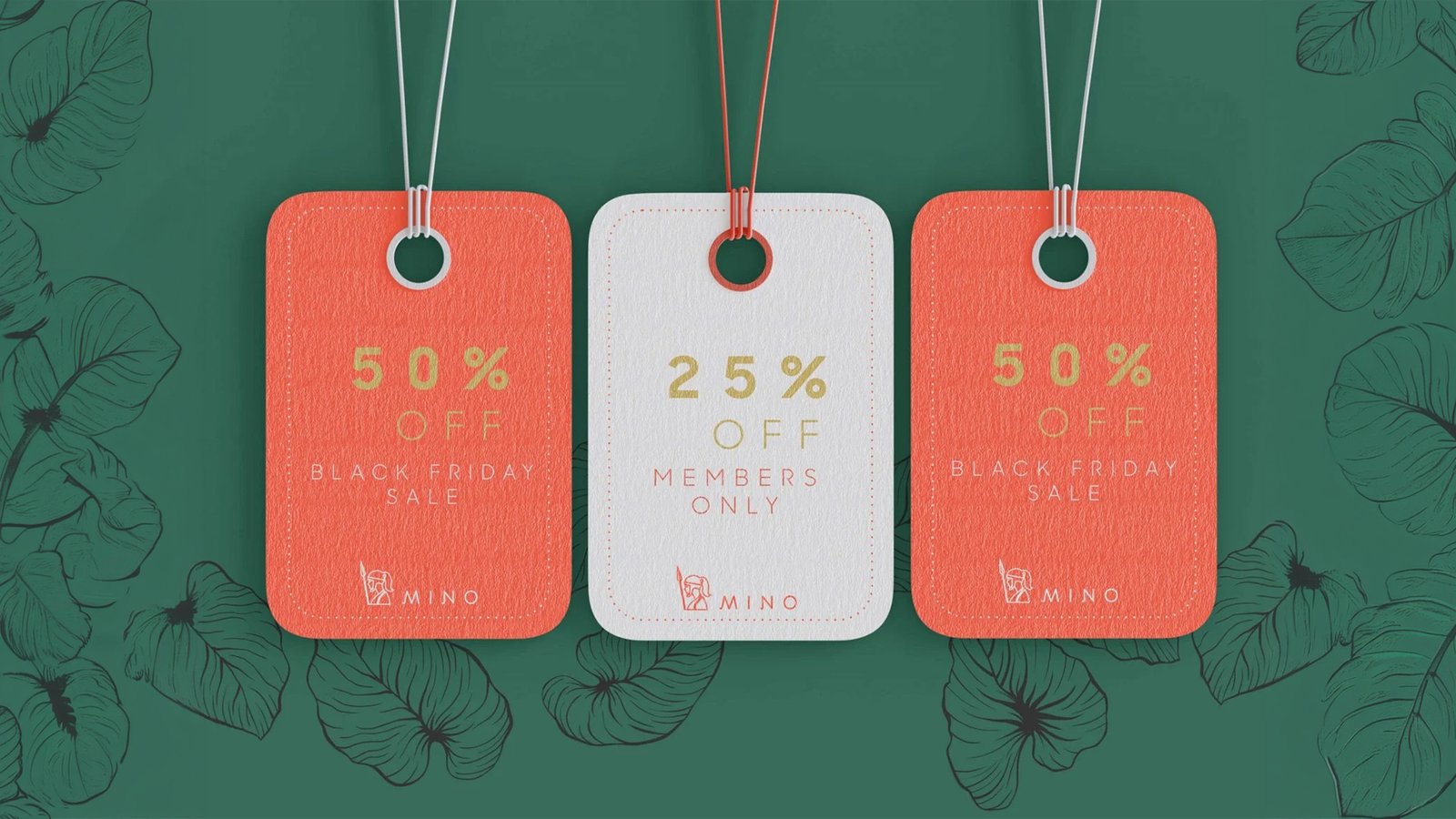
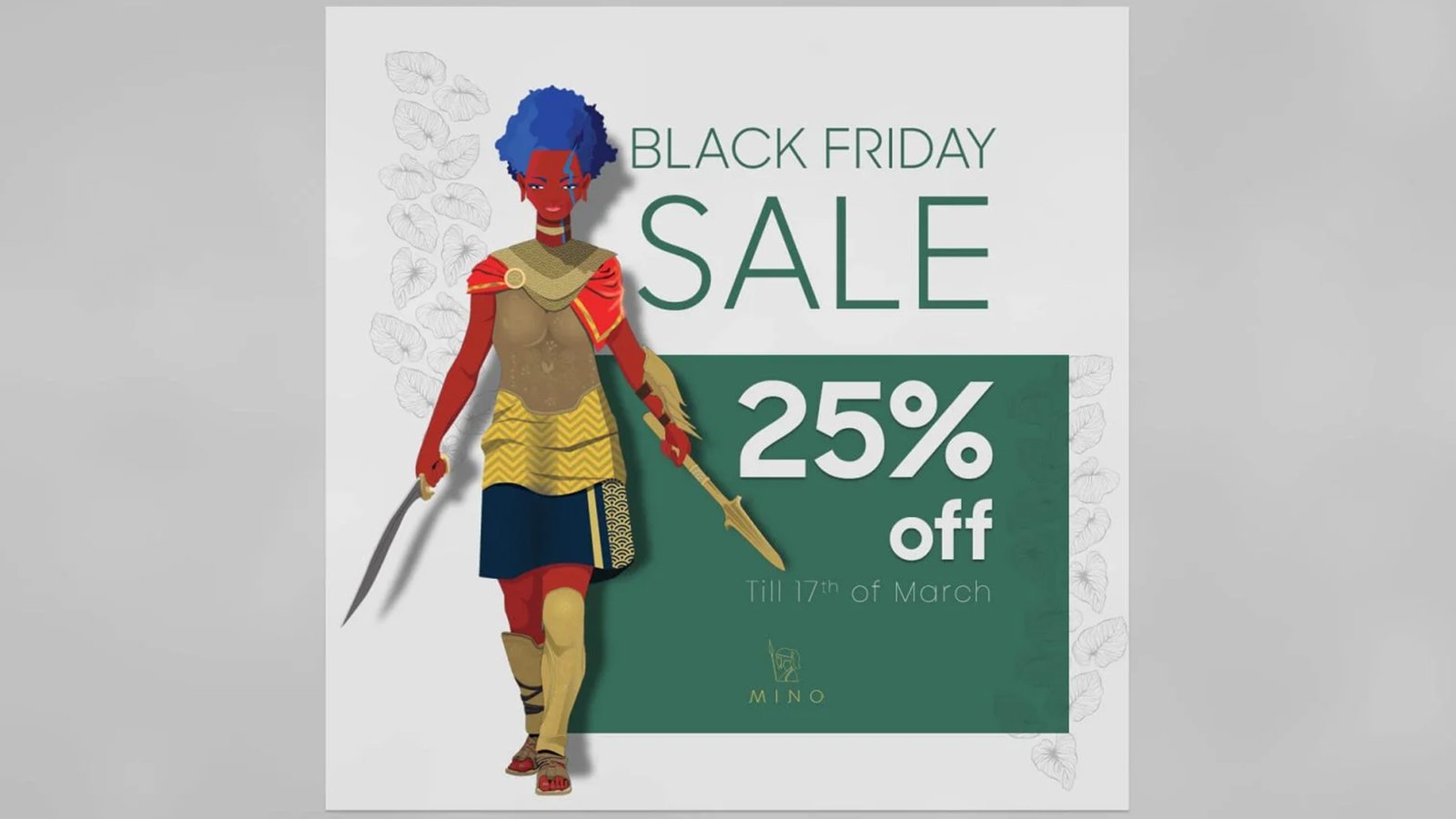
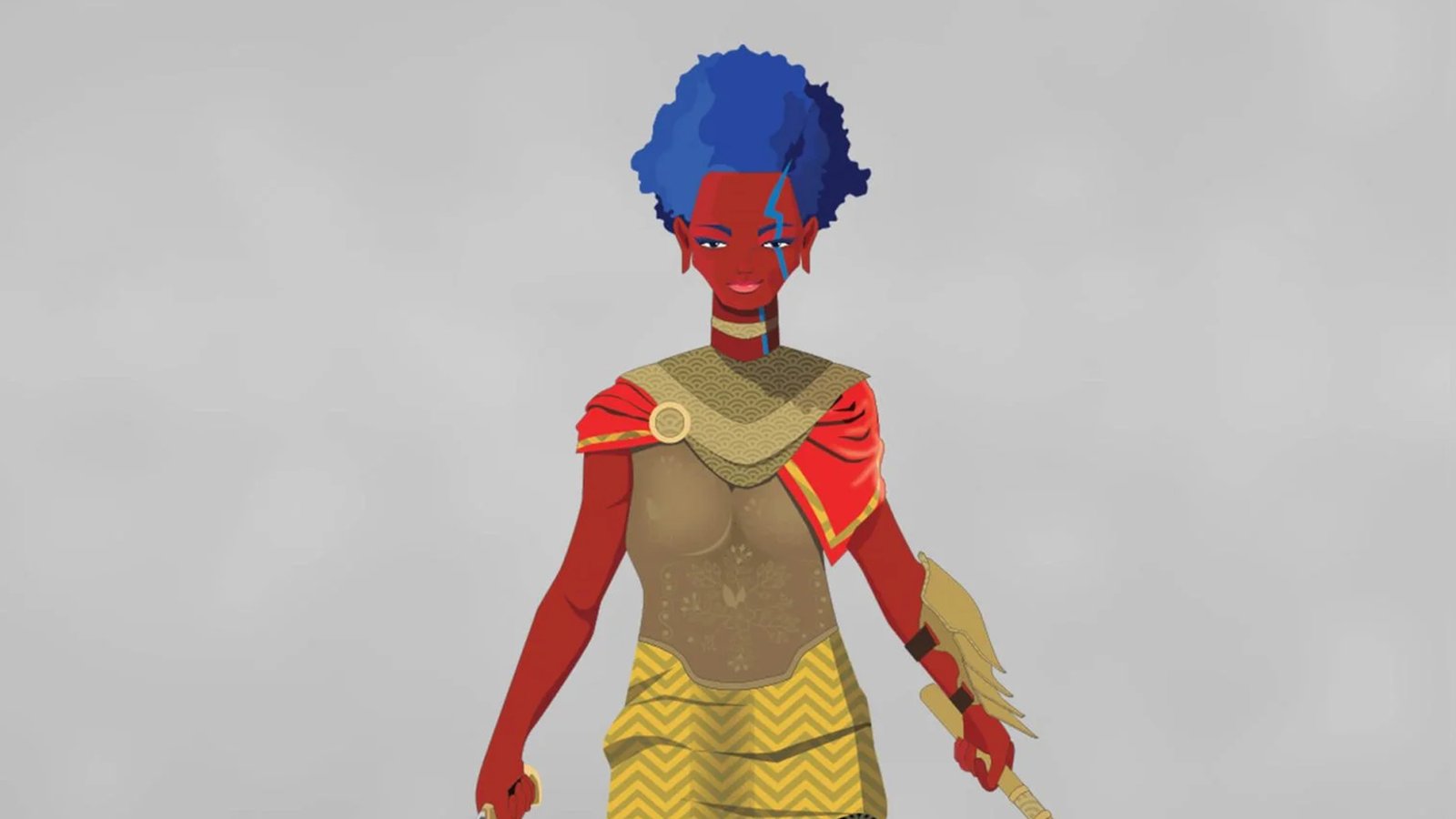
The Mino project delivers a feminine tampon brand featuring minimalist, art-driven designs. The logo balances simplicity and feminine appeal, offering a sense of protection without relying on excessive color codes.
The Mino project delivers a feminine tampon brand featuring minimalist, art-driven designs. The logo balances simplicity and feminine appeal, offering a sense of protection without relying on excessive color codes.
SOCIAL MEDIA
designs